Happy Halloween to all ghouls, ghosts, goblins & witches!

Happy Halloween to all ghouls, ghosts, goblins & witches!
Happy Halloween! We hope that you get lots of treats today and no tricks. Well, maybe a few…
Halloween is my favorite holiday, not just for the candy, but for the long and twisted road of tradition wending it’s way into the distant past, through history, pagan cultural artifacts and religious rites, harvest festivals and communal celebration as what we know now as Halloween is based on festivals such as Samhain traditionally marked the beginning of the increasing darkness that becomes a long winter.
So let’s get started with some vintage postcard finds! Anyone can imagine an iconic witch, as above, riding on her broomstick with her Familiars. And not that it’s not a beauty, but I tend to really love the more offbeat vintage postcards. Especially the ones where the narrative and the symbolism seems pretty obscure and stranger than normal. (All postcards in this roundup are clickable and will take you right to the sites where I found them too.)
For example, this fine bat adorning a pumpkin with a candle running horizontally and lit at both ends. The poem on the postcard shares a little folk magic.
If you light a candle at the ends / Twirl it that the air it rend / Should the right end stay lit / All will be gay./ If the left stay lit, the witches stay / If both stay lit, you will be it. / If both go out, you have routed them out.
Good to know! If such home magic was once more readily known, I’d bet this below scene with a pretty young witch would also be of use, with many a candle a-lit.
And while on the topic of witches, I loved these two below that sort of speak to a White Magic type of crafting more than Black Magic:
These two symmetrical, twin witches are wearing unusually light colors, and even their twin black cat familiars sport white collars. Look, all they are trying to do here is hook you up with the love of your life. So what if a little incantation is needed?
The same goes for the above lovely matchmaker. Her face radiates like the woman on Contadina tins, just happily cooking away with her white owls and black bat motifs. Perhaps the young miss below is one of their clients, hoping to find true love among the many pumpkin bachelors in her class.
But let’s move on to less beautiful witches, as they are much more fun. The below has something of a goblin mixed with a Cardinal going on, which is just fantastic.
Now clearly we have meandered over to Pumpkinheadville. In the below postcard, I am sure that Asian robed lady once was beautiful, but in this scene? She scares the hell out of me. And that is what All Hallows Eve is all about!
A little flight into the surreal, with a false reflection of a giant owl? Or is the creepily white sheeted man a terrifying reflection of the owl? We may never know.
‘O! Charming little punks:
Now I present, two examples of a sub genre I love, where the Devil is being totally awesome at parties. Here he helps himself to carefully laid bounty of goodies with his (fruit? Veggie?) buddies:
And best, here he is planning the menu! With living anthropomorphized fruits, wine and a lamp looking on, and completely stoked.
Supernatural Mischief Chefs!
I’m also a big fan of the more spooky / supernatural themed postcards as well. Lots of Victorian “mirror gazing” and other small spells play out in scenes where the participants are hoping to peer into the future and see their One True Love to come. This one is especially beautiful with the young, fairly innocent looking girl’s shadow casting against the wall as a dark witch and her one-day partner in crime appearing only in the mirror. Truly classic horror movie stuff.
Nope, not scary or spooky at all.
This one is just gorgeous. How many times have I stayed up too late reading a scary book only to be regret it at the slightest sights sounds? Many, many.
Honestly? I just have no clue what is happening here. And that is awesome.
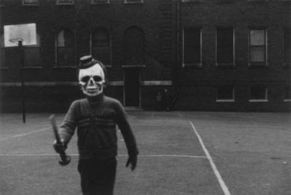
And while this isn’t a postcard? It’s the damn creepiest vintage kid in a Halloween costume photograph that I’ve seen. Eeeeee! Happy Halloween everyone!
(All images by Mikey Ashworth. Copyrighted by London Underground and reproduced with permission.)
Unlike most, there is a very special, and very abandoned, very non-public now-unused part of the Notting Hill Gate station that houses some lovely examples of UK poster design from it’s Mid-Century high point.
However, photographer Mikey Ashworth was able to gain access and take these photos. And you can see more of his photos here at Flickr.
(All images by Mikey Ashworth. Copyrighted by London Underground and reproduced with permission.)
Above, good time UK Party Travel by coach poster, as imagined by poster artist Victor Galbraith, 1958.
The elevator passageway is well abandonned, but its original posters from the day the station was closed still hung on its tiled walls advertising all sorts of bright bits of the world of travel, exhibitions, film, toothpaste and more to no one these days.
(All images by Mikey Ashworth. Copyrighted by London Underground and reproduced with permission.)
The above “Royal Blue Coach Services” poster illustrated by the UK poster artist powerhouse and one of my favorite all-time illustrators, Daphne Padden.
These beauties are a stunning collection of illustration, type design and ad layouts from the late 1950’s, still in their native habitat. Which makes them extra special.
(All images by Mikey Ashworth. Copyrighted by London Underground and reproduced with permission.)
Most unfortunately, for a poster and design nerd like myself, these amazing, vibrant and powerful examples of advertising poster design are completely inaccessible to the public and are likely to stay so for the forseeable future. Once the renovations to this station were completed in 2010, this abandoned passageway was walled back up and sealed off from use again.
Still, many thanks to Mikey Ashworth and the London Underground for publishing these photographs of a poster age (sadly) gone by.
In my morning-coffee-stumble-through-the-internet-while-waking-up ritual today I came across a fantastically cool / I can’t believe that I didn’t know about this before blog, called 50 Watts, run by Philadelphian (yay! My hometown!) Will Schofield.
50 Watts is great little space of the web covering the intersection of book collection, design, and illustration. Sounds like heaven to me. What caught my eye was an image from a post on now vintage book covers from the 40 year span from 1964 – 1984. Here, I’ve posted a few of my favorites, but definitely check out the full post at 50 Watts here.
And yeah, part of me wishes that I could read the text on these beauties. At the same time, they still speak quite clearly and the other part of me loves being able to make up stories about what these stories are about.
Mostly, I just adore the flatness of the color fields, the kapow! of their graphics and layout, and symbolic style of the illustrations. Being a silkscreen printmaker, there is something so excellently familiar about the way that these were printed, probably cheaply, probably in a spot, or one color at a time process like screenprinting. You can see the areas where pieces aren’t in perfect register, or where colors overprint one another, and the use of halftones to mimic saturation levels of a color. All make my heart do little flips. The limitations of this type of printing force incredibly creative and freeing design and illustration choices, which, clearly I love and have embraced as a career. So, no. It’s no surprise that I dig these. I hope that you do too.
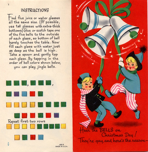
The imagery for Christmas cards might seem like a given these days, simple & bold graphics, perhaps tending towards the nearly unidentifiable winter or generic holiday look. Don’t get me wrong, I love a pure graphic approach to a card. But there is something very engaging and fun about vintage and old-fashioned Christmas cards that really gets my attention.
From the traditional Victorian look:

To the very sweet and peaceful 1940’s style, such a contrast to the reality of that era. Don’t you want to live in that little snowy village?:

And the flowing, natural yet stylized Arts & Crafts-centric 1920s look of this beauty:

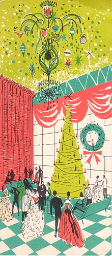
Dashing glamour, sweeping elegance and the highest of hopes translated into a party scene:
 And yet, so many cards were not as soft, sweet or traditional, unlike so much of today’s Christmas cheer fare as edited and produced by (perhaps overly) PC and inoffensive greeting card companies. Prime examples of a more ironic, or bitter take on the Season:

And the of course, there is Margaret Keene (you thought it was Walter, didn’t you!) being a little creepy for Christmas:
There was even a time when Christmas celebrations were outlawed in Boston, MA the Protestant heyday. Bah Humbug!
For more vintage Christmas goodness, check out these Flickr pages and groups: Vintage Christmas: 1945-1970, profkaren’s set Vintage Greeting Cards and a lovely assortment in sakameg’s Flickr account.
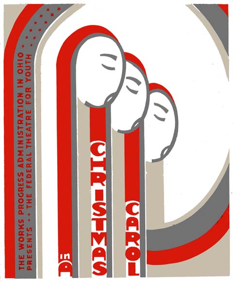
While this isn’t a card, this WPA poster is just the tops.

Works Progress Administration poster for The Federal Theater for Youth’s Christmas Carol production.