Strawberryluna

Bee Love Summer Fresh Art Prints & Notebooks

Introducing our new “Bee LOVE” illustration! My ode to all things wildflower, garden blooming, and crop pollinating.

Our “Bee LOVE” illustration has a sweet double meaning, by adding more love and joy into the world. Something every single body needs more of, no matter who you are. ❤️

Bee LOVE art print, in Sweet Cream. Also available in Crisp White and Garden Green.

ART PRINT DETAILS:

⇒ The art print versions of  our “Bee LOVE” illustration comes in 3 colorways: Garden Green, Sweet Cream, and Crisp White.

⇒ All color options shown below.

⇒ “Bee LOVE” is also available in 3 standard US sized frame options too: 8×10 inches  / 11×14 inches (as above) / and 13×19 inches (as below) too.

From top left to bottom left: Colorway options are: Garden Green, Sweet Cream, and Crisp White. Framed “Bee LOVE” art print shown is 11×14 inches.

Our Bee LOVE giclee art print in Garden Green, using a magnetic wooden slat print hanging system.

Adding to the double-meaning good vibes, we’ve released this design as both an art print and also double-sided sketch & notebook journals too.

Bee LOVE is also available as a beautiful new notebook, sketchbook or journal featuring a double-sided illustration of this field of tall flowers and a sweet honey bee on both the front and back covers. One side is Sweet Cream, the other side is Deep Garden Green.

Plan a garden, sketch your flowers, write your thoughts and embrace summer with us.

We love these sketchbook journals so much. The heavy duty paper is a dream and we’ve oriented the illustrations so that you get to choose which side and colorway (Garden Green or Sweet Cream as above) will be your front & back covers too. Yay!

Both the art prints of Bee LOVE and the Sketchbooks are available and ready to ship here at our website shop and also here in our Etsy store too.

Let’s Summer! 🌸

Detail close-ups of our “Bee LOVE” hand drawn design.

NOTEBOOK DETAILS:

⇒ With a sturdy black metal spiral binding, you can either use the dark green or the summer cream as your “front cover”. We laid our these journals so that when you flip your notebook over the artwork is facing the right way. So you get to choose which color is your cover! 🎨

⇒ Added bonus – these notebooks are perfect for left-handed folks too.

⇒  Sized at 7.5in x 10in our Bee LOVE notebooks are small enough to tote and carry easily. But large enough to actually jot down your thoughts, draw out garden plots, and/or sketch & make art. ❤️

⇒  32 heavy duty drawing paper pages and a matte velvet laminated softcover that feels great in your hands. 💙

The interior pages are a hefty 80lb card stock. That makes these garden journal sketchbooks pages a lovely, beefy, matte finish that’s a joy to sketch, draw, and write in and create. 💚

⇒ Record your thoughts, plan your garden, sketch with pens, pencils, or gouache paints, or just have the happiest to do list notebook ever! ✏️

My personal “Bee LOVE” sketchbook & pencil on our patio in the sun, ready to sketch!


New print release: Going To See My Baby Yellow!

New, all hand screenprinted 6-color silkscreen art print Going To See My Baby Yellow available now! (Click for more info or to purchase.)

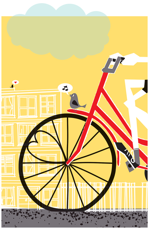
Spring is finally here! And to match the growing warmth and springy feel, here is a new silkscreen art print release! Going To See My Baby Yellow, a brand new colorway of my super popular art print about bicycles, love and that special glee. You know the feeling.

This hand-pulled & hand screenprinted happy day is a brand new colorway of a very popular print that I did in 2007, but in a super small edition for the Screens’n’Spokes fundraiser, now returned in fresh spring lemony yellow and soft sky-blue, just for you.

Going To See My Baby Yellow is my 6-color, all hand screen printed art print with fresh lemon yellow, bright bike red, dark grey, black and soft transparent sky-baby-blue hand-mixed and non-toxic water based silkscreen inks. And yes! The sky-baby-blue cloud breaks the margin/border just like a good cloud should, and it’s partially transparent over the white margin. Tweet! Edition of 200. Size: 16 x22 inches (39.4 cm x 55.9 cm.) Paper: no acid, archival Cougar, White 100lb cover weight.

For more information about this print, or to purchase, visit my website here or check out my Etsy shop here.

Some of the previous colorways like Baby Blue, Orange, Lavender, and Sage are now all sold out, enabling us to donate to a cause we really have close to our hearts, The National MS Society. And, a portion of the sale of each of these prints is donated to The National MS Society as well .

New music released today: Toro y Moi, “Underneath The Pine”

Click!

Yay! It’s Toro y Moi new release day!

I fell in love with “Still Sound”, one of the songs off of this new record from the South Carolina based Chazwick Bundick, aka Toro y Moi earlier this month and have been waiting with just about still breath for the release of this full length record. Today’s the day. Hooray!

Check out Carpark Records to purchase and support independent music & musicians. Or, hop over to Chaz’s Etsy shop and buy a tote bag with his drawing hand screen printed onto a bag that comes with a digital download card of  “Underneath The Pine” here.

And fall in love with “Still Sound” above.

New art prints released: Naptime & I Love My Books!

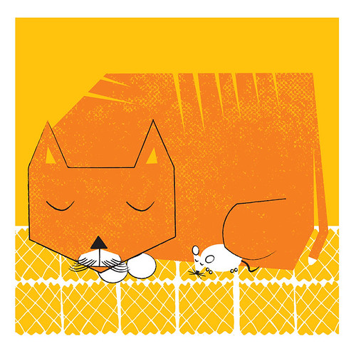
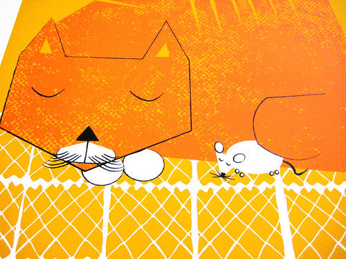
New 3 color hand silkscreened art print, "Naptime". (click to purchase or for more info.)

For a while now I’ve been wanting to try a new layout, a square one, and one that would fit right into an LP record frame. Well, that time has come.

It’s “Naptime”. We all get sleepy snuggly sometimes, and even natural-born enemies can be the best of friends. You just gotta let your softer side rule.

“Naptime” is the first print in that size and layout. From an illustration that I did a few weeks ago while hanging out on a lazy Sunday afternoon off, while we were totally being summer tv heads. Probably we were watching some cooking shows, or Holmes On Holmes (my new obsession) or such like television.

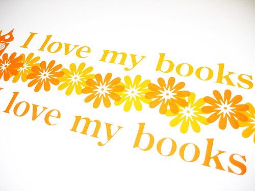
Anyhoo, I also decided rather than waste paper or have a weirdly shaped cast off, as the 12×12 inch size is smaller than my normal print & paper size, that I would run a smaller print at the same, 2-up. (2-up means printing 2 or more designs on the same page at the same time, cutting them down and apart after printing.) So, I did an ode to books for the secondary smaller design, as below, called “I Love My Books”. ‘Cause I do.

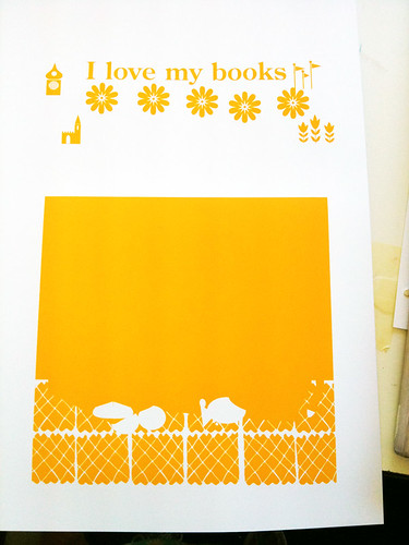
New 3-color (with overprints) mini art print, "I Love My Books", hand screenprinted. (click ot purchase or for more info.)

All sunny and warm, just like this summer. Both “Naptime” and  “I Love My Books” prints are now available at my website here and also in my Etsy shop here. And, for some process photographs of the hand screenprinting process, take a look below. Click on any image below to see more & get more info at my Flickr account too.

1st color, printed. (click to see a larger image, more images or for more info.)

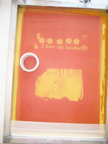
2nd color screen taping & prep. (click to see a larger image, more images or for more info.)

Closeup of "I Love My Books" 3-color hand silkscreened art print.

Closeup of "Naptime", 3 color hand screenprinted art print.

Vintage Christmas Cards

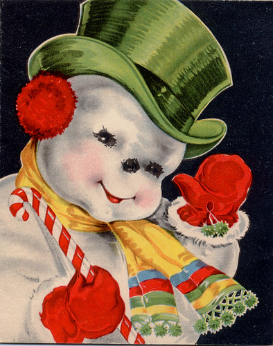
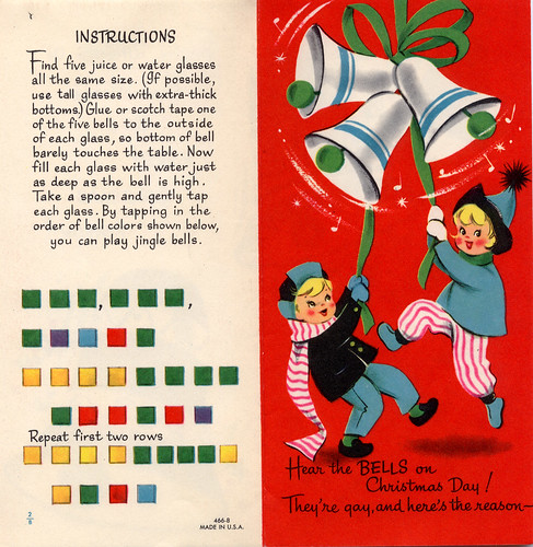
The imagery for Christmas cards might seem like a given these days, simple  & bold graphics, perhaps tending towards the nearly unidentifiable winter or generic holiday look. Don’t get me wrong, I love a pure graphic approach to a card. But there is something very engaging and fun about vintage and old-fashioned Christmas cards that really gets my attention.

From the traditional Victorian look:

victorian_christmas


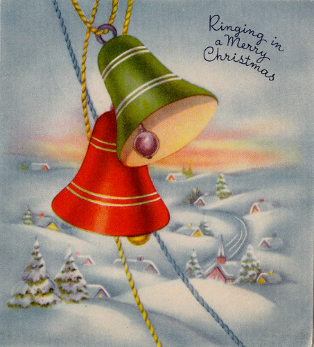
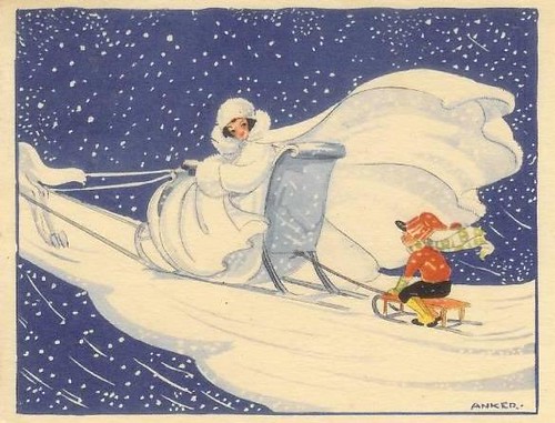
To the very sweet and peaceful 1940’s style, such a contrast to the reality of that era. Don’t you want to live in that little snowy village?:

Dont you want to live there?

And the flowing, natural yet stylized Arts & Crafts-centric 1920s look of this beauty:


1920s


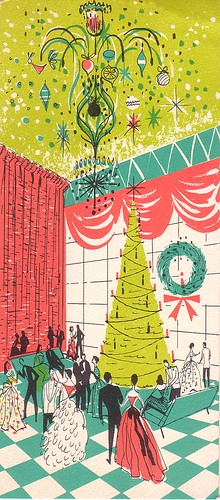
Dashing glamour, sweeping elegance and the highest of hopes translated into a party scene:


 And yet, so many cards were not as soft, sweet or traditional, unlike so much of today’s Christmas cheer fare as edited and produced by (perhaps overly) PC and inoffensive greeting card companies. Prime examples of a more ironic, or bitter take on the Season:


polar

And the of course, there is Margaret Keene (you thought it was Walter, didn’t you!) being a little creepy for Christmas:


There was even a time when Christmas celebrations were outlawed in Boston, MA the Protestant heyday. Bah Humbug!

For more vintage Christmas goodness, check out these Flickr pages and groups:  Vintage Christmas: 1945-1970, profkaren’s set  Vintage Greeting Cards and a lovely assortment in sakameg’s Flickr account.

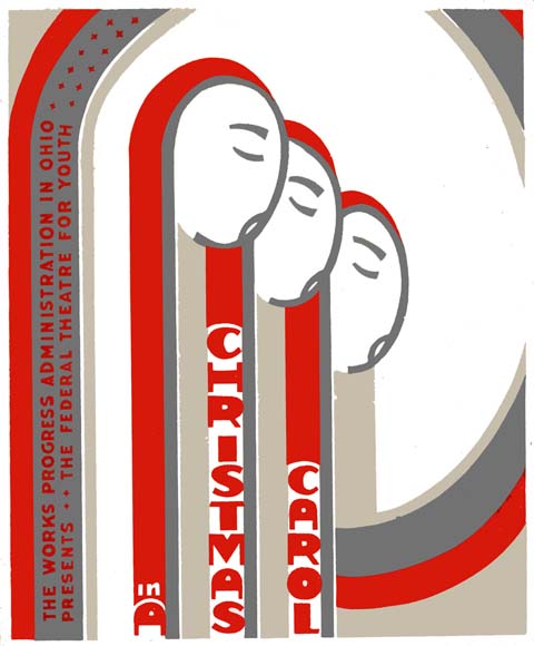
While this isn’t a card, this WPA poster is just the tops.


Works Progress Administration poster for The Federal Youth Theater's Christmas Carol production.

Works Progress Administration poster for The Federal Theater for Youth’s Christmas Carol production.