Strawberryluna

Doodle Time: Ginko edition

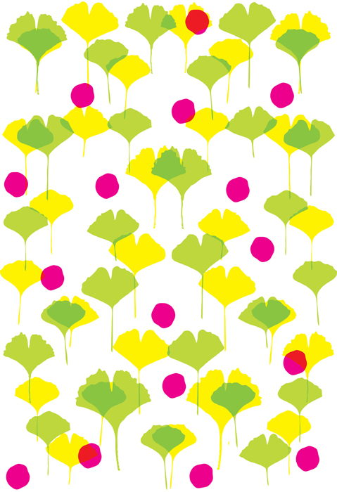
Sketch of upright green & yellow Ginko leaves and some unnaturally colored berries.

Sketch of upright green & yellow Ginko leaves and some unnaturally colored berries.

I’ve been obsessed with the shapes of Ginko leaves for about as long as I can remember, having grown up around them. The tree species was one of a great handful introduced to the United States via my hometown of Philadelphia by avid botanist and horticulturist named William Hamilton in 1784. Other than the admittedly terrible smell of the berries dropped by the female trees, they are simply incredible and beautiful.

Falling Ginko leaves and berries gathering on the ground.

Falling Ginko leaves and berries gathering on the ground.

Last week I started sketching and doodling with some variations on Ginko leaves, berries and textures. Here are a few of those doodles, designs, sketches, what have you, and I also put them all up on both my Flickr account and over in my Spoonflower portfolio as well. Feel free to comment and let me know which you like best, or, conversely, if you think they stink like a Ginko berry.

The further I went, the more it not only felt nice to be sketching, but it felt as though I was working on a textile pattern, perhaps bedding. Which, is extra nice. Sleeping is nice, and I’ve always been very interested in textiles, fabric, bed inens and their design. Odd, maybe. But true nonetheless. Still, it’s clear that I need to learn a good deal more about how to make repeating patterns. Even so, I figured sharing the designs might be fun.

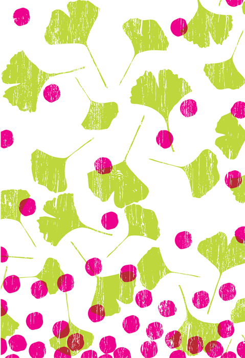
Sort of a free-for-all in color, texture, and overprinty-ness.

Sort of a free-for-all in color, texture, and overprinty-ness.

The Ginko is an incredibily ancient species, with fossils dating back to the Permian period, some 270 million years ago. Amazingly, the Ginko’s loveliness  almost died out, only to persist in such small numbers that the species is listed as a living fossil. There is something very comforting and assuring to me about the lovely fact that something so beautiful could last for so long and throughout so many massive changes.

Yes, I am corny like that.
Doodle time


mice playing ball

mice playing ball

Continuing a “why not?” approach to working on small things in between other commissioned, rock poster, and other assorted “for a reason” sort of work, I’m trying to make quick time for doodles and sketches. I give myself a set amount of time and see what I can come up with. So, they are imperfect and flawed, unfinished. (Hint, look at the tails…)

Today’s is 3 mice, playing ball. Like the do. When you’re not watching. Against an old scanned zipatone background. Could be the basis for a future art print. Who knows!

Doodles

Definitely received a great gift around Hanukkah-Christmas here, (we celebrate it all baby!) in the form of a magical little graphics tablet. The Wacom Bamboo to be more precise. It’s a lower-end piece of awesome that I’ve really been enjoying getting to play with around here this winter. 

My George Washington All The Presidents Men Show print was the first thing that I worked on with it, and since they I’ve been having the itch to draw and sketch things nearly every day, though not every day has ended with me actually getting time to draw with it. Most unfortunately.

So, for no good reason at all, I’ve been thinking about posting up unfinished work, mocks, comps, sketches and the like here on my blog rather than my website where I feel like things ought to be slightly more pro and complete. This is the first installment of Unfinished Work, today I present: Doodles. 2 of ’em!

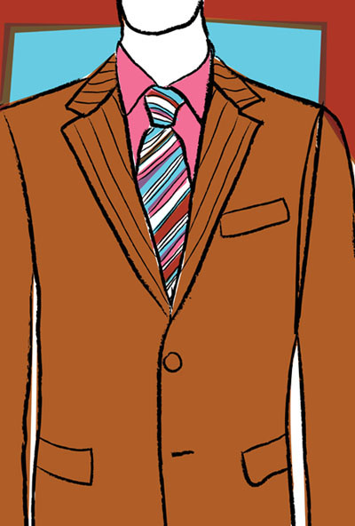
Sometimes I just like parts of things, and this is part of a suit that’s part of  a man, completely unfinished. I did surprise myself with the late 70s /early 80s dry cleaner poster sort of vibe with this one. Unexpected, but that’s sort of the fun of doodling, ain’t it?

Coming from the past to a dry cleaner near you.

WE DO SUITS. Coming from the past to a dry cleaner near you.

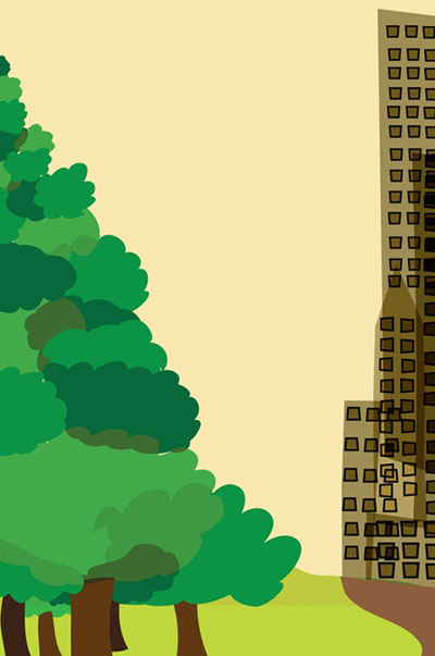
This one below is an unused sketch from an illustration for a book cover design. I like things that are tumbled on top of each other, transparency, patterns, and layers. I wanted nature, here represented as a forest, to be as tall and thick as city overloaded with skyscrapers and buildings, each being imposing in their own way.

Forest, City nary between.

Forest, City, naught in between.