Strawberryluna

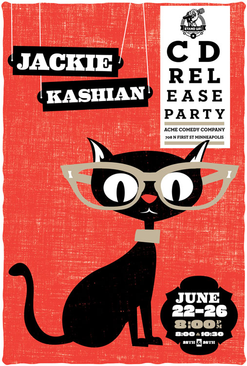
New poster released: Jackie Kashian CD release party poster

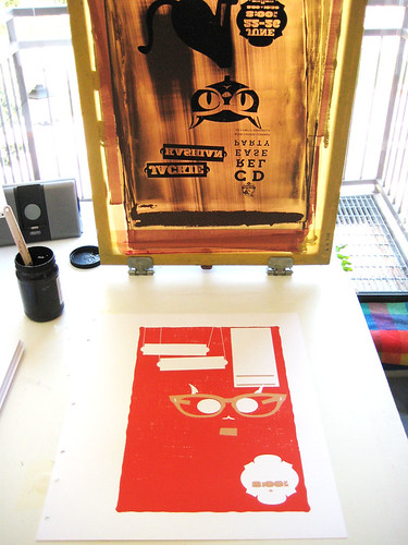
3 color, hand screenprinted poster for Jackie Kashian. (click for more info & to purchase.)

The first in a slew of new releases. Ok. Well, if 3 new releases can be a slew, then call me Seattle.

Jackie Kashian is a danged funny person. No, really, check out her newest CD release It Is Never Going To Be Bread or a live show to prove me wrong. Go ahead, I’ll wait. ‘Cause you won’t be able to prove me wrong. And this poster is for her new CD release party set of shows in Minneapolis, MN on June 22- 26th, 2010 at Acme Comedy Company.

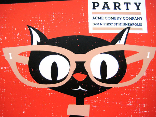
This kitty-kitty at an ophthalmology appointment my all hand screenprinted poster for super rad Jackie Kashian’s CD Release party shows at Acme Comedy Company in Minneapolis. It’s my 3-color, scene of a poster with bright red, sensible beige and black cat black, hand mixed and non-toxic water based screenprinting inks.

Like all of my posters, this limited edition silkscreen poster is signed (by me) and numbered in a limited edition of 80. Size: 16 x22 inches (39.4 cm x 55.9 cm.) Paper: archival Cougar, White 100lb cover weight. This poster was available from Jackie Kashian, at her CD Release party shows and then it will also be available for $20 + shipping & handling from Dan Schlissel at  Stand Up Records, her CD/record label’s website thereafter, contact Stand Up Records:

Website: http://www.standuprecords.com
Email: Dan Schlissel – ismista [ a t ] yahoo dot com

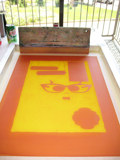
And! Would I forget some process photos? Come on. Below and always more over in my Flickr account.

1st color screen, ready to print. Click to see more process photos.

3rd color about to be printed. Click to see more process photos.

Detail of kitty-face. Click for more process photos.

Rock, Paper, Show realease party & our first book signing @ The Strand, NYC June 4th.

(click for more info about the Rock Paper Show, Flatstock book)

Next week is going to be a huge, big ridiculous week for us at strawberryluna. And, to boot, it’s in the hugest, biggest, most ridiculous city in the country. So, perfect!

Not only are we doing the Renegade Craft Fair in Brooklyn next weekend, and are participating in the Rock For Kids Poster Artist Interview Series, but, we’ve also amazingly been invited to be a part of the Rock  Paper Show Flatstock book release party on Friday evening, June 4th, 2010. Holy smokes. And to boot, it’s made better by the fact that the release party event is at my absolute favorite bookstore, let alone one of my favorite places on the entire planet. The Strand bookstore in Manhattan! Eeeeeeeeeeeeeeee! Can’t even believe it. Any time that I am in NYC, I definitely make sure to get into the hallowed walls and rows of The Strand, but this time, not just as a book nerd, but as an artist in the rock poster movement representing Rock Paper Show & Flatstock.

Someone pinch me, cause I must be dreaming.

The one & only Strand Bookstore at 4th & Broadway in Manhattan.

For the special release party and book signing at The Strand bookstore,  Geoff Peveto, curator of Rock Paper Show, president of the American Poster Institute and partner in The Decoder Ring, an Austin based design collective, will be available to discuss the history of Flatstock and the steady growth of the gig poster community. Featured Rock Paper Show artists Hero, Mat Daly, strawberryluna, Vahalla, and Tara McPheerson will all be available to sign copies, as well as Holly Gressley of Rumors, the book’s designer, and Mike Treff from Soundscreen Design, the book’s publisher and producer.

If you are in the New York City area on Friday evening, June 4th, come check us out and say hello. We’d love to say hi and talk about posters and books. Cause we’re dorks.

Can’t wait to see you again my old friend, The Strand.

Rock Paper Show: New York Release Party info:

Date: Jun 4, 2010
Time: 7:00 PM – 8:00 PM
Location: The Strand — 828 Broadway, New York (4th & Broadway) (212) 473-1452

For more information about the 18 miles of books at this historic and heavenly bookstore, click here.

For more information about the Rock Paper Show Flatstock book, read my blog post here.

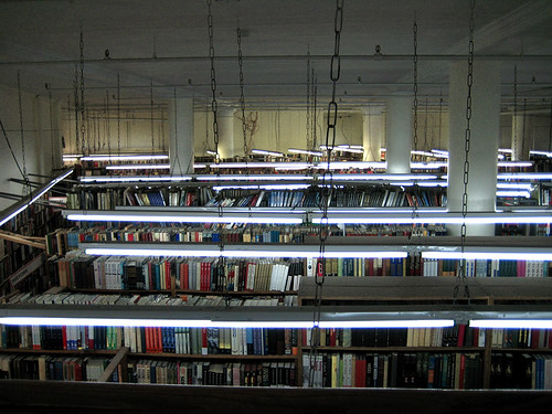
And here is a photo that I took there in my geeky glee on a visit in 2007.


moe. Snoe.down ice sculpture, based on our poster!


Awesome ice sculpture by Ben Rand at Moe.'s Snoe.down 2010, with our poster characters.

So how often does this happen? You design a poster for a band, illustrate characters from animals, and then BOOM! Those characters & your typography come to life in the form of an awesome ice sculpture?

Not too often. But it’s cool as hell, (pardon the pun if you must.)

The above photo was sent to me from the band Moe.’s label, it’s from their Snoe.down Festival, for which we did the official Festival poster (as below). A friend of the band named Ben Rand  is a nationally recognized ice sculpture artist and he did this interactive &  amazing rendering of our poster’s animals and even the typography that we did, with little holes to poke your head into so you could become either the Moose or the Polar Bear character right from  from our poster. Whoa! ::mindblown::

We love it!

So much so that we’re running a little contest, yep. That’s right.

If you went to the 2010 Snoe.down and have a photograph of this ice sculpture with people in it’s super faceholes, send us a copy of your photo and we’ll add it here, and add your name to the Grand Prize drawing and then choose a winner at random and send you a special winner gift of a free Snoe.down poster + super secret & special prizes! Enter in one of two ways:

1. Email us  your photo at strawberryluna { a t } strawberryluna dot com OK OK.

2. Drop a link to your photo in the comments section.

Contest Runs until April 30th, at midnight EST. Good luck!

Our screenprinted Snoe.down 2010 poster (click for more info or to purchase)

Vintage Japanese Industrial Expo posters


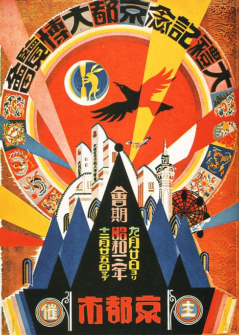
Grand Exposition in Commemoration of the Imperial Coronation – Kyoto, 1928 (click to see more posters & for more information.)

One of my favorite thing about the interwebs is stumbling onto incredible things that I would otherwise never see. Recently I came across the Pink Tentacle’s fantastically beautiful blog post featuring Vintage Japanese posters produced for several different industrial expositions throughout the late 1930’s and into the early 1940’s.

I can’t gush adequately or explain my fascination with propaganda in general, let alone describe the thrill of looking at poster art such as these pieces. They are just stunning. I really love the ways that the themes and imagery run from incredibly dark, heavy serious (much like the word “industry” can conjure such connotations as well) such as the two examples below:
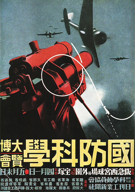
National Defense Science Exposition – Hyogo, 1941 (click to see more posters & for more information.)

The above being especially chilling given that the imagery evokes Japanese-American connection to each other and WWII via Pearl Harbor both in theme and the year of the Japanese National Defense Science  Exposition, 1941.
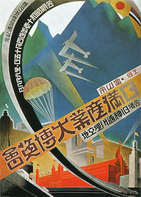
Japan-Manchuria Industrial Exhibition – Toyama, 1936 (click to see more posters & for more information.)

Or, a much ligher aspect of “industry” can be called forth, as in the Tourism Industry Expo poster seen here, where even a Buck might be enticed into playing tourist:
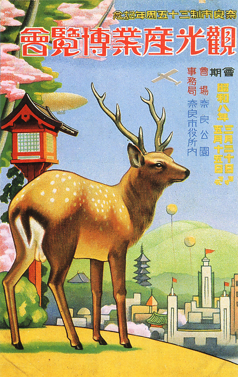
Tourism Industry Exhibition – Nara, 1933 (click to see more posters & for more information.)

And here is an interesting combination of both heavy, militaristic and mythologically represented industries in the form of a Sea & Air Expo:
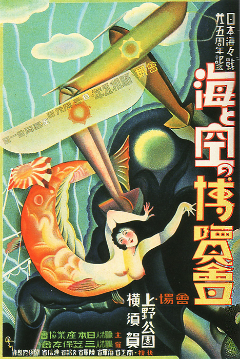
Sea and Air Exhibition – Tokyo, 1930 (click to see more posters & for more information.)

Beyond the heavily represented military-based industries & expositions, of which there seem to have been numberous. Check out the poster  for an exhibition for the Second Sino-Japanese War below, which weirdly had only begun the year previous to this Expo’s poster and continued on for another 7 years:
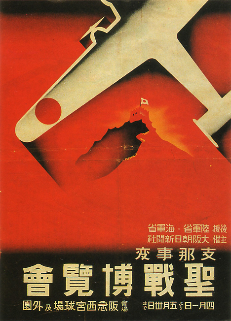
Second Sino-Japanese War Exhibition – Osaka, 1938 (click to see more posters & for more information.)

There were also some really lovely commemorative exposition posters produced for potentially simpler and more peaceful (t0 a degree) endeavors like the new (at that time) Hakata port construction, an international gateway port for centuries in Japan:
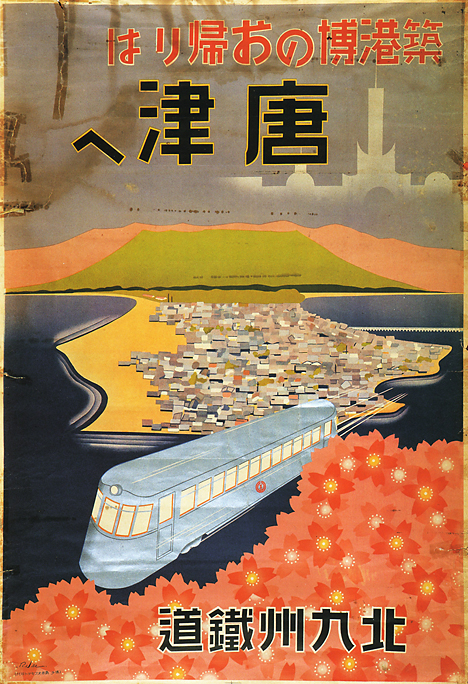
Exposition Commemorating the Construction of Hakata Port – Fukuoka, 1936 (click to see more posters & for more information.)

And then finally, there are some posters whose lettering just really catches my eye. No, I read no Japanese and don’t know a thing of Kanji. Even so, I find the idea of reading letters a pretty amazing feat as they rarely formed the same way twice when rendered by hand or in different fonts and lettering style. When you stop & think about it, it’s practically a miracle that humans read really. Case in point, the lettering examples below are so stylized and almost wrought with objects and illustration or have parts of the illustration itself crossing into the formation of the letterforms, that even I can see how non-traditionally styled they are:
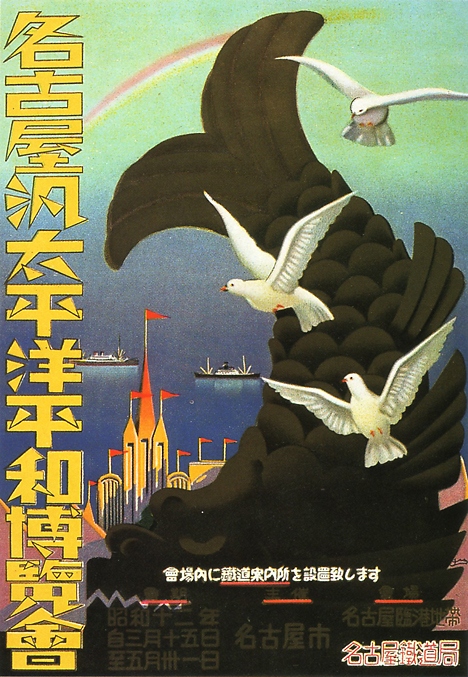
Nagoya Pan-Pacific Peace Exposition – Nagoya, 1937 (click to see more posters & for more information.)
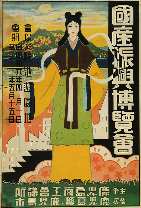
The National Products Progress Exhibition – Kagoshima, 1931 (click to see more posters & for more information.)

Above all else, I am in love with the colors, opacity & transparencies and relationships of shapes in all of these posters. They are just phenomenal. Thanks to Pink Tentacle for posting so many and feeding my eyes. To see more posters, visit the always interesting Pink Tentacle blog here or click on any of the images above. And as always, feel free to comment!
ModCloth’s Blog did a lil feature on me = the poster artist is ::blushing::

My poster for The Dandy Warhols in ModCloth's feature on Gig Posters. (Click to read the piece.)

One of my favorite online clothing and accessories stops (I seriously look over there weekly) is ModCloth. They’re awesome, and they really capture the mix of vintage and modern style that I adore with their selections.

ModCloth also run a blog, and to  my utter flattered and shyly amazed delight, their Lifestyle writer Natalie B. wrote a piece about Gig Posters and featured my work. (!) It’s always so cool as a printmaker and designer to hear about what I and others in our little field think about our work, both in a personal way and just generally. Especially since while many of us posters artists know each other, we tend to be far flung and each working in our own microcosmic corners of the scene.

Anyway, thanks so much Natalie & ModCloth! Below is the article, and you can also click the links in this post (like right HERE) or the image above to read the comments posted on the ModCloth blog post about my Dandy Warhols poster (available by clicking HERE) and other poster artists. Or, be awesome and post some of your own comments about poster art & artists here on my blog too. Don’t be shy 😉

Have you ever seen a flier for your fave indie act and thought, “That is too awesome to throw away”? Then you’re already familiar with the artistic allure of gig posters!

The 60’s spawned some of the first fantastic fliers, but today there are a plethora of places that you can suss out posters of beloved bands, from A Tribe Called Quest to Rachael Yamagata, as well as superior sites which feature vast collections, such as GigPosters.com, and individual artists’ sites, like Todd Slater’s. You could even ask around your city to find local haute handbill-creating talent, such as my favorite Pittsburgh poster gal — StrawberryLuna!

One thing’s for sure — if you’re a lover of music and appreciator of art, you will be captivated by gig posters. Do you have a favorite gig poster artist or fantastic flier that you’d like to share? Tell us about it!