Strawberryluna

Flatstock & SXSW: Here we come Austin, TX!

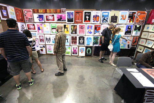
The strawberryluna booth at SXSW Flatstock '09, so come see us this year too. (click for more info)

It’s really Spring! And for us that means the first Flatstock of the year, in Austin, TX during the HUGE music festival SXSW. We’ll be working part of the time and having a blast the other. Come on and see us and close to 100 (that’s right) poster artists from all over the world, showing our work and talking shop with music industry folks, poster art fans and the wide open general public.

We will be debuting new posters and new art prints as well as bringing a slew of Test Prints too, so it’s going to be rad.  Come say hi!

Co-presented by the American Poster Institute (API) and SXSW, Flatstock 24 will display the works of more than 100 artists from across North America and the globe. Posters representing decades of styles, colors and techniques will be on display and for sale as well as additional merchandise. Show up early and be ready to be overwhelmed with amazing posters. (You might want to bring some dough since you won’t want to leave empty handed!) The exhibition is free and open to the public. Check out this year’s exhibiting artists.

Big ol' fisheye view of a Flatstock in Austin, TX, photo Jen Soto. (click for more info)

The best concert posters have always captured both the essence of the music they promoted and the spirit of the time in which they were produced. Flatstock provides an ongoing series of opportunities to see fine poster art in person and to meet the artists who created it.

Making SXSW a true music collector’s paradise, don’t forget to set time aside for the Austin Record Convention in the same exhibit hall and the Texas Guitar Show in the adjacent hall.

The legendary Smokey Robinson will visit Flatstock 24 on Thursday afternoon following his keynote address to sell his limited edition prints designed by Shepard Fairey. Swing by to get your one-of-a-kind poster signed by both Smokey and Shepard.

Screenprinted art print of the legendary Smokey Robinson by Shepard Fairey.

The Important Details!

Schedule & Hours:

  • Thursday. 3/18  HOURS from 1:00pm – 6:00pm (includes Smokey Robinson & Shepard Fairey appearances.)
  • Friday. 3/19 and Saturday. 3/20 HOURS: from 10:00am – 6:00pm

Location:
Austin Convention Center Level 1, Exhibit Hall 1, on the Ground Floor.

About the API: The American Poster Institute is a nonprofit corporation dedicated to serving the poster artist community and promoting the art form. The Flatstock shows provide the American Poster Institute with a way to present poster artists collectively while showcasing the breadth of styles they represent.

About SXSW: The first South by Southwest Music Conference and Festival (SXSW) was held in 1987 in Austin, Texas. Despite the fact that Austin was not a Top 20 major market at the time, the background and character of the city made it a perfect location for the conference. SXSW’s original goal was to create an event that would act as a tool for creative people and the companies they work with to develop their careers, to bring together people from a wide area to meet and share ideas. That continues to be the goal today whether it is music, film or the internet. And Austin continues to be the perfect location.
2 new rock poster releases! St. Vincent & The Wreckids


My 6 color, hand screenprinted poster for St. Vincent's show wi/ Wildbirds & Peacedrums in Pittsburgh on 2/21/10. (Click to purchase or for more info,)

After taking the month of January off from printing to work on some big design projects, as well as recover and regroup from a fantastically hectic summer + fall + winter 2009 work schedule, we were finally able to really focus on getting my new studio up and running for real. Craig found the space in July ’09 and I signed the lease starting in September. It was love at first sight for sure. A blog post covering the set up and construction of my new solo studio (nicknamed Friendship Studio) is definitely due. And now that it’s been one week since completing my first prints and posters there from start to finish? I’m feeling really great about all of the crazy and hard work that we did. But, more on that soon.

For now, I’m really stoked to post these new releases, as they are the first posters out of my Friendship Studio!

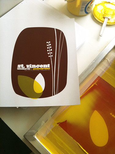
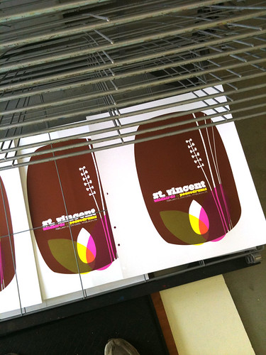
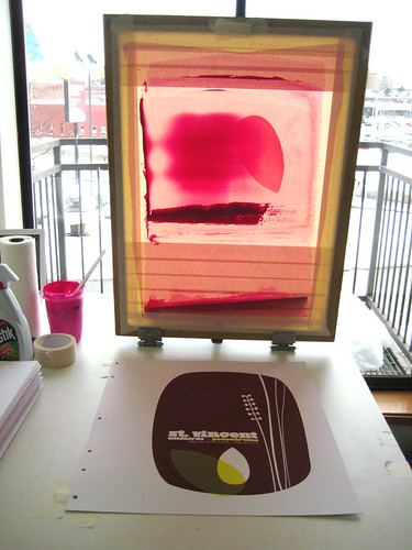
First up is actually the 2nd poster printed at my new space : that being my poster (pictured above) for St. Vincent. I’m really proud to be a part of the tour series organized for this tour, with the super cool (& Swedish!) Wildbirds & Peacedrums. The show was…amazing. Definitely try to catch St. Vincent on tour at some point this year. The above is my 6-color all hand pulled screenprinted poster with bark brown, clear yellow & magenta hand-mixed, non-toxic water based acrylic inks. Super secret magic: Three inks & 3 screens were used to make a total of 6 colors utilizing lots of overprints. (Overprints are when semi-transparent layers of ink combine and overlap to make another color.) I will have a very limited number of this poster for sale, as most of the edition was sold by the band on the night of the show & on tour. Size: 16w x 22h inches. Edition of 125. Paper: acid-free & archival Cougar 100 lb White, cover weight. Click here for more information on my website or to purchase.

And next up is actually the FIRST poster that I printed in my new studio. Is it backwards posting this first poster one second? Yes. But cousin, that’s how I roll.

My 2 color, hand screenprinted poster for The Wreckids CD release show in Pittsburgh on 2/19/10. (Click for more info!)

This poster is special all over. It’s for our dear friends The Wreckids CD release party in Pittsburgh, and you need to know a few things. 1. They are the coolest. 2. They’re awesome. 3. This poster is ONLY and EXCLUSIVELY available through the band. Yep, that’s right. So if you like it? Please help support them and purchase a poster from The Wreckids directly via their Myspace page HERE.

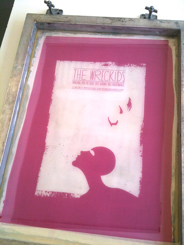
The Wreckids are some sweetie pies in disguise. This poster is for their CD release party for the record “Singing You To Sleep But Giving You Nightmares”, and doesn’t that just about folktale style say it all? The above is my 2-color all hand pulled screenprinted poster with blood red and midnight black hand-mixed, non-toxic water based acrylic inks. Size: 16w x 22h inches. Edition of 25. Paper: acid-free & archival Cougar 100 lb White, cover weight.

And, I finally got to take some more screenprinting process shots, only these offer some sneak peaks into my new print digs. Holy moly! Natural light! Click HERE or on the images below for more information about my hand screenprinting process & to see more photos at my Flickr page.

St. Vincent poster process photos:

2nd color printed of my St. Vincent poster. (Click for more information & photographs.)

My completed hand screenprinted St. Vincent poster, drying on the rack. (Click for more information & photographs.)

St. Vincent poster process, 3rd color flooded in the screen backlit screen. (Click for more information & photographs.)

The Wreckids poster process photos:

The Wreckids CD release poster 1st color screen. (Click for more information & photographs.)

The Wreckids CD release poster, racked & done SON! (Click for more information & photographs.)

My above St. Vincent poster is now available in my webstore here.

Have questions about these posters or screenprinting? Ask away! It might take me awhile, but I always write back.

ModCloth’s Blog did a lil feature on me = the poster artist is ::blushing::

My poster for The Dandy Warhols in ModCloth's feature on Gig Posters. (Click to read the piece.)

One of my favorite online clothing and accessories stops (I seriously look over there weekly) is ModCloth. They’re awesome, and they really capture the mix of vintage and modern style that I adore with their selections.

ModCloth also run a blog, and to  my utter flattered and shyly amazed delight, their Lifestyle writer Natalie B. wrote a piece about Gig Posters and featured my work. (!) It’s always so cool as a printmaker and designer to hear about what I and others in our little field think about our work, both in a personal way and just generally. Especially since while many of us posters artists know each other, we tend to be far flung and each working in our own microcosmic corners of the scene.

Anyway, thanks so much Natalie & ModCloth! Below is the article, and you can also click the links in this post (like right HERE) or the image above to read the comments posted on the ModCloth blog post about my Dandy Warhols poster (available by clicking HERE) and other poster artists. Or, be awesome and post some of your own comments about poster art & artists here on my blog too. Don’t be shy 😉

Have you ever seen a flier for your fave indie act and thought, “That is too awesome to throw away”? Then you’re already familiar with the artistic allure of gig posters!

The 60’s spawned some of the first fantastic fliers, but today there are a plethora of places that you can suss out posters of beloved bands, from A Tribe Called Quest to Rachael Yamagata, as well as superior sites which feature vast collections, such as GigPosters.com, and individual artists’ sites, like Todd Slater’s. You could even ask around your city to find local haute handbill-creating talent, such as my favorite Pittsburgh poster gal — StrawberryLuna!

One thing’s for sure — if you’re a lover of music and appreciator of art, you will be captivated by gig posters. Do you have a favorite gig poster artist or fantastic flier that you’d like to share? Tell us about it!

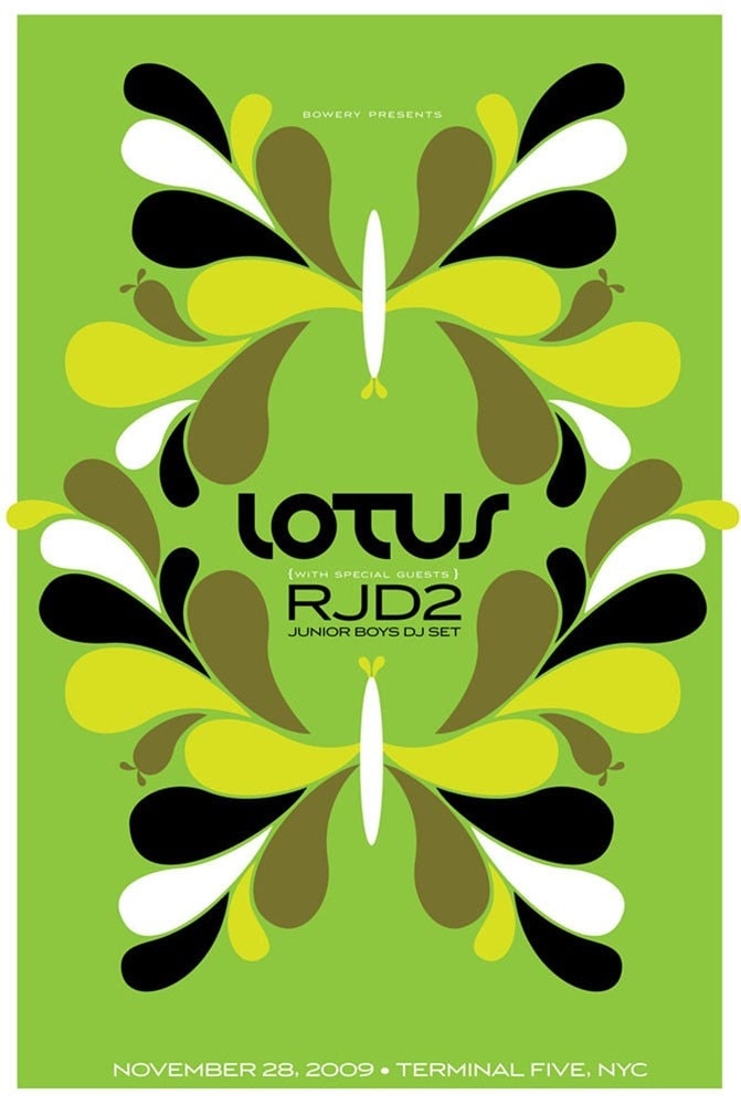
New poster released: Lotus w/ RJD2 & Junior Boys

4-color, hand screenprinted gig poster for Lotus, RJd2 & Junior Boys. (Click for more info or to purchase.)

Float on in.

This is my all hand screenprinted, limted edition poster for Lotus‘ show with RJD2 & Junior Boys DJ Set on Saturday, November 28th, 2009 at Terminal 5 in NYC, NY.

Mega chillout Lotus psych-style. Reverberation, symmetry and green dreams.

This is my 4-color hand screenprinted poster with light-green, yellow, and black hand-mixed, non-toxic water based acrylic inks.I have a very imited number of this poster for sale, as most of the edition was sold by the band on the night of the show. Size: 16w x 22h inches. Edition of 125. Paper: acid-free & archival Cougar 100 lb White, cover weight.

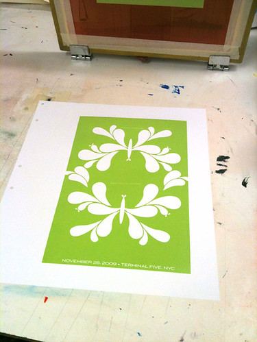
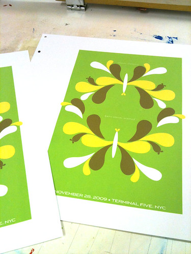
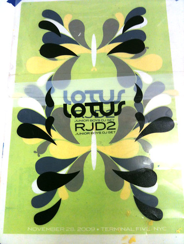
Click the above image to visit my website and for more information or to purchase. And hey! Below are some process photographs of this poster being hand screenprinted at my Flickr site:

1st color printed here.

3rd color printed!

Registering the 4th & final color.

Design For Obama, featuring my Vote! print

Design For Obama book, edited by Spike Lee & Aaron Perry-Zucker w/ an essay by Steven Heller. Click to purchase or for more information.

Hey! Remember the 2008 Presidential Election? The intensity, the rabble-rousing, the way that people were so directly affected to work for their chosen candidates? Well, color me included in that wave. Twice, if you will.

A poster that I designed and printed (my Vote! poster, below, or page 64 in your books!) to help get the word out about Barack Obama in the fall of 2008 was included in a fantastic new book called Design For Obama, published this November by the swell Taschen Books, edited & curated by Spike Lee & Aaron Perry-Zucker with an essay by design steward, Steven Heller.

2-color hand screenprinted poster, Vote! Click for more information or to purchase.

The book is culled from a collection of posters from around the world  that were submitted to and featured on the Design For Obama website before the election of the United States 44th President. Designers interested in the election and wanting to express their take on the entire Obama campaign’s story sent in an amazing series of work. When I became aware of the site, I sent in my own poster, which had already been printed, and in turn I was blown away by the work of hundreds of others who had also been feeling similarly. But don’t take my word for it, here are some of the editors words about their book:

Design/ers for Obama was created when Design Observer essentially asked the question, “how can graphic designers best support Barack Obama?” Our answer ended up extending the question to cover visual communicators at all levels. In addition to supporting Obama for America we jumped at the opportunity to bring the spirit of grassroots style organizing and collaboration to poster design which, to us, meant not only forming communal bonds but sharing the fruits of our efforts equally and in such a way that anyone can enjoy and benefit from (because most of us do not own our own printing presses).

Design for Obama was created by Aaron Perry-Zucker, a senior studying graphic design at the Rhode Island School of Design, and was built by Adam Meyer, a senior studying industrial design at said school. This website was inspired and is supported by Design Observer.

Design for Obama book key info for you:

If you are at all interested in design, art, the intersection of politics, propaganda and the previous, well…I don’t know what you are waiting for, this book is rad. I’m sure that it would make a great gift for the design and political wonks in your life too. Thanks very much to Spike Lee, Aaron Perry-Zucker & Steven Heller for including my poster in your kickass book. Cheers!