Strawberryluna

Design For Obama, featuring my Vote! print

Design For Obama book, edited by Spike Lee & Aaron Perry-Zucker w/ an essay by Steven Heller. Click to purchase or for more information.

Hey! Remember the 2008 Presidential Election? The intensity, the rabble-rousing, the way that people were so directly affected to work for their chosen candidates? Well, color me included in that wave. Twice, if you will.

A poster that I designed and printed (my Vote! poster, below, or page 64 in your books!) to help get the word out about Barack Obama in the fall of 2008 was included in a fantastic new book called Design For Obama, published this November by the swell Taschen Books, edited & curated by Spike Lee & Aaron Perry-Zucker with an essay by design steward, Steven Heller.

2-color hand screenprinted poster, Vote! Click for more information or to purchase.

The book is culled from a collection of posters from around the world  that were submitted to and featured on the Design For Obama website before the election of the United States 44th President. Designers interested in the election and wanting to express their take on the entire Obama campaign’s story sent in an amazing series of work. When I became aware of the site, I sent in my own poster, which had already been printed, and in turn I was blown away by the work of hundreds of others who had also been feeling similarly. But don’t take my word for it, here are some of the editors words about their book:

Design/ers for Obama was created when Design Observer essentially asked the question, “how can graphic designers best support Barack Obama?” Our answer ended up extending the question to cover visual communicators at all levels. In addition to supporting Obama for America we jumped at the opportunity to bring the spirit of grassroots style organizing and collaboration to poster design which, to us, meant not only forming communal bonds but sharing the fruits of our efforts equally and in such a way that anyone can enjoy and benefit from (because most of us do not own our own printing presses).

Design for Obama was created by Aaron Perry-Zucker, a senior studying graphic design at the Rhode Island School of Design, and was built by Adam Meyer, a senior studying industrial design at said school. This website was inspired and is supported by Design Observer.

Design for Obama book key info for you:

If you are at all interested in design, art, the intersection of politics, propaganda and the previous, well…I don’t know what you are waiting for, this book is rad. I’m sure that it would make a great gift for the design and political wonks in your life too. Thanks very much to Spike Lee, Aaron Perry-Zucker & Steven Heller for including my poster in your kickass book. Cheers!

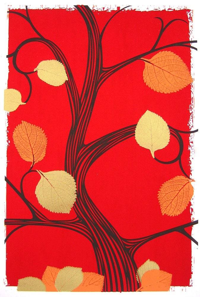
New art print released: Fall 2009, in 2 colorways!

Hand screenprinted, 4-color love letter to fall. Clock for more details or to purchase.

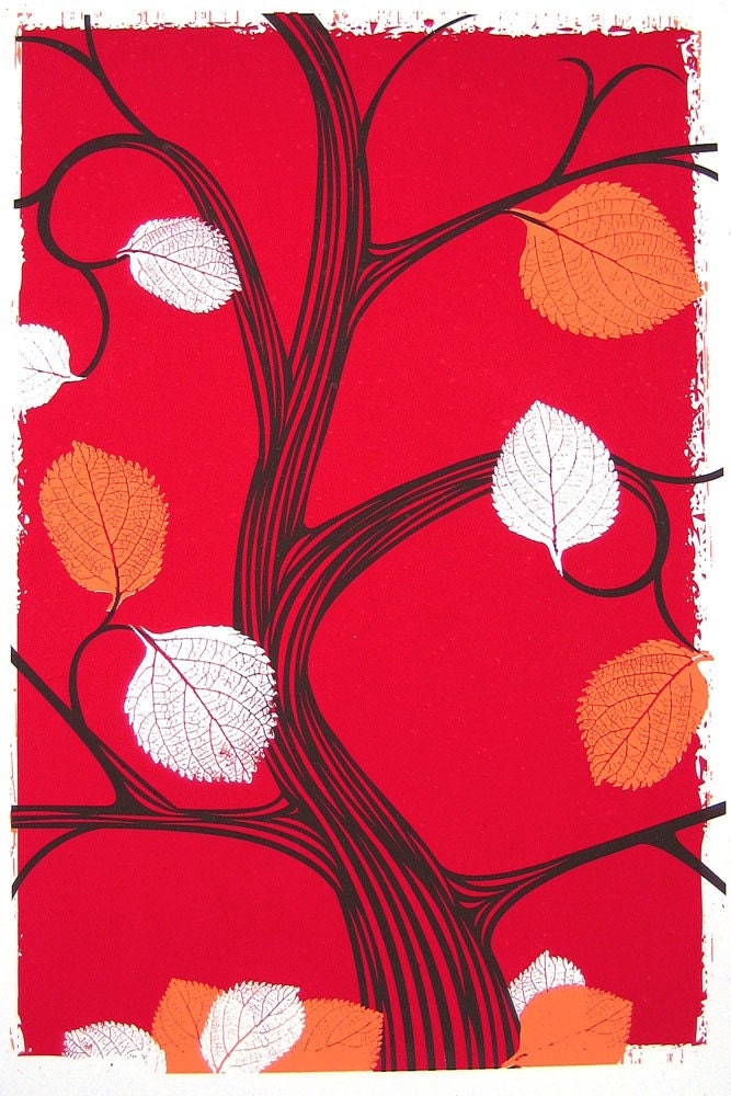
Hand screenprinted, 4-color love letter to fall. Click for more details or to purchase.

Fall & Autumn, my favorite 2 seasons. So, I’m not at all surprised that while in the process of hand printing this art print, I decided to do two colorways of the same print. This is the fourth print in series of seasonal, limited edition prints that I’ve been doing all year. That’s right, they fit the number of seasons, crazy right?!

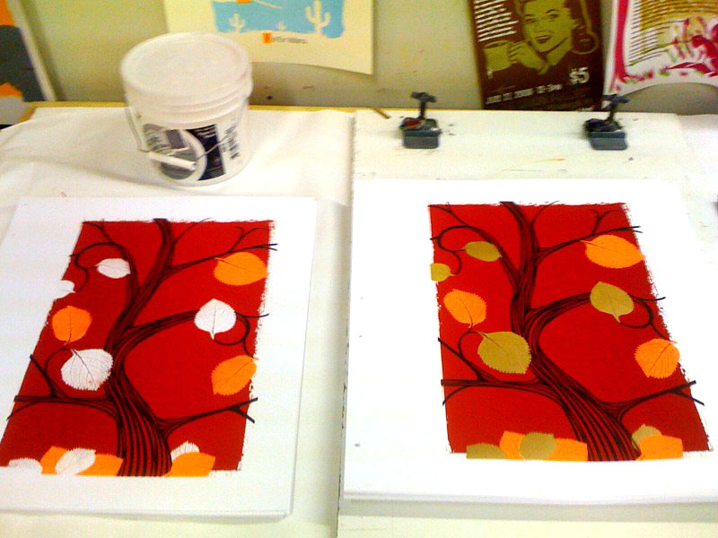
Anyhoo, here you see both colorways, the above as planned 4-color design with metallic gold leaves, (edition of 75) and the below with frosty, nay, ghostly white negative space leaves. A harbinger of things to come (a smaller edition of just 25). The leaf shapes are from leaves that I gathered on a dog walk and scanned in at home a couple of years ago. I love their shape and definition.

Click either image for more details or to purchase, cause those clicks will take you right to my website.

Hand screenprinted, 3-color love letter to fall. Click for more details or to purchase.

Hand screenprinted, 3-color love letter to fall. Click for more details or to purchase.

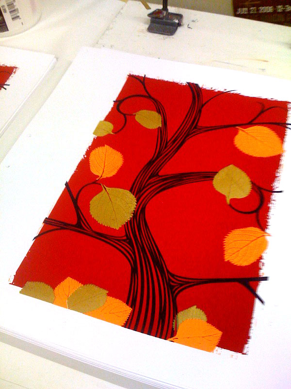
And, here are a few cruddy phone-photographs of the print in progress while on press:

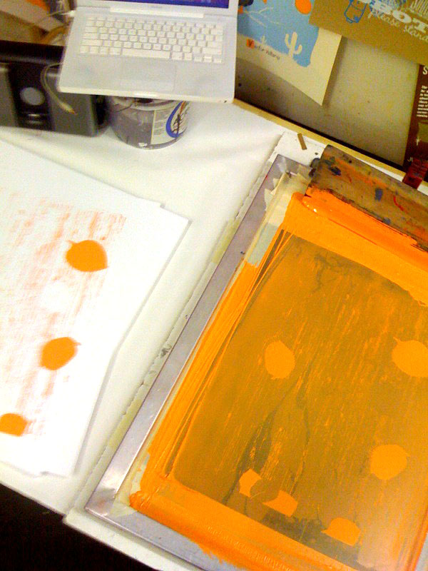
First color, orange, being printed.

First color, orange, being printed.

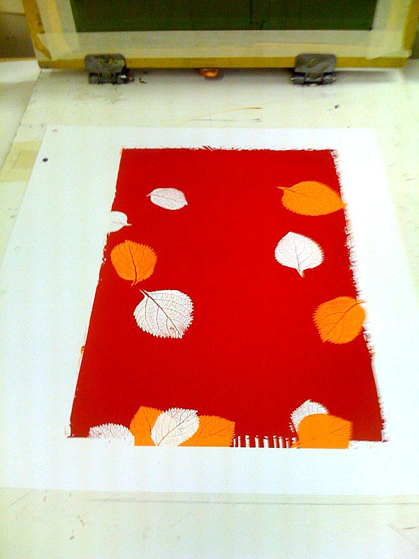
2 colors completed, things are shaping up!

2 colors completed, things are shaping up!

3rd color, the brown of the tree. This is where I started thinking about splitting the edition in two.

3rd color, the brown of the tree. This is where I started thinking about splitting the edition in two.

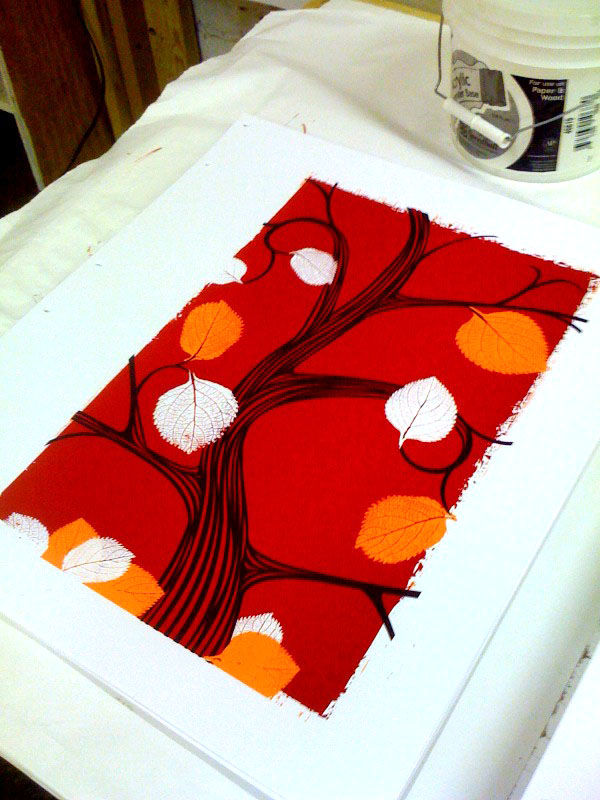
The final 4-color print, on press and all done.

The final 4-color print, on press and all done.

Side by sidesies.

Side by sidesies.

Some new strawberryluna releases!…?…!

Ok, I won’t lie. This summer and well, now early fall have been breakneck speed work, travel to several shows all over the country (Chicago Flatstock, Seattle Flatstock & Chicago Renegade, to name a few), packing orders (with many prints and posters now sold out) and more work for me here at strawberryluna World Wide HQ. So much so that I seem to have forgotten to update my ol’  bloggery here with a few “new” prints and posters. Whoopsie daisy Maisy!

So, without further chit chat, I bring you some “new” releases! Ooooohhhhh…

First up, POSTERS:

Hey, remember Joe Cocker? The man was and IS a rock’n’roll animal to the core. And, he’s been touring pretty much non-stop since the John Belushi SNL skit days, (too young to know what I’m talking about? Weren’t watching SNL as a little kid like I was? Learn here whippersnapper.) Anyway, I had the supreme honor of doing a poster for his show at the Delta Classic Chastain Park Ampitheater in Atlanta, GA.

Offset printed, 4-color, CMYK poster for the incomparable Joe Cocker.

Offset printed, 4-color, CMYK poster for the incomparable Joe Cocker. Click to purchase or for more info!

Next up, is my rainy day homage to one of my favorite US cities: Seattle! For one of the premier rock poster shows, Flatstock, designers & poster artists have free range to produce a poster for each Flatstock and it’s super fun to do. This year for Seattle’s Flatstock, which happens during the Bumbershoot Music Festival, I made a little play on Seattle & Pittsburgh’s similarity – rain. This poster is based on an illustration that I’ve had floating around for about a year and that I really wanted to use, so I added some musical notes and textures and a lil mod-city in the background to finish the layout. Hope that you dig.

Hand screenprinted, 3-color poster for Flatstock Seattle, 2009 & Bumbershoot Music Festival. Click to purchase or for more information!

Hand screenprinted, 3-color poster for Flatstock Seattle, 2009 & Bumbershoot Music Festival. Click to purchase or for more information!

And next, let’s get caught up with strawberryluna Art Prints:

And, just in time for autumn, I’d like to premier my Summer 2009 art print, the next new print in my Seasons series. Oh yeah! On time like a bus on a sleeting Christmas Sunday. And not a hair too soon before my Fall 2009 print is done and ready. Ho, ho ho. Loads of overprints dominate this hand screenprinted breezy summer lovin’ expression.

Hand screenprinted, 7-color art print, Summer 2009. Available at my website now. Click to purchase or for more information.

And lo & behold,  last but not least, my most recent art print, the newest colorway of my super popular Going To See My Baby print, this time is fall-ready orange.  Hence the name, Going To See My Baby Orange. Tricky! I know. Who doesn’t love love?

New colorway of my 5-color, hand screenprinted art print, Going To See My Baby Orange. Available on my website now. Click to purchase or for more information!

New colorway of my 5-color, hand screenprinted art print, Going To See My Baby Orange. Available on my website now. Click to purchase or for more information!

Ok then, I think that we’re all caught up. Bye summer!

New poster released: Magnolia Electric Co.

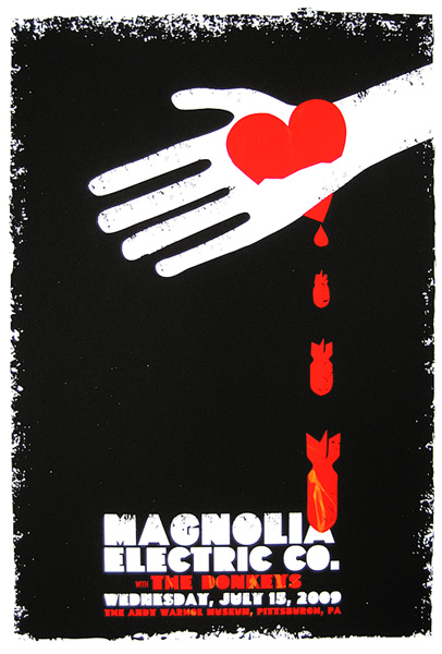
3-color, all hand screenprinted poster for Magnolia Electric Co.'s show on 7/15/09.

3-color, all hand screenprinted poster for Magnolia Electric Co.'s show on 7/15/09.

Heartbreakers. In a great way. That’s what Jason Molina’s band,  Magnolia Electric Co. are, and they’re amazing. I’m pleased as puch to be a part of the summer 2009 Magnolia Electric Co. tour series of posters, (a different limited edition, hand screenprinted poster was produced by artists from all over the country, one poster for each night of the tour) and had such a fun time at the show last night at The Andy Warhol Museum seeing MEC and the super cool Sand Diego band, The Donkeys. Thanks so much again!

Sometimes something beautiful goes wrong, in a beautiful way. KABOOM! This is my all hand screenprinted poster for the heartbreakingly lovely Magnolia Electric Co. It’s a 3-color, print with heart red, alarm-orange and midnight black inks. The orange ink is swirled into the red throughout the bombs and the text so that each print is unique and different. (Just like you Butterfly.) Edition of just 85, so they’ll go quick. Size: 16w x 22h inches. Paper: acid-free & archival Cougar 100 lb White, cover weight.

* This poster is now available on my website here, and also on tour with Magnolia Electric Co. this summer! *

New poster released: The Detroit Cobras!

Don’t mess with these badass ladies. Just, effin’ don’t.

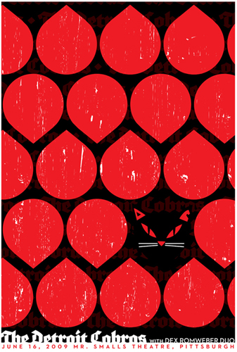
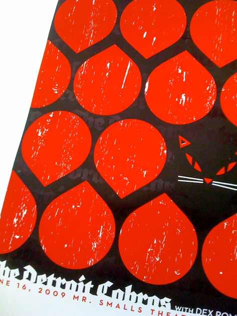
2-color, hand screenprinted poster for The Detroit Cobras.

2-color, hand screenprinted poster for The Detroit Cobras.

Yeah! Kitty kitty. This is my all hand screenprinted poster for the awesome, kickass band The Detroit Cobras‘ show with Dex Romweber Duo on Tuesday, June 16, 2009 at Mr. Small’s Theatre, Pittsburgh, PA. I got to catch the show last night and they were fantastic! Even with singer Rachel Nagy admitting to feeling under the weather, the band was hot and ON. We loved it. Thank you Detroit Cobras! They are still on tour, so do catch a set if they are in your town.

So excited to once again do a poster for some of the most kickass ladies of ROCK, the awesome Detroit Cobras. This feline of a poster is a 2-color, multi-layered print with blood red and midnight black inks. The black is slightly transparent, allowing repetition of awesomeness to show through. See it? Yeah, that’s right pal. Edition of just 80. Size: 16w x 22h inches. Paper: acid-free & archival Cougar 100 lb White, cover weight.

Here are a few process photos of this poster as I printed, with more over on my Flickr page too.

1st color, red, flooded and ready to go.

1st color, red, flooded and ready to go.

First color red, bloody red, flooded in the screen and ready to print (pull). “Flooding” is a lighter pressure pass of ink with a squeegee across the stencil and is the way to get enough ink across the screen to fill the stencil and allow for one perfect print pull with the squeegee.

1st color, red red red, printed, down and done.

1st color, red red red, printed, down and done.

Below is a close up of a freshly printed Detroit Cobras poster showing the red underprinting a slightly transparent black, allowing the red to show through.

Close up and angular to show underprinting.

Close up and angular to show underprinting.

This limited edition Detroit Cobras poster is trimmed, editioned, signed and ready to go. Look for these (and many other awesome posters for the band) on the rest of their tour this summer, and also at my website here.