Strawberryluna

BookBook = lit geek meets computer geek, falls in love.

BookBook's cool MacBook cover, click for details and info.

This might be the coolest thing I’ve seen all year. And yes, I’m aware that 2010 just began. And yes, I’m still saying that this might be one of my favorite things for the entire year, already. Yes. I really might be.

BookBook is a rad Apple MacBook laptop case and cover designed exclusively for MacBooks & MacBook Pros, from Twelve South (whose self-proclaimed motto is: “We’re not just Mac friendly, we’re Mac only.“)

There is little more depressing and somewhat sad to me than a dullard, run-of-the-mill laptop cover. Seriously. Those of us who use (and love) our little super machines develop an emotional affinity with them, so why encase that in something that says: “Do you have those TPS report cover letters?” Yuck. I am currently rocking a custom made laptop by the sadly now defunct Flicka bags, but I’m mega tempted to add one of these awesome cases to my gear.

BookBook disguises your laptop neatly. Click for more details.

The old book cover style evokes a Robinson Crusoe/Great Books Of the Western World vibe to it that I just adore. It reminds me of perusing used bookstores for hours with my mom as a kid, being held in reverie by older, fantastically bound books that had clearly seen better days, yet seemed all the more loved for their reading wear.

From Twelve South’s site, they describe BookBook’s protective qualities of the hardbound book and soft interior:

Protecting your MacBook is a top priority and it’s job one for BookBook. Slip your Mac inside the velvety soft, padded interior. Zip it closed and your baby is nestled between two tough, rigid leather hardback covers for a solid level of impact absorbing protection. The rigid spine serves as crush protection for an additional line of defense. BookBook creates a hardback book structure that safeguards your MacBook like few other cases can. Far better than any floppy neoprene bag ever will. End of story.

Each BookBook case is individually hand crafted, and with design details like the ability to keep your laptop plugged in and charging while in use. If you can be a hardcore laptop user, that’s a really great feature. Clever + good looking + functional = I’m all about it. As to Twelve South‘s claim that the BookBook is a more secure way to disguise or prevent the theft of your laptop, well, I don’t know about that. Especially if this sucker gets as popular as it should, but then again, I’m not one to leave my laptop out in the open in public much anyway. Still, it is a clever disguise.

Like a laptop at Vincent Price Halloween bash, it’s BookBook. Nifty and cool.

Click for more information about BookBook from Twelve South.

Win this print at Design Crush!

Click on this image & enter to win my 6-color all hand screenprinted print: "Going To See My Baby Sage" from the blog Design Crush. It's free to enter. Good luck!

Free stuff is rarely this easy.

This week the fabulous Kelly from the awesome design & style blog Design Crush is featuring one of my prints in one of their fun Win It Giveaways (<–click for details and to enter.) Kelly is not only fun and funny and cool, but as it turns out, she is also from Pittsburgh, and now living in Oklahoma City, OK. Yinz rock!

Design Crush is a really super dupes blog, so definitely check it out while you are there. Kelly posts new things just about every day, and it’s all stellar picks from around the globe.

Starting yesterday Monday, January 25, 2010 (I’m late to post this, I know, I’m sorry! But there is still plenty of time!) and running through this coming Monday, February 1st at 9am CST you can enter into Design Crush’s Win It contest and get your very own, pristine copy of my “Going To See My Baby Sage” print. Just for you! And just for entering.

The entry rules are simple:

1. Head over to Design Crush to enter.

2. Post a comment THERE, as per Design Crush’s instructions, before the deadline and BAM! You are entered and ready for Lady Luck.

One winner will be chosen at random and that winner will receive my print (shown above). Yep! It’s that easy. I will ship directly to the winner, so no worries, the winner will get my usual treats and tricks in their tube too 🙂

There are already 73 entrants, so go on with your bad self. Enter today!

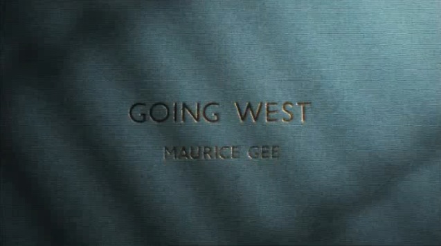
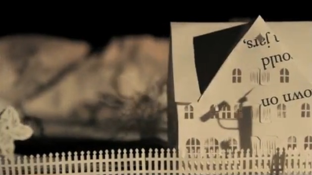
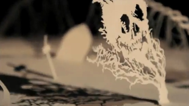
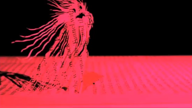
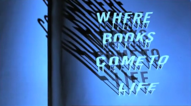
Stunning animation: Maurice Gee’s “Going West”, by Andersen M Studio

(click to watch the animation)

So, here is a really cool animation that I found through my friend Standard Design’s Twitter feed today (Tom Pappalardo) and I’m just unable to stop watching it.

It’s from an outfit called The New Zealand Book Council, a not-for-profit organization that serves to promote more reading, foster a love of  books and promote New Zealand authors. I think it’s just completely riveting, beautiful, eerie, and downright superb.

(click to view the animation)

Paper cutting, stop-motion, and plain old lighting are 10,000x more mysterious and lovely looking than computer-generated work. As a fan of very old Disney (just about only the old stuff) and more so Warner Bros. classic Looney Tunes work, I’ve said it a million times before and I’ll probably be saying it in my grave.

(click to view the animation)

This piece, “Going West” is based on a novel by New Zealand author Maurice Gee. Produced for The New Zealand Book Council by the Andersen M Studio in London (a multi-talented brother & sister duo), the aim is clear as the NZBC’s motto at the end of the animation suggestion, to bring books to life. This piece is a stunner in that attempt.

(click to view the animation)

The NZBC’s mission statement reads: “Bringing books and people together. Like no other human activity reading opens up our imagination. It enables us to understand those around us. It allows us to project the future and reach back into the past. Reading can entertain, challenge and educate. We believe that reading can transform people’s lives.”

Having never heard of Maurice Gee, I can assure all that I will be seeking out his work based purely on the animation done here from his novel “Going West”, so it appears that their aims have worked a bit already. And, I’m now a HUGE fan of the Andersen M Studio, who’s range of work runs from animated pieces (as evidenced here) to commercial photography, music-making, and music packaging to book design. Perhaps I’ve found new heroes.

To learn more about the novel “Going West” click here.

To learn more about Maurice Gee, click here.

To learn more about Andersen M Studio, click here.

To learn more about The New Zealand Book Council & it’s projects, click here.

(click to view the animation)

Criterion Collection films now on Netflix “Watch Instantly”

Click for more info and full list of available films

And it’s pretty darn exciting. The Criterion Collection of films has been an outstanding aggregator & distributor of excellent movie-making from around the world for over 2 decades. Keeping pace with the advent of DVDs and now more online film viewing, Criterion has released 35 movies for Netflix online streaming tool “Watch Instantly”.

For someone like me, who uses the heck out of the “Watch Instantly” feature on Netflix, often while printing or otherwise working the studio, these releases are a welcome addition.

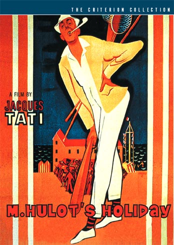
The list of Criterion releases is impressive and not at all a slacking one. The complete list (with links right to their corresponding Netflix pages) is here at the Criterion Cast podcast site (or by clicking the above & below images). It’s also worth noting that Criterion’s standards include routinely fantastic renderings of poster and cover art for their releases as well. Some of my favorites are below.

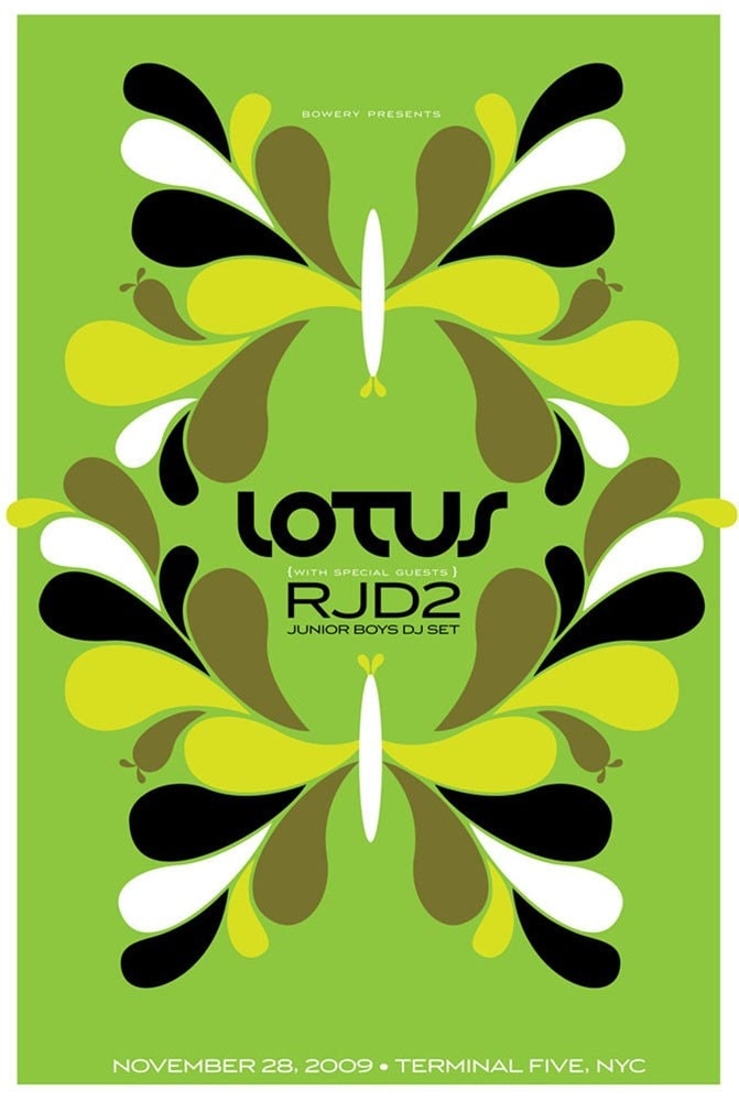
New poster released: Lotus w/ RJD2 & Junior Boys

4-color, hand screenprinted gig poster for Lotus, RJd2 & Junior Boys. (Click for more info or to purchase.)

Float on in.

This is my all hand screenprinted, limted edition poster for Lotus‘ show with RJD2 & Junior Boys DJ Set on Saturday, November 28th, 2009 at Terminal 5 in NYC, NY.

Mega chillout Lotus psych-style. Reverberation, symmetry and green dreams.

This is my 4-color hand screenprinted poster with light-green, yellow, and black hand-mixed, non-toxic water based acrylic inks.I have a very imited number of this poster for sale, as most of the edition was sold by the band on the night of the show. Size: 16w x 22h inches. Edition of 125. Paper: acid-free & archival Cougar 100 lb White, cover weight.

Click the above image to visit my website and for more information or to purchase. And hey! Below are some process photographs of this poster being hand screenprinted at my Flickr site:

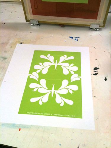
1st color printed here.

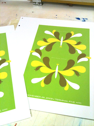
3rd color printed!

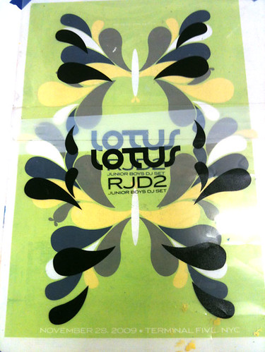
Registering the 4th & final color.

Jackson Pearce’s awesome Sisters Red giveaway!

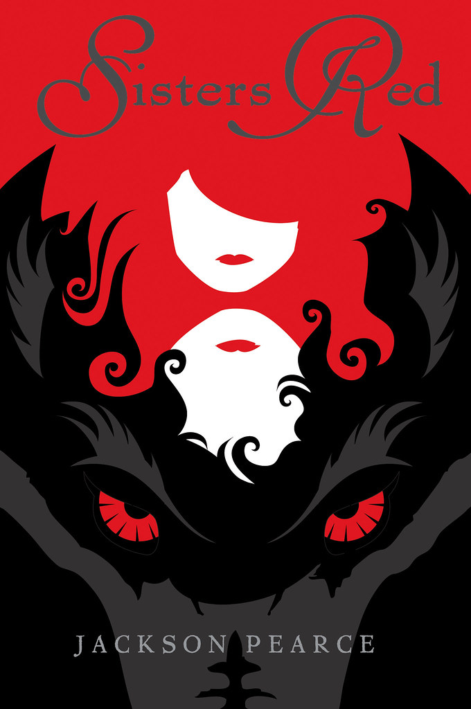
My ARC jacket design for Jackson Pearce's awesome new book "Sisters Red" (Click for more info.)

Ohhhh dang yinz, this is rad. The lovely and funny Jackson Pearce, the author of the above upcoming book Sisters Red (for which I designed the cover, such a fun gig!), is doing an amazing 6 months of giveaways for you.

Here’s the deal, she gives away one ARC copy of Sisters Red plus lots of mystery prizes AND previous prizes per month. How does this work? Well, allow Jackson to tell you herself here on her video blog:

So, what are you waiting for? Enter her giveaway of Sisters Red and pass the word around too!

Book Light for Book nerds

Super cool hanging Book Light by Studio MS. (Click for more info.)

Ooooh neato. I love these very cool and yes, clever Book Lights designed by UK design outfit Studio MS. Am I a nerd? Yes, for design and for bookish things, so naturally these lovely lights are right up my alley.

Neat desk or end table Book Light by Studio MS. (click for more info.)

Constructed of leather (just like an old classic hard-bound classic), paper, PVC and cotton, these lights are really appealing and give off a very warm and soft light. There is something very sweet about these lights that feels like curling up with tea and settling in for a good long read. I love it.

So pretty! Book Lights by Studio MS. (click for more info.)

Visit the UK-based Studio MS for ordering and more information. Happy reading!


New print released: Winter 2009

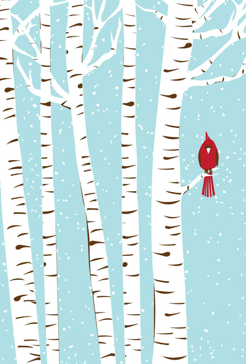
Hand screenprinted, 3-color art print 'Winter 2009', part of my seasons series and available now. Click for more info!

Yay for cold weather, hot cocoas, snow and bar branches! Yes, that’s right, I mean it. I am a true Northerner because I love Winter. And my newest print is a love letter to an under-rated season.

I just love that absolute quietness that falls with snow in a forest. We have Cardinals here in the winter, and their brilliant red always darts out from the winter pattern of color behind them like a signal, reinforcing the magic of a winter’s day.

Hey hey! So you looking at my Winter 2009 art print, a part of my new Seasons series. This is the fifth print in series of seasonal, limited edition prints that I’ll be releasing. Ready? Here’s the mind-blowing part = there will be 4 per year.

Winter 2009 is my 3-color, all hand screenprinted art print with icy blue, bark brown and scarlet red hand mixed and non-toxic water based inks. Edition of 119. Size: 16 x22 inches (39.4 cm x 55.9 cm.) Paper: acid free & archival Cougar, White 100lb cover weight.

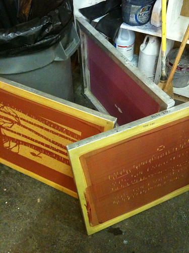
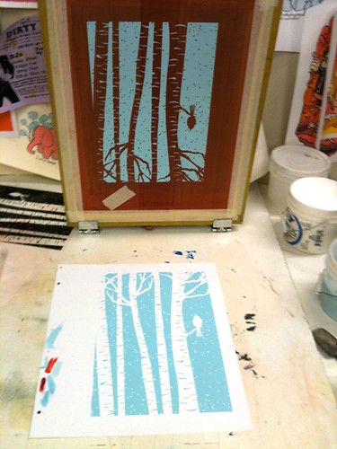
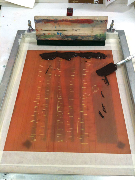
As always, here are a few photos of the print in progress, and you can see more at my Flickr page here too.

3rd & final color ink, ready to go!

Design For Obama, featuring my Vote! print

Design For Obama book, edited by Spike Lee & Aaron Perry-Zucker w/ an essay by Steven Heller. Click to purchase or for more information.

Hey! Remember the 2008 Presidential Election? The intensity, the rabble-rousing, the way that people were so directly affected to work for their chosen candidates? Well, color me included in that wave. Twice, if you will.

A poster that I designed and printed (my Vote! poster, below, or page 64 in your books!) to help get the word out about Barack Obama in the fall of 2008 was included in a fantastic new book called Design For Obama, published this November by the swell Taschen Books, edited & curated by Spike Lee & Aaron Perry-Zucker with an essay by design steward, Steven Heller.

2-color hand screenprinted poster, Vote! Click for more information or to purchase.

The book is culled from a collection of posters from around the world  that were submitted to and featured on the Design For Obama website before the election of the United States 44th President. Designers interested in the election and wanting to express their take on the entire Obama campaign’s story sent in an amazing series of work. When I became aware of the site, I sent in my own poster, which had already been printed, and in turn I was blown away by the work of hundreds of others who had also been feeling similarly. But don’t take my word for it, here are some of the editors words about their book:

Design/ers for Obama was created when Design Observer essentially asked the question, “how can graphic designers best support Barack Obama?” Our answer ended up extending the question to cover visual communicators at all levels. In addition to supporting Obama for America we jumped at the opportunity to bring the spirit of grassroots style organizing and collaboration to poster design which, to us, meant not only forming communal bonds but sharing the fruits of our efforts equally and in such a way that anyone can enjoy and benefit from (because most of us do not own our own printing presses).

Design for Obama was created by Aaron Perry-Zucker, a senior studying graphic design at the Rhode Island School of Design, and was built by Adam Meyer, a senior studying industrial design at said school. This website was inspired and is supported by Design Observer.
Design for Obama book key info for you:

If you are at all interested in design, art, the intersection of politics, propaganda and the previous, well…I don’t know what you are waiting for, this book is rad. I’m sure that it would make a great gift for the design and political wonks in your life too. Thanks very much to Spike Lee, Aaron Perry-Zucker & Steven Heller for including my poster in your kickass book. Cheers!

New poster released: The Spinto Band tour poster!

Hand screenprinted, 4-color tour poster for The Spinto Band,. Click here for more information!

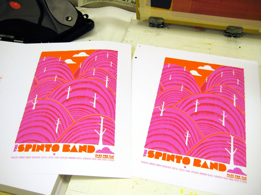
Hey hey! Brand new poster finally released and out there for you! It’s my fall 2009 tour poster for The Spinto Band, with Generationals & Pepi Ginsberg‘s Park The Van “Family Values” fall super tour.

Hooooraay! I love ’em. Bright, fun, hard workin’ and rad. 3 super sounds in one show poster.

This poster is my all hand screenprinted tour poster for some super bands (check them out and see if I’m lying.)

What you see here is a 4-color poster with magenta, sunny orange and black inks. Size: 16w x 22h inches. Edition of 145, though I have only 30 for sale and the rest were sold on tour with the band. Paper: acid-free & archival Cougar 100 lb White, cover weight.

Now available for purchase at my website HERE!

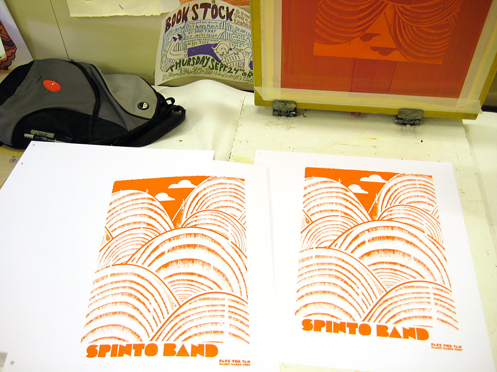
Here’s a couple photos of the print being built:

1st color down

2nd color, transparent magenta, lets the orange under layer show through and it makes a nice ruby red where they overlap.

And, some more good old fashioned hand printing process photos are here on my Flickr page too.

Happy Halloween!

Run!

Yay! It’s Halloween, my fav-o-rite! From current celebrations to Halloween’s incredibly rich pagan history across many cultures and groups of people and religions, the close of summer and the end of the harvest is an incredibly powerful and interesting time. Be a dork like me and learn more here: Halloween Wikipedia entry.

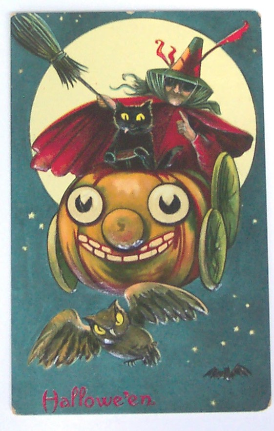
Here are a few vintage Halloween postcards that I’ve found around the web and really love. I’m just fascinated by how many postcards used to be produced to commemorate nearly every day. And as always with vintage postcards, the emotional and stylistic gamut they run is so interesting.

We’ve got your spooky (above) and your portraiture (below)

It's like a family photo.

A little classic witchery, complete with some amazing characters in the cauldron’s smoke.

Witch & kitty & friends.

A touch of what the…???

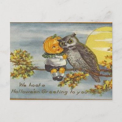
The traditional Pumpkinhead & Owl BFFship.

The traditional Pumpkinhead Baby & Owl BFFship.


Rad pumpkin cart!

Sage advice from the Greeks to us.

A little Victoriana is always found in postcard art:

Vintage Sexy Witch, omg!

Some things never change.

The Man In The Moon likes what he sees.

And this gem that has a lot more in common with Halloween’s ancient thematic roots of the harvest and fear of winter than most of things we see now:

Scary!

So, enjoy!

Happy Halloween scary blast from the past. Poor Pluto!

Sisters Red, by Jackson Pearce & my book cover design

My ARC jacket design for Jackson Pearce's awesome new book "Sisters Red"

Well, OK, this post was a LONG time coming. I’ve been working on a bunch of really fun designs since the summer and haven’t posted many of them here on my blog. In part because for a few, like this one that I am SUPER excited about, I had to wait until everything was final and a full on GO.

And here we go! I got the chance and had the supreme pleasure of working with Little, Brown, & Co. on the book jacket design for Jackson Pearce, and really lovely and talented writer, on her newest book Sisters Red, which will be published to the public in June 2010.  Jackson Pearce describes the plot best, so I won’t bother to butcher it for you:

Scarlett March lives to hunt the Fenris– the werewolves that took her eye when she was defending her sister Rosie from a brutal attack. Armed with a razor-sharp hatchet and blood-red cloak, Scarlett is an expert at luring and slaying the wolves. She’s determined to protect other young girls from a grisly death, and her raging heart will not rest until every single wolf is dead.

Rosie March once felt her bond with her sister was unbreakable. Owing Scarlett her life, Rosie hunts fiercely alongside her. Now Rosie dreams of a life beyond the wolves and finds herself drawn to Silas, a young woodsman who is deadly with an ax– but loving him means betraying her sister and has the potential to destroy all they’ve worked for.

A little publishing world insider information: What you see above is the final design for the ARC Cover, aka the Advanced Reading Copy, this is a near-final copy of a book that is sent out for reviews, but that may still have final revisions before the actual publication date. ARC covers are typically not the complete or final design, though sometimes they are very close. (As we think in this case…don’t you?)

Naturally having read a manuscript copy of Jackson’s book Sisters Red I can tell you that it’s super awesome and that you should certainly find a copy next year when it’s out (I’ll post a reminder, don’t worry) because it’s quite good. But, in the meantime Jackson is hosting a giveaway of a few of her personal copies of her ARCs on her website here with a super fun video of “Things You Can’t Have” (including her adorable puppy and some of my prints eeeee!) and then happily “Things You CAN Have” too, so check it out.

The main problem that this designed needed to solve was to be eye-catching and to be something that would attract you from across a room, say at a bookstore. Fun challenge for sure. So, I hope that you like it.

Double thanks to Tracy & Little, Brown & Co. and Jackson!

Book publishers, see anything you like 🙂 Feel free to contact us for book jacket design, we love doing them!

New art print released: Fall 2009, in 2 colorways!

Hand screenprinted, 4-color love letter to fall. Clock for more details or to purchase.

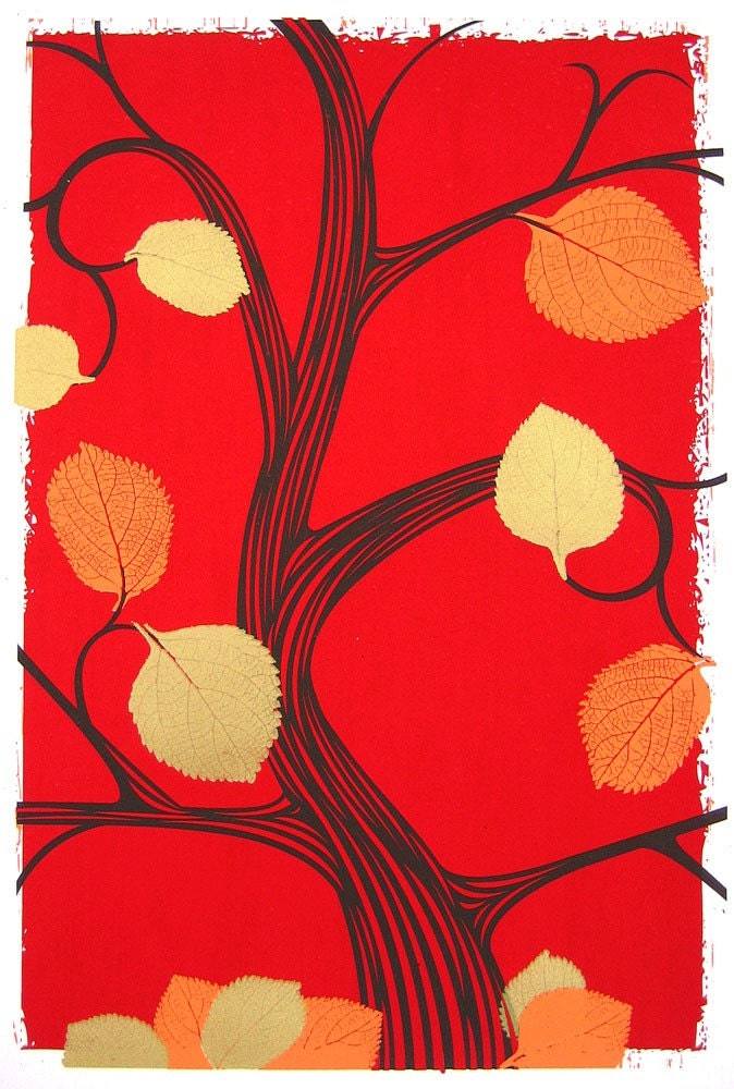
Hand screenprinted, 4-color love letter to fall. Click for more details or to purchase.

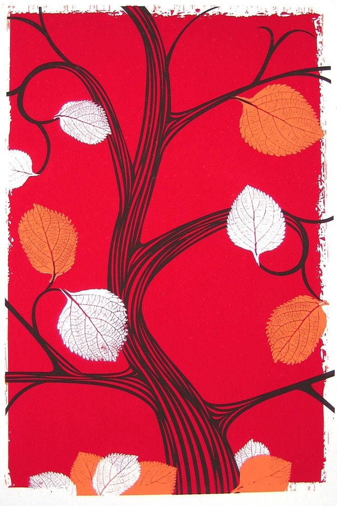
Fall & Autumn, my favorite 2 seasons. So, I’m not at all surprised that while in the process of hand printing this art print, I decided to do two colorways of the same print. This is the fourth print in series of seasonal, limited edition prints that I’ve been doing all year. That’s right, they fit the number of seasons, crazy right?!

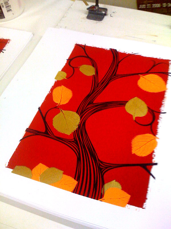
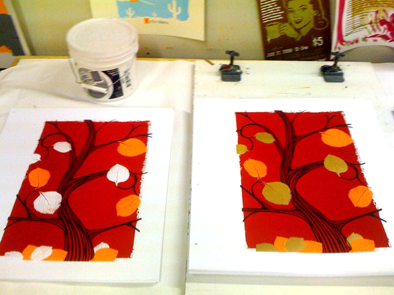
Anyhoo, here you see both colorways, the above as planned 4-color design with metallic gold leaves, (edition of 75) and the below with frosty, nay, ghostly white negative space leaves. A harbinger of things to come (a smaller edition of just 25). The leaf shapes are from leaves that I gathered on a dog walk and scanned in at home a couple of years ago. I love their shape and definition.

Click either image for more details or to purchase, cause those clicks will take you right to my website.

Hand screenprinted, 3-color love letter to fall. Click for more details or to purchase.

Hand screenprinted, 3-color love letter to fall. Click for more details or to purchase.

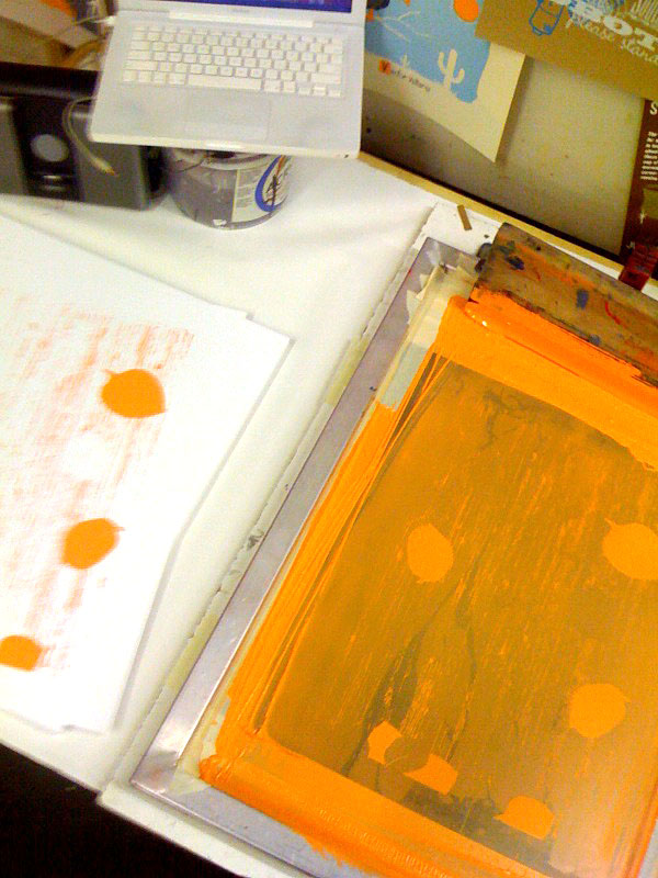
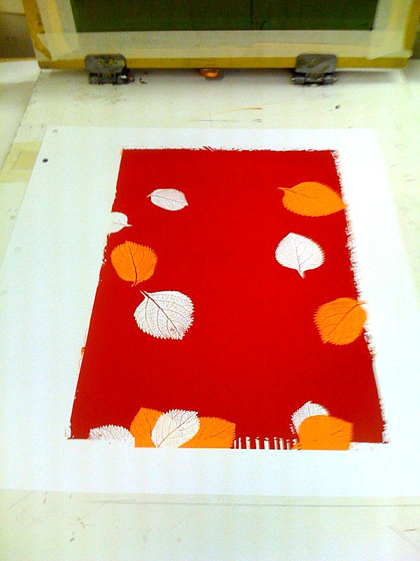
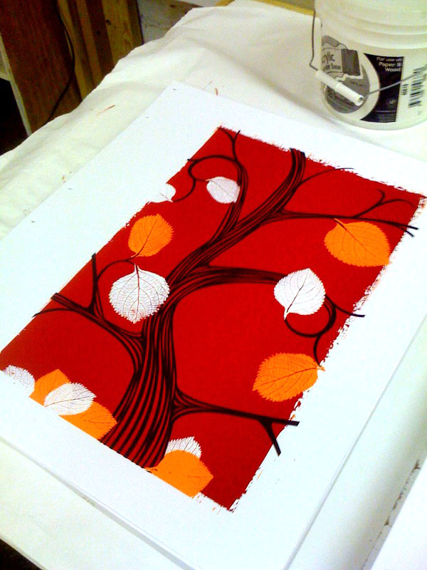
And, here are a few cruddy phone-photographs of the print in progress while on press:

First color, orange, being printed.

First color, orange, being printed.

2 colors completed, things are shaping up!

2 colors completed, things are shaping up!

3rd color, the brown of the tree. This is where I started thinking about splitting the edition in two.

3rd color, the brown of the tree. This is where I started thinking about splitting the edition in two.

The final 4-color print, on press and all done.

The final 4-color print, on press and all done.

Side by sidesies.

Side by sidesies.

New Interview, by El Jefe for The Vinyl District, Screening Process

Well, color me blushing.

The super talented and extremely cool Jeffery Everett of El Jefe Design, in Washington DC asked me to do an interview for his series called The Screening Process on a blog that he regularly contributes to called The Vinyl District. (Please check out TVD it’s amazing! For instance, I just found a great post with some old David Sylvan / Japan mp3s. And here, I thought that I was the only one who liked Japan then, let alone now.)

Jefferey’s questions were really great, and my responses were kinda…well, me. Ha! Anyway, if you are interested in the behind the scenes sort of process, thought, and mindsweat that goes into design and hand screenprinting posters and prints, SHA-BAM! This interview will wet your whistle, cowboy.

The interview is posted here for you and definitely check out El Jefe Design’s work, he’s quite the fella. And, he will also be appearing at the Crafty Bastards Arts & Crafts Fair on October 3rd, 2009. Can’t wait to hang out and look at his work in person.

Some new strawberryluna releases!…?…!

Ok, I won’t lie. This summer and well, now early fall have been breakneck speed work, travel to several shows all over the country (Chicago Flatstock, Seattle Flatstock & Chicago Renegade, to name a few), packing orders (with many prints and posters now sold out) and more work for me here at strawberryluna World Wide HQ. So much so that I seem to have forgotten to update my ol’  bloggery here with a few “new” prints and posters. Whoopsie daisy Maisy!

So, without further chit chat, I bring you some “new” releases! Ooooohhhhh…

First up, POSTERS:

Hey, remember Joe Cocker? The man was and IS a rock’n’roll animal to the core. And, he’s been touring pretty much non-stop since the John Belushi SNL skit days, (too young to know what I’m talking about? Weren’t watching SNL as a little kid like I was? Learn here whippersnapper.) Anyway, I had the supreme honor of doing a poster for his show at the Delta Classic Chastain Park Ampitheater in Atlanta, GA.

Offset printed, 4-color, CMYK poster for the incomparable Joe Cocker.

Offset printed, 4-color, CMYK poster for the incomparable Joe Cocker. Click to purchase or for more info!

Next up, is my rainy day homage to one of my favorite US cities: Seattle! For one of the premier rock poster shows, Flatstock, designers & poster artists have free range to produce a poster for each Flatstock and it’s super fun to do. This year for Seattle’s Flatstock, which happens during the Bumbershoot Music Festival, I made a little play on Seattle & Pittsburgh’s similarity – rain. This poster is based on an illustration that I’ve had floating around for about a year and that I really wanted to use, so I added some musical notes and textures and a lil mod-city in the background to finish the layout. Hope that you dig.

Hand screenprinted, 3-color poster for Flatstock Seattle, 2009 & Bumbershoot Music Festival. Click to purchase or for more information!

Hand screenprinted, 3-color poster for Flatstock Seattle, 2009 & Bumbershoot Music Festival. Click to purchase or for more information!

And next, let’s get caught up with strawberryluna Art Prints:

And, just in time for autumn, I’d like to premier my Summer 2009 art print, the next new print in my Seasons series. Oh yeah! On time like a bus on a sleeting Christmas Sunday. And not a hair too soon before my Fall 2009 print is done and ready. Ho, ho ho. Loads of overprints dominate this hand screenprinted breezy summer lovin’ expression.

Hand screenprinted, 7-color art print, Summer 2009. Available at my website now. Click to purchase or for more information.

And lo & behold,  last but not least, my most recent art print, the newest colorway of my super popular Going To See My Baby print, this time is fall-ready orange.  Hence the name, Going To See My Baby Orange. Tricky! I know. Who doesn’t love love?

New colorway of my 5-color, hand screenprinted art print, Going To See My Baby Orange. Available on my website now. Click to purchase or for more information!

New colorway of my 5-color, hand screenprinted art print, Going To See My Baby Orange. Available on my website now. Click to purchase or for more information!

Ok then, I think that we’re all caught up. Bye summer!