Strawberryluna

New art prints released: Naptime & I Love My Books!

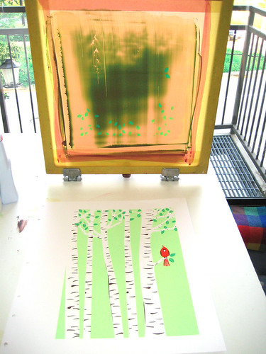
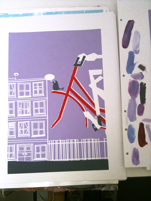
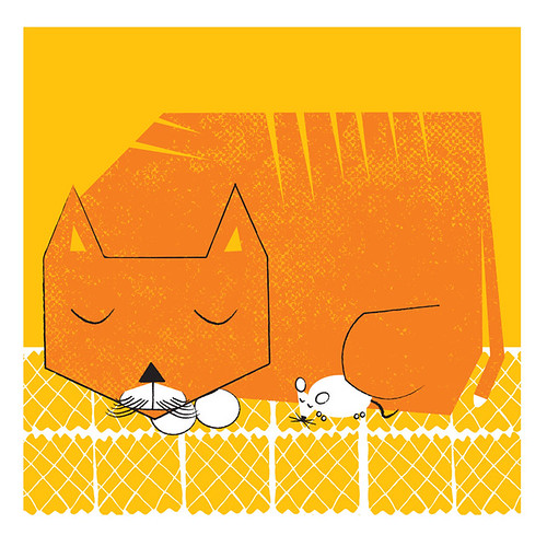
New 3 color hand silkscreened art print, "Naptime". (click to purchase or for more info.)

For a while now I’ve been wanting to try a new layout, a square one, and one that would fit right into an LP record frame. Well, that time has come.

It’s “Naptime”. We all get sleepy snuggly sometimes, and even natural-born enemies can be the best of friends. You just gotta let your softer side rule.

“Naptime” is the first print in that size and layout. From an illustration that I did a few weeks ago while hanging out on a lazy Sunday afternoon off, while we were totally being summer tv heads. Probably we were watching some cooking shows, or Holmes On Holmes (my new obsession) or such like television.

Anyhoo, I also decided rather than waste paper or have a weirdly shaped cast off, as the 12×12 inch size is smaller than my normal print & paper size, that I would run a smaller print at the same, 2-up. (2-up means printing 2 or more designs on the same page at the same time, cutting them down and apart after printing.) So, I did an ode to books for the secondary smaller design, as below, called “I Love My Books”. ‘Cause I do.

New 3-color (with overprints) mini art print, "I Love My Books", hand screenprinted. (click ot purchase or for more info.)

All sunny and warm, just like this summer. Both “Naptime” and  “I Love My Books” prints are now available at my website here and also in my Etsy shop here. And, for some process photographs of the hand screenprinting process, take a look below. Click on any image below to see more & get more info at my Flickr account too.

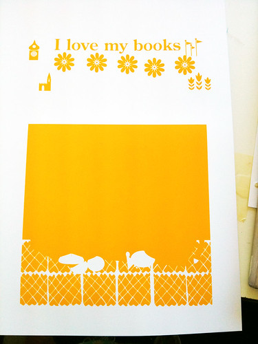
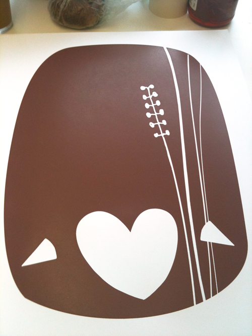
1st color, printed. (click to see a larger image, more images or for more info.)

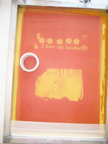
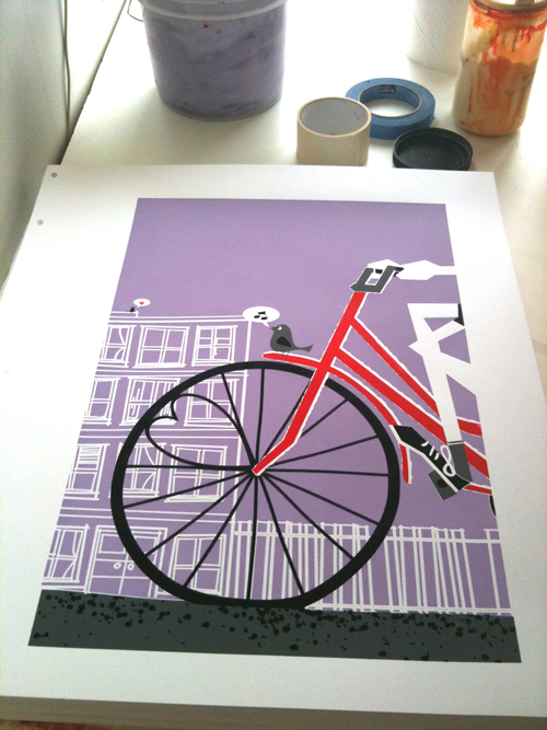
2nd color screen taping & prep. (click to see a larger image, more images or for more info.)

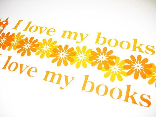
Closeup of "I Love My Books" 3-color hand silkscreened art print.

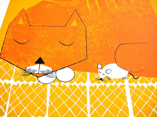
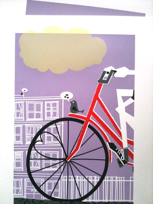
Closeup of "Naptime", 3 color hand screenprinted art print.

New poster released: We Were Promised Jetpacks (!)

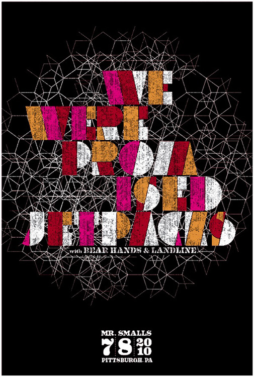
4 color, (3 screens) hand silkscreen printed poster for We Were Promised Jetpacks. (click for more info & to purchase.)

And here we go! The 3rd & final release for today, phew!

And ROMG! Do you love this band like we do? ‘Cause we sure do. If it’s not Scottish, it’s crap. And that’s pretty true as pertains to music.

This is my hand silkscreen printed poster for the super We We Promised Jetpacks‘ show with Bear Hands & Landline on July 8, 2010 at Mr Smalls, Pittsburgh, PA. The poster was sold at the show, and I have just a small number for sale, so they will go quick!

4 color (3 screens) all hand screenprinted poster with dark yellow, magenta & space black non toxic screenprinting inks and in produced in a limited edition, this poster is signed (by me, strawberryluna) and numbered. Overprint magical secret = Where you see red, the yellow inks were overprinted by transparent magenta to make a hot red. Yep! Edition: 105. Size: 16 x22 inches (39.4 cm x 55.9 cm.) Paper: archival Cougar, White 100lb cover weight. I design & hand screenprint my prints and posters. If you have any questions, just let me know.

This poster was super fun to print, and it’s so awesome that We We Promised Jetpacks totally brang it for the show too. See them live DARN IT.

We Were Promised Jetpacks poster is now available from my website here.

Process photos below for you from my Flickr account, with plenty more photos there too. Click away!

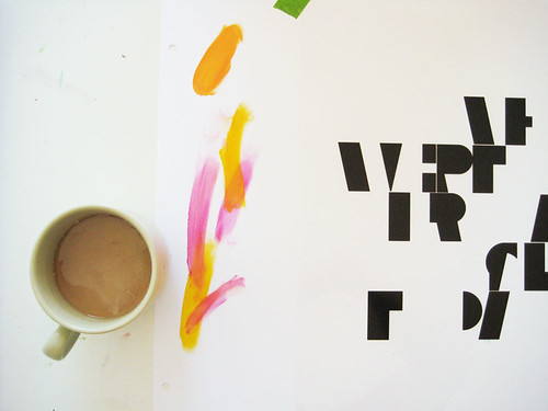
Coffee and starting to do color tests and registering for We Were Promised Jetpacks. Click for more process photos and info.

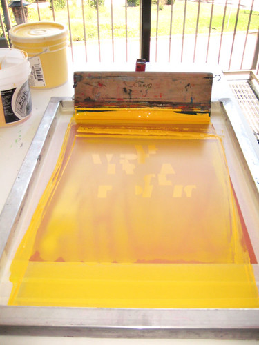
1st color ink flooded in the screen, ready to print. Click for more process photos & info.

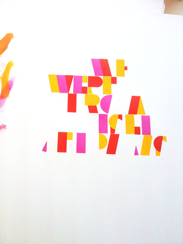
2nd color, with overprints making red showing, of my 4 color hand screenprinted poster for We Were Promised Jetpacks. (click for more process photos or info.)

Close up of the textures! 4 color, hand screenprinted poster for We Were Promised Jetpacks. Click for more process photos & info.


New poster released: The New Pornographers in NYC!

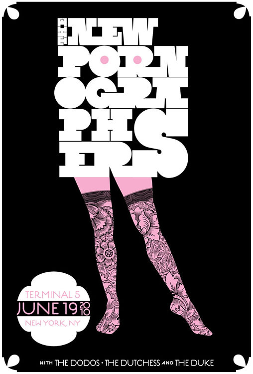
Hot-cha! 2-color, all hand screenprinted poster for The New Pornographers' show at Terminal 5 in NYC. (click to purchase or for more info)

I’m a little late to post this, my apologies. Summer brain seems to have taken a good hold of me lately when I’m not working.

Anyhoo, here is our latest poster, and we’re pretty danged excited about this one. We’re a part of The New Pornographers tour poster series for their Summer 2010 tour. A tour series is where a band commissions a different poster for each stop on their tour, and it’s always a treat to see the variety of work, as well as it being a super way for fans to connect to that night’s show.

Details:

Hand screenprinted poster for The New Pornographers with The Dodos, and The Dutchess & The Duke’s show on June 19, 2010 at Terminal 5, New York, NY.

One of our long time favorites, The New Pornographers. Huzzaah! We are really excited to be a part of their summer 2010 tour poster series, where the band has a different gig poster artist do a different poster design for each stop on the tour. Plus the neato line up of bands on this tour, and, being that we’re super down with NYC, winner winner! So hey chum, you are looking at my all hand screenprinted poster for this awesome line up of bands. It’s my 2-color, suggestive and rockin’ all hand screenprinted poster with tender pink and midnight black, hand mixed and non-toxic water based screenprinting inks.
Like all of my posters, this limited edition silkscreen poster is signed (by me) and numbered in a limited edition of 240. Size: 16 x22 inches (39.4 cm x 55.9 cm.) Paper: archival Cougar, White 100lb cover weight.
This poster was sold by the band at the show on June 19th at Terminal 5, and it’s now available on my website here too for $20+ shipping. Got questions? Email me! allison [ a t  ] strawberryluna dot com.
Here are a few process photos that I took while printing too, and there are more in my Flickr account here as well. Or, just click on any image below.

A dozen types of pink to find The One.

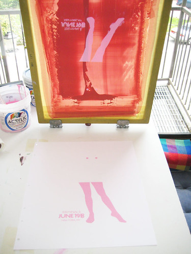
1st color printed, looking all abstract.

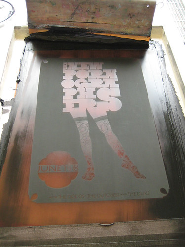
2nd color (black) screen after a print pull.

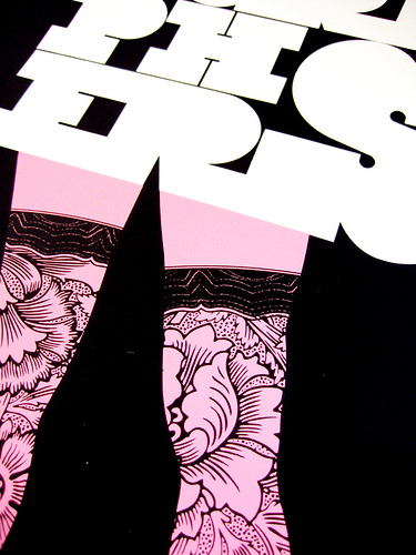
Close up & detail photo of the lace of her stockings. (click for more info)

New poster released: Beach House

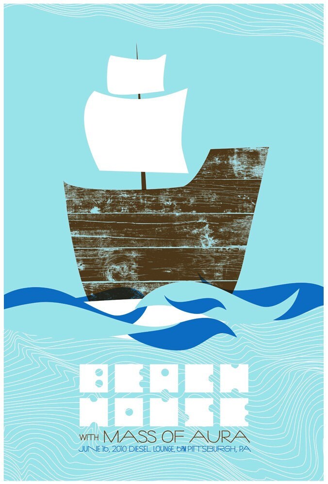
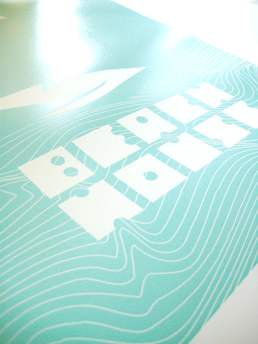
4 color, all hand screenprinted poster for Beach House (click for more info or to purchase)

We love Beach House, so so much. Semi ethereal, almost otherworldly-ghostly quality that I (of course) really dig, You’d have to close your ears hard not to notice that their lyrics often involve the sea, salt water, and drifting oceanic themes, like a ghost-ship, the kind that are found abandoned at sea carrying on alone.

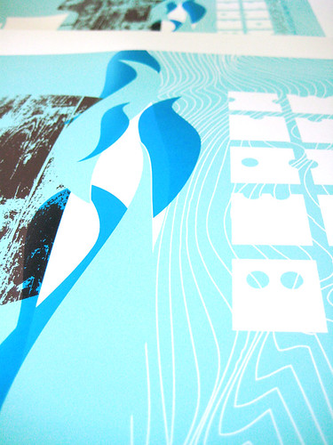
And therefore, you are looking at my all hand screenprinted poster for the incomparable Beach House. It’s my 4-color, all hand screenprinted poster with ocean-sky blue, deep sea blue, and timber brown hand mixed and non-toxic water based screenprinting inks. The dark ocean blue overprints the timber brown of the ship to make a 4th color, overprint magic!

These posters were sold at the show. Didn’t get one there? Lucky you, I have a few copies left for sale. This limited edition poster is signed (by me) and numbered. Edition of 98. Size: 16 x22 inches (39.4 cm x 55.9 cm.) Paper: archival Cougar, White 100lb cover weight.

Now available at my website here.

And, here are some process photos for you below, also more are on my Flickr account too.

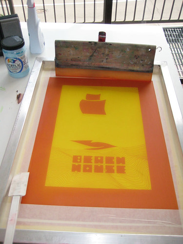
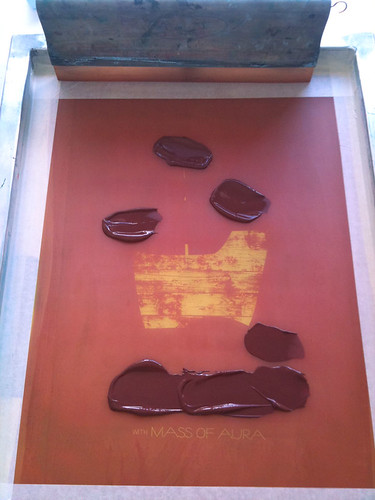
1st color screen, ready to start printing. (click for more info)

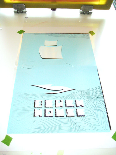
1st color being registered. (click for more info)

1st color for Beach House poster, detail. (click for more info)

2nd color ink in the screen, ready to start printing. (click for more info)

Registering the 3rd & final color to be printed. (click for more info)

Overprinty goodness in the waves over the ship on my Beach House poster. (click for more info)

Renegade Craft Fair Brooklyn reminder! Come say hellos!

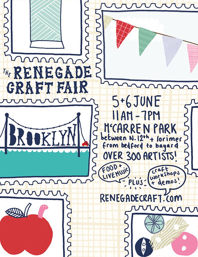
Just a quick reminder that I will be in Brooklyn, NY this weekend at the fabulous Renegade Craft Fair, and so looking forward to it!

Renegade Craft Fair is one of the premiere independent DIY showcases of all things art, craft, and handmade. Renegade Craft Fairs are held in several cities across the US every year – including Brooklyn, Chicago, San Francisco, Los Angeles & Austin.  The fair is known for being one of the first events of its kind, and for having the top-notch indie-craft artists and designers who travel from all over the map to participate. Renegade got its start in Chicago’s Wicker Park in the fall of 2003, and has spread like wildfire ever since.

With over 300 artists coming together in historic McCarren Park in Brooklyn to sell our handmade work, this year’s Renegade Craft promises to be as amazing as ever, if not more so. There will live music and live craft demonstrations, as well as an hourly raffle of goodies at theEtsy booth too. AND!  Renegade Craft Fair is wide open to the public and 100 % FREE to attend too.

I’m going to have tons of new prints and posters and test prints, as well as lots of other new goodies too. So come say hi! We love love love meeting new friends at shows!

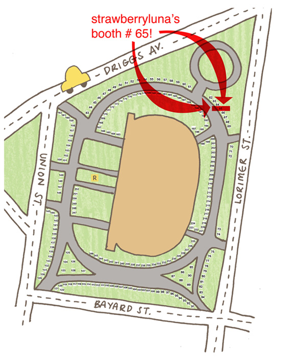
Check it: strawberryluna, Booth #65. Write it down ;) Click the below to see a larger map image.

Click the above to see a larger version of this map!

The Details:

What: Renegade Craft Fair, Brooklyn

When: June 5th & 6th, 2010

Where: McCarren Park, in the Williamsburg neighborhood in Brooklyn, NY at Driggs Ave + Lorimer St. + Bayard St. + Union St. (as above)

Cost: FREE!!!

Why: For cream of the crop handmade awesomeness.

And here is the photo of our little pup Sprite, helping me pack up some of those new Test Prints I mentioned, featured on the Renegade Blog:

Sprite: The best 17lb assistant ever 😉


Steeltown Stock, poster art show opens this Friday, June 4th!

There’s a new poster show in town, and it’s going to be rad. I’m thrilled to have been asked by the excellent Pittsburgh arts blog Steeltown Anthem’s Mundania Horvath to be in Steeltown Stock, a big fat cool showcase of local printmakers and poster artists.

Steeltown Stock opens this Friday, June 4th at the <C> SPACE COLLECTIVE on Penn Avenue (4823 Penn Avenue, 15224) with an opening reception. Posters and prints on display as well as other prints will be available for purchase, many directly from the artists themselves. How cool is that?! (Unfortunately, I won’t be able to be there for the opening reception since I will be in NYC for the Renegade Craft Fair Brooklyn, but I will definitely be around for the closing reception on Friday June 25th, so stop by then too.) Posters & prints will be available for sale throughout the duration of the show, but will be in limited quantities for sure.

The many faces of Pittsburgh printmaking and design will be represented at the Steeltown Stock gallery show at the <C> Space Collective from letterpress to silk screen, block printing, and more all wrapped up into one rad talent pool of illustration and design printed by hand and locally by working Pittsburgh artists.

Steeltown Stock Details:

Location : <C> SPACE COLLECTIVE at 4823 Penn Avenue, Pitttsburgh, PA 15224

Show Opening reception : Friday June 4th from 6-9pm

Show Closing Reception : Friday June 25th from 6-9pm (Last chance to purchase prints before the show closes.)

Participating artists:
strawberryluna
Bearded Studio
Black Sheep productions
Justin Flagg
Phil Mollenkof
Andrew Paul
War Admiral Press
Stewart Williams
Rachel Sager
Cara Kleid
David Pohl
Diana Hurd
Michael Cocco
Sam Thorpe
L2 Design Collective
Sapling Press
Wall-to-Wall Studios

And here is an abbreviated sneak peak at some of the works & artists showing at Steeltown Stock, (click any image below and be sure to visit Steeltown Anthem for more images and info.) Images below courtesy of Steeltown Anthem.

“Tour De Yinz – Part Deux” Digital by Justin Flagg

"Black Angles" show poster by L2 Design Collective

“Pittsburgh.” 16 x 20 screen printed by Phil Mollenkof

“Typewriter” by Cara Kleid

"St. Vincent" 16x22 screen printed by strawberryluna

“Life Lessons” 9.5 x 15.5 3 color screen print by Rachel A. Sager

New art print released: Spring Cardinal


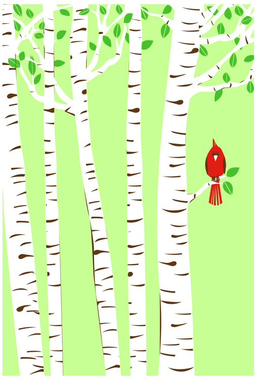
New, hand screeprinted, 4-color art print "Spring Cardinal". (Click to purchase or for more info.)

Freshly off the presses and now available: you are looking at my Spring Cardinal, the spring 2010 art print. What a happy little fellow!

Hey hey! Tweet! Tweet! Spring Cardinal is a part of my new Seasons series. This is the sixth print in series of seasonal prints that I’ll be releasing. Ready? Here’s the mind-blowing part = there will be 4 per year.

This year for  the 2010  Seasons series, I am doing things a little differently, rather than making a new image for each season, I’ve decided to follow the same bright red fellow in the same scene, across all 4 seasons. We have lots of Cardinals here all year round. I love looking out of my window and seeing their amazing scarlet red color jumping out from wherever they are, and whatever they are up to.

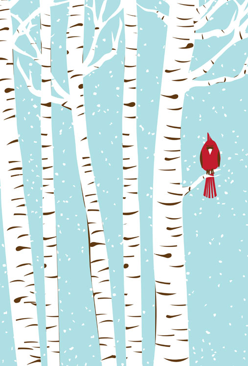
Although the original “Winter 2009” prints are sold out, I’ve printed a new edition, in a slightly different colorway titled “Winter Cardinal” to round out the first two seasons, (see the below photo), now available at my website here. Summer Cardinal, the summer 2010 print will be available shortly thereafter. Keep a sharp eye out!

Winter Cardinal, 3-color hand screenprinted art print. (click for more info or to purchase.)

Spring Cardinal is my 4-color, all hand screenprinted art print with tender mint green, bark brown, scarlet red, and new-leaf green, hand mixed and non-toxic water based inks. All prints are hand signed and titled. Additionally photos are selections from the hand screenprinting process. Size: 16 x 22 inches (39.4 cm x 55.9 cm.) Paper: archival Cougar, White 100lb cover weight.

This new art print, Spring Cardinal is now available here, at my website.

I design & hand screenprint my prints and posters. If you have any questions, just let me know. Below are a few selections from my photos of the hand screenprinting process for this new art print too. Click any of the below images for more information and / or to visit my Flickr account:

Screens drying for my Spring Cardinal art print.

1st color printed for Spring Cardinal.

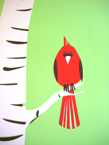
2nd color, the crimson Cardinal's body printed in my Spring Cardinal print.

3rd color, bark, beak & wing brown, printed for my Spring Cardinal art print.

All done! 4th color printed and on the press for my Spring Cardinal art print.

The Sketchbook Project 2011, open call to artists.

click for more information

It’s like a concert tour but with sketchbooks.

We’re not even halfway through 2010, but you might want to start thinking about 2011 a bit. At least, if you are interested in participating in The Sketchbook Project, 2011.

Organized by Art House Co-op, a group that seeks to create large art projects that tie hundreds to thousands of artists together, the newest incarnation of their Sketchbook Project for 2011 is possibly the most ambitious attempt yet. Unlike other sketchbook sharing and interactive projects, this one gives each artist their own book to work with, rather than depending on artists to share and ship books amoung themselves.

Which, honestly? Is probably a good thing. Each person is responsible for their own destiny and whatnot. It’s pretty sensible.

Sketchbooks ready to be displayed and read. (click for more information.)

However, it’s also super cool, because additionally, by having one identically sized Moleskine sketchbook for each individual artist or studio participating, The Sketchbook Project 2011 will do the following amazing stuff:

1. Tour the country to at least 6 particpating galleries across the US as a sort of . Currently set are:

Brooklyn, NY Austin, TX San Francisco, CA Portland, MEAtlanta, GA Chicago, IL

2. Each returned Sketchbook will be assigned a unique bar code which will enable the curators and artists alike to:

  • See where each book is along the touring show.
  • See how many times it was viewed as artists will be able to receive viewing notifications each time their Sketchbook is viewed and checked out via the Library Card system.
  • Allow the book to be catalogued and become a part of the permanent collection of the Brooklyn Art Library system.

3. Digitize the Sketchbooks for artists who wish to participate in that additional aspect of the Sketchbook Project (for an additional small $20 fee) so that their Sketchbook is available for viewing online as well after the Tour ends.

Sketchbook browsers at The Brooklyn Art Library. (click for more information.)

Rather than a random hodgepodge of sketchbooks filled with unrelated material, The Sketchbook Project 2011 has outlined 31 themes for participants to choose from, to align the material inside to whatever degree the artists’ see fit. Themes like “Sleepless”, “This will be fun I swear”, “I’m sorry I forgot you”, “This is not a sketchbook” and “A record year for rainfall” are among the open and/or suggestive themes.

Participation is open for those interested at a starting cost of $25, which covers your individual Sketchbook (with optional cover colors), shipping to the artists, individual bar code, and (hopefully) first choice on a theme, as they are expected to fill up quickly. For an additional fee, artists can opt for the digitizing of their Sketchbooks for online use (covered above), and/or have an 11×17 poster made as well.

Completed Sketchbooks being scanned before lending. (click for more information.)

Interested in learning more or becoming a participating artist in The Sketchbook Project 2011? (I did! Can’t wait for my Sketchbook to arrive.)

If you haven’t clicked any of the above images or previous links, click here forThe Sketchbook Project 2011. Silly goose.

2010 Sketchbook Project books arriving in the mail to Art House. (click for more information.)

Sweet new Sisters Red news & fun stuff!

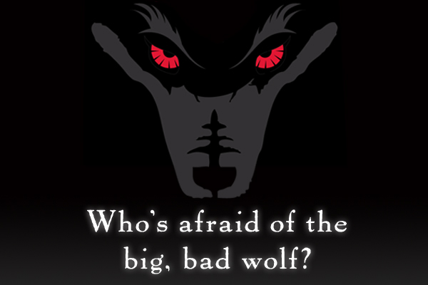
Are you afraid?

We’re not. With the impending release date of the new Jackson Pearce novel Sisters Red creeping slowly closer (the official release date is June 7th, 2010), we’re getting pretty excited around here. The buzz about Pearce’s 2nd Young Adult novel is really good, and moreover, the cover art illustration and jacket design that we did for Jackson Pearce and her publisher Little, Brown & Co. has also been getting attention as well.

That’s just rad. I won’t lie. It’s not just gratifying as a lowly, often practically anonymous book jacket illustrator and designer, (I mean, I know that I look to see who designed covers I like, but really, I know that’s also an art nerd thing too).

Here’s the thing: The main challenge we were given when first approached for this book jacket design by Little, Brown & Co. was to create a cover illustration and design that would fully pull people across a crowded book store just to find out more about Sisters Red, based purely on the cover art. Awesome! That’s the sort of challenge every designer and illustrator wants, and, it’s also the kind of challenge is, well, frankly a heck of a challenge. However, working on this project was not only that, but super fun and one of the most rewarding creative experiences strawberryluna, as a firm, has had to date. It’s not surprising really, as Little Brown, & Co. is also the publisher for the Twilight Series as well, also with a stunningly notable cover art. We’re so thankful and excited about the whole shebang we wanted to share a little more with you.

Coupled with the coolness and a well-written upcoming new book like Sisters Red, you can imagine it’s been a dream project already. And the publication date is just over a month away!

To that end, there’s a bunch of fun goodies over at the Sisters Red website here. Like what? Alright, hold on a sec, I’ll ya. Dang!

There are beautiful Wallpapers for your Mobile Phones (the iPhone sized one is below as an example) and for your Computer Desktops here, all perfectly sized and ready to go for you.

Click to view all Wallpapers, sized & ready to download.

And, there are some neat E-Cards, as shown below. Send them and spook your friends into Believing.

Click to view & send all E-Cards.

Click to view & send all E-Cards.

Also, the lovely Jackson Pearce is not only an author, but a really great video-blogger. She’s always up to new and fun posts at her Live Journal site, and via her YouTube site as well. She posts about what she’s writing, the creative process, and speaks directly with her fans as well as other authors weekly. In a word? She’s rad!

If you are more interested in what Sisters Red is about, (and of course you are), you can click here to read an excerpt and definitely check out this promo video Pearce posted recently about Sisters Red here:

And finally, (wowzers!) a review of Sisters Red’s cover art from Barnes & Noble.com by Melissa-Walker, with Pearce’s perspective as well. We’re just tickled! Click here to read it.

Thanks so much again Jackson & Little, Brown, xo.

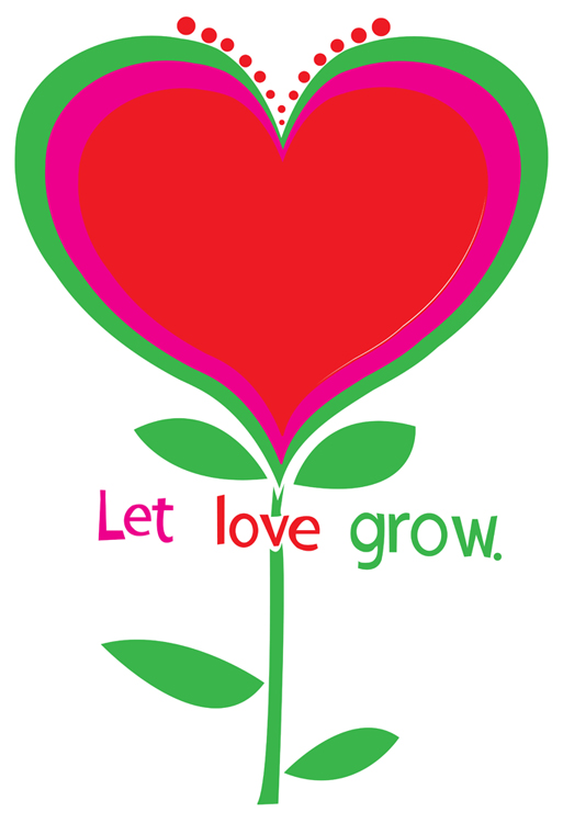
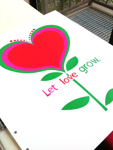
New art print release: ‘Let Love Grow’ hand screenprinted, limited edition

New hand screenprinted, 3-color, limited edition art print: "Let Love Grow", fresh & ready. (click here for more info or to purchase)

Lately, I’ve been really obsessed with 60’s design, but not the psychedelic and (to me) overly wrought side, but more of the very clean and simplistic designs that came out of Madison Avenue in the forms of advertising and brand / logo design and cohesion. There is something so appealing about those directions to me, very pure. This print and design is a part of that interest, as well as a statement on everyday negativity & violence, be they figurative or actual.

Hey negativity! Scram! Just feed, water, and nourish love and it will grow like a flower forever.

This simple scene is my newest art print “Let Love Grow”, bright & ready to help you plant seeds happiness and love all around you. Featuring hand lettered text, it’s a perfect gift of hope and love for your sweetie pie, as a wedding gift, for a young person in your life, or to brighten up your own home.

Love: Let it grow bright and strong.

You, my friend, are looking at my 3-color, all hand screen printed, limited edition art print with fresh spring green, vibrant magenta, and heartbeat red hand mixed and non-toxic water based inks. Edition of 190. Size: 18 x 22 inches (45.7 cm x 55.9 cm.) Paper: acid free & archival Cougar, White 100lb cover weight.
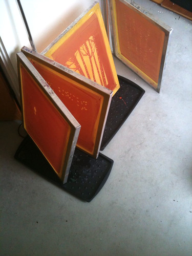
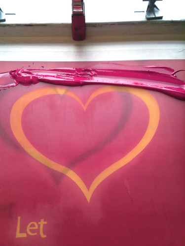
Below are some process photos, now also up on my Flickr account, of this art print, “Let Love Grow” being printed. Got questions? Shoot me an email!

1st color of "Let Love Grow", printed. (click to see more process photos.)

2nd color ink (magenta) in the screen, getting ready to print. (click here to see more process photos.)

About to print the 3rd & final color (green) of a new art print, "Let Love Grow". (click to see more process photos.)

All done! "Let Love Grow", finished printing and fresh for spring. (click to see more printing process photos.)

Our Iron & Wine poster in Ready Made, home decor by Bee Things.

Some of the gorgeous walls chez Bee Things, including my Iron & Wine poster from 2005.

While spring cleaning away this past Saturday, I’d left a small pile of fun mail as yet un-opened and un-perused. So, when I took a little sit-down break and read a tweet from my friend Beth from Hero Design that she saw our Iron & Wine poster (sold out, sorry!) in a spread the new April/May issue of Ready Made magazine, I kinda freaked out. Funny enough, my own issue had just arrived the day before but I hadn’t had a chance to open it and read it yet.

So, of course I tore in immediately 🙂

The feature is on the absolutely amazing and beautiful home of Texas design and screenprinting, husband & wife duo studio, Bee Things, (Jeff Barfoot & Shay Ometz) whose work I have admired from afar for a while now. So, seeing their superbly decorated home, so fantastically well curated and without being fussy or overly intentionally showy (you know what I mean!) featured prominently in a 10 page spread was a complete inspiration and a big blushing moment. I think it’s fantstic how you can see their love of printmaking in all forms by the incredible collection of prints that they have hanging everywhere in their home.

A room full of awesome. The Been Things livingroom and book collection.

Bee Things run a screenprinting studio from their home, from design to printmaking, which we of course relate to and love. And the sunlight that they get in their East Dallas space is completely lovely. They also did a great little tutorial on the screenprinting process for Ready Made that you can see in the April/May issue, and it’s also available online here as well at ReadyMade.com. I love the quote from Note the great IKEA flat file ALEX (the while drawer file in the lower left), a screenprinter’s pal. We have one too in our office! It’s a great way to store films, paper, and ink jet printer inks, among other tools of the trade. Good show Bee Things 😉

Bee Things studio.

We’re just beyond flattered and tickled to the gills to have a design & screenprinting couple, like us, like our work enough to hang it in their home and among their other quite formidable print treasures. And, just so you can see more awesome, this is the entire last page of the feature on Bee Things adorable home below.

Full page scan view.

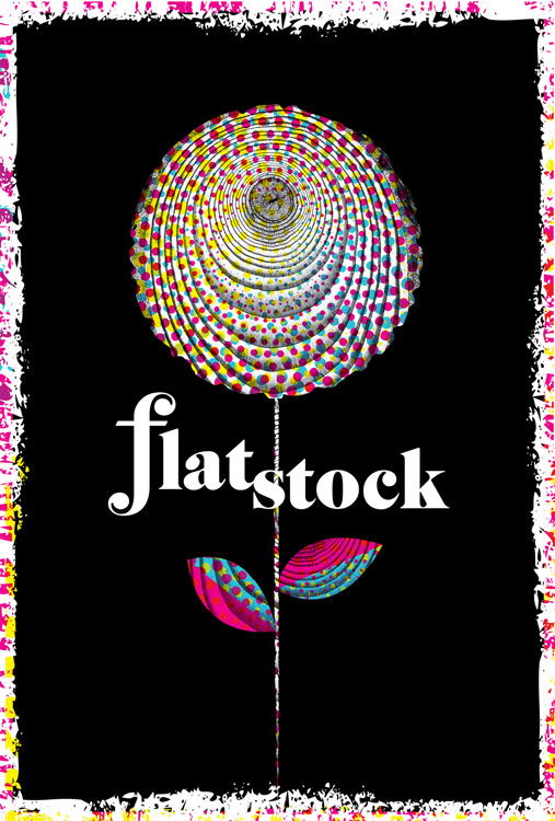
“Rock Paper Show: Flatstock Vol. 1”, new poster book feature!

Click for more info or to pre-order "Rock Paper Show, Flatstock Volume One"

Holy smokes, we’re super stoked on this. At SXSW & Flatstock Poster Show in Austin, TX just over a week ago, a brand new and bitchin’ book made it’s debut: Rock Paper Show: Flatstock Volume One. Published by Soundscreen Design, this book on the rock contemporary rock poster scene has more specific bent & focuses on the Flatstock shows and posters artists’ Flatstock posters, which are created specifically for these poster events.

Rock Paper Show is something of a visual history of the first 20 Flatstock festivals, (there have been 24 as the time of this writing, with 4 per year currently in Austin, TX, Chicago, IL, Seattle, WA and Hamburg, Germany) featuring interviews and essays by artists, collectors and bands, and a compilation of the posters created for the first 20 Flatstock poster shows. What is a Flatstock? Good question! The Flatstock Poster Show series is an ongoing series of exhibitions featuring the work of many of the most popular concert poster artists working today presented by the American Poster Institute (API). Flatstock shows provide the general public with an ongoing & unique series of opportunities to see fine poster art in person and to meet the artists who’ve created it — they provide the API with a way to present the poster artists collectively while showcasing the breadth of individual styles they represent.

Included in Rock Paper Show are our Flatstock 9, Flatstock 12, & Flatstock 14 posters (as seen below)

3 of my hand screenprinted Flatstock posters featured in "Rock Paper Show"

In addition to the standard edition of Rock Paper Show, the limited, Deluxe Edition (produced & limited to just 500 sets) comes enclosed in a collector’s case in which you will find a hand-screened, letterpressed, or stenciled 11″x17″ set of 20 artist prints made especially for Rock Paper Show. The prints feature the original posters commissioned for the book contained within a custom portfolio folder. We’re incredibly honored that we’re among the artists asked to do one of these 20 posters, which are also featured as the chapter headers for each of the 20 chapters of  Rock Paper Show. Here is a look at our poster below I will have a very limited number of these screenprinted posters for sale on my website later this spring.

Flatstock poster for the book about the first 20 Flatstocks, "Rock Paper Show".

Since its inception in 2002, Flatstock has evolved into the definitive showcase of the most talented poster artists working today. Rock Paper Show: Flatstock Volume One is an editorial and visual history of the first 20 Flatstocks, with contributions from the artists and studios that regularly attend the events and the bands who are often the subjects of the posters, as well as critics and collectors involved in this community. Rock Paper Show collects for the first time the original posters created for each Flatstock by the attending studios. Veteran poster-makers take the reader on behind-the-scenes looks at the studios, the artists, the regional scenes, and the personalities of this vibrant and varied community.

Curated by Geoff Peveto (president, American Poster Institute). Designed by Rumors (Brooklyn, NY). For a full list of editorial contributors and Studio Index, please click here.

Over 60 editorial contributors, including: Aesthetic Apparatus, Craig Finn (the Hold Steady), John Foster (author, Masters of Poster Design), Clay Hayes (gigposters.com), Jeff Kleinsmith (Patent Pending), Jay Ryan (the Bird Machine), and Paula Scher (Pentagram). Standard Edition – 312 pages. 566 color images. Hardcover.

You can pre-order either (or both) editions of Rock Paper Show today by clicking on this link! Orders will ship in early May.

Get a sneak peek at Rock Paper Show: Flatstock Volume One in the photo below where Soundscreen debuted at Flatstock 24 at SXSW Music Festival, or by clicking here. It’s a beauty.

Soundscreen's booth at Flatstock 24 (Austin, TX SXSW) debuting "Rock Paper Show" as well as the 20 original & exclusive limited edition posters produced just for the book. (Hey look! My poster is on the lower right!)

2 new art prints released: Lovebirds & Going To See My Baby Lavender

New 7-color hand screenprinted art print, "Lovebirds" now available. (click for more info or to purchase!)


Ok! This is a quick post as I really should be packing my clothes for Flatstock & SXSW in Austin TX (see this previous post for more info), so I will keep this one short and sweet.

I jammed out two brand new art prints this past weekend in a marathon printing run. 2 days, 8 screens, 13 colors, 1,000+ pulls, 200+ prints =  2 new prints. BOOM!

The first print is above, and it’s called “Lovebirds”. When we were working on our poster for St. Vincent, we started playing around with the flower illustration and found that it made very cute little birdies, we added a heart and ta-da! Lovebirds.

The second new art print is below, and it’s a fresh new colorway of my very popular “Going To See My Baby” print, now in Lavender. I love that lemony cloud action. I have to say as well that it’s kinda funny that both new prints feature hearts and love and romance quite prominently. Spring is here!

New 6-color hand screenprinted art print, "Going To See My Baby Lavender" now available. (click for more info or to purchase!)

It’s been really awesome getting to work out of my new studio space, rockin’ out to music and watching movies too while printing. In fact, I did a little Twitter contest while printing “Lovebirds” and asked if anyone could name the movie that I was watching in the background of a Photoshop mock, and wouldn’t you know it? Someone (@kurometarikku) got it right on the money by identifying “The Great Race” from a terrible screenshot. Amazing! Check out the photo below:

The Great Race in the background. Goofy, yes. But Jack Lemmon never disappoints.

And here are a few process shots of each print, sorry that they are not up on Flickr yet, but they will be next week! Apologies for some of the greyed out light. I do live and work in Pittsburgh, PA afterall. The actual prints are on lovely & crisp white paper 🙂

1st color of my new hand screenprinted art print "Lovebirds". (click for more info or to purchase)

2nd color of my hand screenprinted new art print "Lovebirds". (click for more info or to purchase)

3rd & final color of my new hand screenprinted art print "Lovebirds" drying on the rack. (click for more info or to purchase)

1st, 2nd, & 3rd colors printed of my new colorway "Going To See My Baby Lavender" art print.

Colors 1,2, and 3 of my hand screenprinted art print, "Going To See My Baby Lavender, with color test smears of inks on the right. (click for more info or to purchase!)

4th color down (black) of my hand screenprinted art print, "Going To See My Baby Lavender". (click for more info or to purchase!)

All done! New hand screenprinted art print, "Going To See My Baby Lavender". (click for more info or to purchase!)

2 new rock poster releases! St. Vincent & The Wreckids


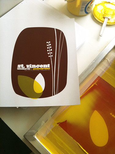
My 6 color, hand screenprinted poster for St. Vincent's show wi/ Wildbirds & Peacedrums in Pittsburgh on 2/21/10. (Click to purchase or for more info,)

After taking the month of January off from printing to work on some big design projects, as well as recover and regroup from a fantastically hectic summer + fall + winter 2009 work schedule, we were finally able to really focus on getting my new studio up and running for real. Craig found the space in July ’09 and I signed the lease starting in September. It was love at first sight for sure. A blog post covering the set up and construction of my new solo studio (nicknamed Friendship Studio) is definitely due. And now that it’s been one week since completing my first prints and posters there from start to finish? I’m feeling really great about all of the crazy and hard work that we did. But, more on that soon.

For now, I’m really stoked to post these new releases, as they are the first posters out of my Friendship Studio!

First up is actually the 2nd poster printed at my new space : that being my poster (pictured above) for St. Vincent. I’m really proud to be a part of the tour series organized for this tour, with the super cool (& Swedish!) Wildbirds & Peacedrums. The show was…amazing. Definitely try to catch St. Vincent on tour at some point this year. The above is my 6-color all hand pulled screenprinted poster with bark brown, clear yellow & magenta hand-mixed, non-toxic water based acrylic inks. Super secret magic: Three inks & 3 screens were used to make a total of 6 colors utilizing lots of overprints. (Overprints are when semi-transparent layers of ink combine and overlap to make another color.) I will have a very limited number of this poster for sale, as most of the edition was sold by the band on the night of the show & on tour. Size: 16w x 22h inches. Edition of 125. Paper: acid-free & archival Cougar 100 lb White, cover weight. Click here for more information on my website or to purchase.

And next up is actually the FIRST poster that I printed in my new studio. Is it backwards posting this first poster one second? Yes. But cousin, that’s how I roll.

My 2 color, hand screenprinted poster for The Wreckids CD release show in Pittsburgh on 2/19/10. (Click for more info!)

This poster is special all over. It’s for our dear friends The Wreckids CD release party in Pittsburgh, and you need to know a few things. 1. They are the coolest. 2. They’re awesome. 3. This poster is ONLY and EXCLUSIVELY available through the band. Yep, that’s right. So if you like it? Please help support them and purchase a poster from The Wreckids directly via their Myspace page HERE.

The Wreckids are some sweetie pies in disguise. This poster is for their CD release party for the record “Singing You To Sleep But Giving You Nightmares”, and doesn’t that just about folktale style say it all? The above is my 2-color all hand pulled screenprinted poster with blood red and midnight black hand-mixed, non-toxic water based acrylic inks. Size: 16w x 22h inches. Edition of 25. Paper: acid-free & archival Cougar 100 lb White, cover weight.

And, I finally got to take some more screenprinting process shots, only these offer some sneak peaks into my new print digs. Holy moly! Natural light! Click HERE or on the images below for more information about my hand screenprinting process & to see more photos at my Flickr page.

St. Vincent poster process photos:

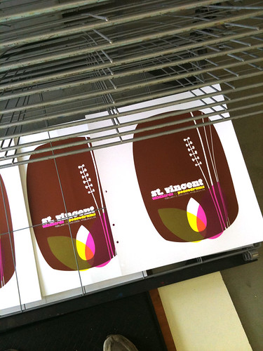
2nd color printed of my St. Vincent poster. (Click for more information & photographs.)

My completed hand screenprinted St. Vincent poster, drying on the rack. (Click for more information & photographs.)

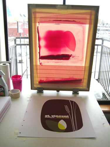
St. Vincent poster process, 3rd color flooded in the screen backlit screen. (Click for more information & photographs.)

The Wreckids poster process photos:

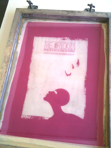
The Wreckids CD release poster 1st color screen. (Click for more information & photographs.)

The Wreckids CD release poster, racked & done SON! (Click for more information & photographs.)

My above St. Vincent poster is now available in my webstore here.

Have questions about these posters or screenprinting? Ask away! It might take me awhile, but I always write back.

Damn Fine Tea & Damn Fine Design

Series 1 teas in Nepalese, Ceylon & Chinese green styles. (click for more info)

It’s hard to tickle my design and happy feathers more than something like this does. Yummy, carefully crafted teas and super dupes design all smooshed up into one awesome product. Our  design-y peers (nay, HEROES) at Aesthetic Apparatus have teamed up with the folks at Damn Fine Tea to produce a series of limited edition teas, all with an eye as careful on the design as the teas themselves. If you are a design nerd or a tea devotee, or gasp! BOTH well dang, here’s our Nirvana. This is a design dream job.

Series 2 teas in traditional English tea styles. (click for more info or to purchase)

Tea-obsessed Damn Fine Tea offer exceptional teas, sold loose and processed traditionally, rather than industrially with custom blends and styles. All with a keen eye on the quality not only of each tinning, cup and brew, but in the design factor as well. Potentially an endangered cultural species these days. Plus, each style has specific brewing tips tailored for that particular tea for the perfect cup.

We love these tins’ killer flair and style, and of course we do. They are all designed by the powerhouse of fun, rad, and on-point Aesthetic Apparatus out of Minneapolis, MN.

With each series Damn Fine Tea & AA take a fresh approach to the tea’s style and name. This is so apparent with teas such Series 1 and Series 2 pictured above (inspired by British Victorian boxers & the wonders of the Far East) and the below Series 3 & Series 4, respectively inspired by Rock’n’Roll (YES! See? It’s a triple match made in heaven!) and 2010 The Year Of The Tiger.

Series 3 teas in Rock inspired styles. (click for more info or to purchase)

Sometimes tongue-in-cheek comes off poorly, more like tongue-in-cheekiness or it just falls flat. Not so at all with these designs paired so well with these teas. For instance, the Series 2 teas come with limited edition mini-posters, replicating the awesome old boxing posters of yore. A fact that’s coolness is only amplified by the fact that Aesthetic Apparatus are rooted firmly in the rock & gig poster scene as well as the Series 2 mini-poster designs evoke the phenomenal test print style that so many know and love AA for in the first place. It’s like a hall of damn designers, errr, I mean mirrors. With designers in them. Maybe.

Moving on, just peep the below Carävan tea with it’s adorable little blood dripping pentagram, surrounded by a ring of tea like a Dark Wizard waiting for his Master. Hehe.

Series 3 teas come with a freakin’ Tour Patch too. Seriously, if the AA guys weren’t so nice and cool, you want to hate them for being so damn fun.

Hellfire!!!! (click for more info or to purchase)

And finally, the newest addition to the Damn Fine Tea line is the ultra-limited edition tea for Series 4, Yunnan tea, inspired by 2010, the Chinese Year Of The Tiger. Raaarrrrrrrrgh! Amazingly, this tea is limited to just 50 (FIFTY! Come on, that’s crazy!) tins, with designed & hand screenprinted labels by Aesthetic Apparatus. At the time of writing this blog post, only 6 tins remained…duh DUH.

So, these Damn Fine Teas are my current obsessive design and tasty treat geek out. Pass it on if you’re down.

We can’t wait to see what comes next.

Series 4 tea is Yunnan & limited to just 50 tins. (click for more info or to purchase)