Strawberryluna

New release: Giclee art prints Part 1: Ghost Ship By Day & Ghost Ship by Night

2 new giclee prints, Ghost Ship By Day & Ghost Ship By Night, both sold either separately or as a diptych set. Click for info or to purchase prints.

As designers and illustrators for hire, we’ve been getting more into more really fun and cool non-silkscreen printed work this year. Sometimes in working on sketches for clients, we get to try out new things, and new styles that wouldn’t always be a great fit for the super labor intensive, one-color-at-a-time method of hand screenprinting as we do with our rock posters and many art prints. Sometimes those sketches move forward, sometimes they don’t. Until now that is. Rather than just let some designs die a slow, sad death in a file somewhere even though we really like the art work, we’ve been mulling over the chance to create a new line of art prints in the form of giclees.

And, in a multi-part series of blog posts, we’re announcing their release into the world. Hooray!

Part 1, Ghost Ship By Day and Ghost Ship By Night, a 2-print diptych set. These 2 prints were designed to go perfectly together, but also are fully able to stand alone as well. Hence, we are offering them for sale either individually for $20 a piece, or as a true diptych set for $35. A nice little deal!

* Extra bonus: Use the coupon code STRAWBERRYLUNABLOG10 during checkout in my Etsy shop and receive 10% off your entire order! *

New giclee art print, "Ghost Ship By Day". Click for more info or to purchase a print.

I have a thing for Ghost Ships, especially the spooky ones. From reading stories about the famous Marie Celeste as child to The Rime Of The Ancient Mariner, ships adrift without a crew, carried on the whims of the sea and the winds have long fascinated me.

In this original illustration “Ghost Ship By Day”, there’s the nice bright, Daylight aspect of a journey. Setting out, high hopes and sun fill this illustration.

Below is “Ghost Ship By Night”, the second of a 2-part image showing the Night time aspect of an ocean voyage. Shrouded in moonlight and mystery, this Ghost Ship print moves ever on alone.

Many Ghost Ships roamed the seas alone for months or even years, seeing many suns rise and set in their solitary journeys without a living crew.

Both prints are available individually or as a set now at my website here and also in my Etsy shop here.

New giclee art print, "Ghost Ship By NIGHT". Click for more info or to purchase a print.

Exclusive new Designer Desktops set for Design Milk: “Light As A Bird” released!

Click to download a free, full-sized version of our Designer Desktop for July from Design Milk! Formatted for your computer, iPad and iPhone.

Hello there! We’re really excited to finally share a new bit of design work with everyone. We were approached by the powerhouse design blog Design Milk
(huge shout out thanks to lovely Kelly at Design Crush for the recommendation) in May to be a part of their ongoing curated Designer Desktops series. Of course, being a fan of Design Milk for quite sometime I said yes right away.

Jaime, the founder of Design Milk, asked us to choose a design related quote and then work from there to create a suitable exclusive illustration for desktop backgrounds and Apple wallpapers. Preferably something which would also relate to design, naturally. When I came across this gem by Coco Chanel:

“I never wanted to weigh more heavily on a man than a bird.”

I fell in love instantly and we went with it. Read more about the inspiration for these designs here at Design Milk 

Our Designer Desktops are FREE and available for download in multiple formats exclusively at Design Milk here for the entire month of July. There are 4 sizes to choose from for standard computer monitors as well as an iPad & an iPhone version too. All especially formatted for perfection, of course! Click below to download any and all of these sizes:

1024×768

1280×1024

1680×1050

1900×1200

iPhone

iPad

So drop on by Design Milk and get your free, light as a bird new desktops and wallpapers and spiff up!

Click to download this free iPhone wallpaper, or snag any of the 5 other formats of our design for Design Milk's July Desktops

Re-post from 8 Hour Day “Girls Just Want To Have Fun”

Yep, this is a full re-post of what I think is a great, important, and should be seen by anyone interested in design type of blog post. I think that Katie Kirk, one half of the lovely couple behing the design studio 8 Hour Day said it best, so I’m just spreading her words and images below.

So awesome to see some of the best women designers and illustrators out there too, friends, peers, and new to me talents who kick ass in this field every day.

*Please note – The below is a post originally written and collected by Katie Kirk of 8 Hour Day, not myself, so if you dig, also go over there and check them out, comment there too and support them as well. Cheers all!

There’s been a lot of discussion happening around a recent Good Magazine article entitled “Why We Can’t Let Design Become a Boys’ Club” by Dylan Lathrop. It has spawned numerous comments, opinions,counter arguments and retorts from all sides. Many of us feel strongly about this, and it’s definitely a subject with many shades of gray. Though we may not all agree on the matter, I think the fact that it’s being discussed at all is great. After reading through all the articles and all the commentary, I felt compelled to showcase some of the women that continue to inspire me. So here are some of my favorites–thanks for the inspiration, ladies!


Aimee Gauthier


Allegra Lockstadt


Allison Newhouse


Anchalee Chambundabongse


Angie Lewin


Anke Weckmann


Annette Marnat


Anne Ulku


Autumn Whitehurst


Celeste Prevost


Danielle Davis


Deanna Halsall


Eleanor Grosch


Elsa Lang 
(Always With Honor)


Erin Fuller


Esther Aarts


Gemma Correll


Gina Triplett


Gracia Lam


Helen Dardik


Jacqui Oakley


Janine Rewell


Jennifer Daniel


Jenny Bowers


Jessica Hische


Jessica Walsh


Jillian Tamaki


Julia Rothman


Karen Goheen 
(Two Arms)


Kate Bingaman-Burt


Kelli Anderson


Kelly Munson


Kristina Collantes


Lauren Gregg


Laurie DeMartino


Lotta Nieminen


Lydia Nichols


Maria Janosko


Maricor/Maricar


Meg Hunt


Melissa Buchanan 
(The Little Friends of Printmaking)


Missy Austin


Natalie Schaefer


Parliament of Owls
 (Meg Paradise, Lauren Sheldon & Ariana Dilibero)


Ping Zoo


Roxanne Daner


Sanna Annukka


Sarah Labieniec


Sara Lintner


Sol Linero


Susie Ghahreman


Tonya Douraghy


Tuesday Bassen


Valerie Jar


Veronica Corzo-Duchardt 
(winterbureau)


Sharon Werner & Sarah Forss 
(Werner Design Works)


Zeloot

New release! Bright Eyes silkscreen poster

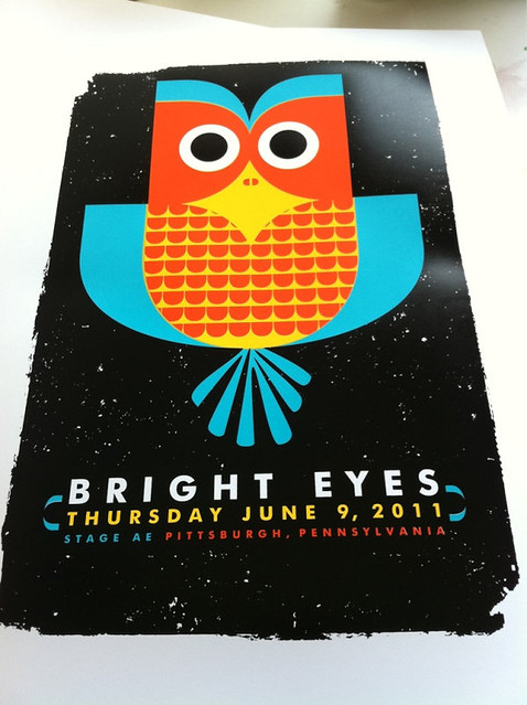
New! Our 4-color, hand silkscreen printed poster for Bright Eyes, Click to purchase or for more info!


Brand spanking new and fresh off the press, it’s our new poster for Bright Eyes for his show at Stage AE in Pittsburgh,

The music of Connor Oberst and Bright Eyes is like a beacon of individuality, sweetness, anger, and passion, at least that’s the way I hear it. When I first began printing at the community studio Artists Image Resource (AIR) in Pittsburgh, Bright Eyes was on heavy rotation during Open Studio nights and his voice still reminds me of that awesome time toiling away in that funny early stage of learning printmaking where you learn to love mistakes as much as you do successes.

In homage to all things organic, wise and bright this fella is our all hand silkscreen printed poster for the singular sound of Bright Eyes with hand mixed midnight black, teal, acrylic screenprinting inks. Edition: 150, each of these limited edition posters are signed & numbered (by me, strawberryluna) Size: 16×22 inches (39.4 cm x 55.9 cm.) Paper: archival Cougar, White 100lb cover weight.

Now available at my website here or also in my Etsy shop here.

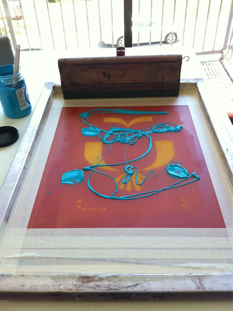
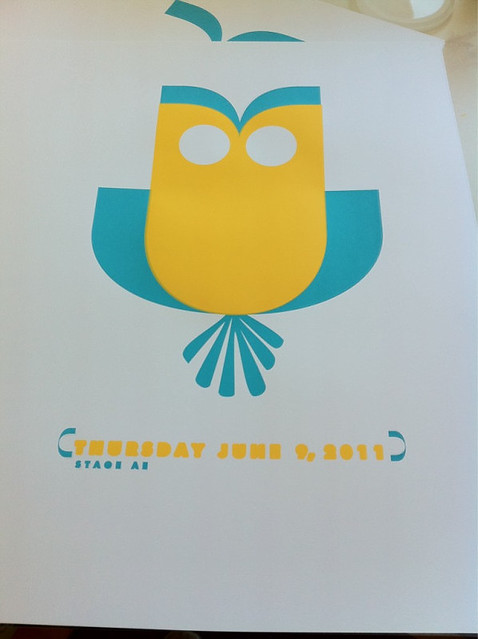
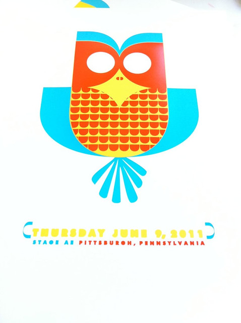
Dig screenprinting? Have no clue what the hand printing process is like? Below are some process shots that I took while silkcreening this poster in my Flickr account:

1st color ink in the screen for our hand printed poster for Bright Eyes. (Click for more info & photos.)

t 2nd color printed for our hand printed poster for Bright Eyes. (Click for more info & photos.)

3rd color ready to go for our hand printed poster for Bright Eyes. (Click for more info & photos.)

3rd color printed for our hand printed poster for Bright Eyes. (Click for more info & photos.)

All done! 4th color printed for our hand printed poster for Bright Eyes. (Click for more info & photos.)


New poster release! Paramore, 2011 Tour “Hands Up” poster

Click to purchase or for more info.


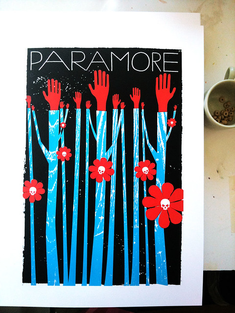
We’re mega excited about this one around here! Introducing our all hand silkscreen printed, limited edition poster for Paramore for their 2011 Tour.

The darker side of Spring exposed for the band Paramore here in our poster for them. We’re so stoked working with these guys on a Spring 2011 poster.
All things grow in Spring, but all things may not always be what you expect. Dark, sweet, and sharp. That’s the allure of Paramore.

Available for sale at my website here and also in my Etsy shop here, this my all hand screenprinted poster for Paramore with bright blue, midnight black and scarlet red hand-mixed acrylic silkscreen inks. Edition: 300 to the band (look for them on tour and from their website!) and an Artist’s Edition of only 50 posters is available for sale here. All 350 limited edition posters are signed & numbered (by me, strawberryluna) Size: 16×22 inches (39.4 cm x 55.9 cm.) Paper: archival Cougar, White 100lb cover weight.

Are you a Paramore Superfan? They you will love what they’ve done that’s all rad and high tech with their copies of our poster. Oh yeah! The future is here. Only at the Paramore webstore, each poster includes a QR code on the back that will take you to a website with three options for mobile wallpapers that feature three unreleased photos of the band. The QR code can only be scanned by those who have a camera phone with a barcode reader and internet connection on their phone.

And for you printmaking nerds (and I hope that you are, like me!) check out some process photos in my Flickr account too!

Mixing ink for our hand silkscreen printed Paramore poster. Click for more info.

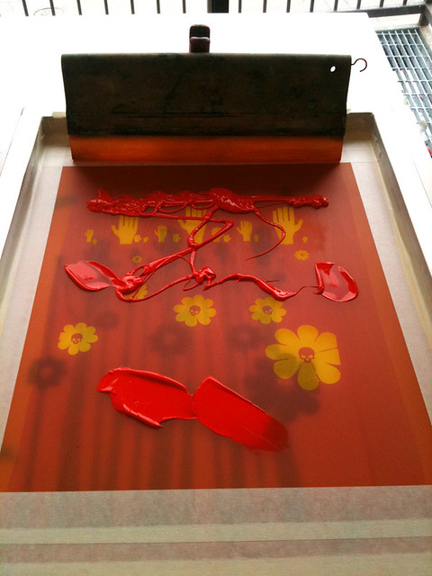
Printing red skull flowers for our Paramore poster. Click for more photos of the hand silkscreen printing process.

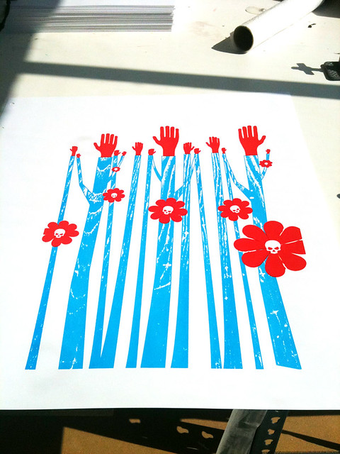
Paramore hand silkscreen printed Tour poster, 2nd color. Click for more info & more process photos.

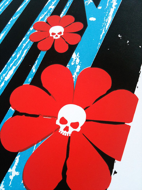
Detail show of our hand silkscreen printed Paramore Tour poster. Click for more process photos and details.

All done! 350 prints later, this is our all hand silkcreen printed Paramore tour poster. Click for more info and process shots.

Book Cover Design in India 1964 to 1984, from 50 Watts

Click to see more from this collection.

In my morning-coffee-stumble-through-the-internet-while-waking-up ritual today I came across a fantastically cool / I can’t believe that I didn’t know about this before blog, called 50 Watts, run by Philadelphian (yay! My hometown!) Will Schofield.

50 Watts is great little space of the web covering the intersection of book collection, design, and illustration. Sounds like heaven to me.  What caught my eye was an image from a post on now vintage book covers from the 40 year span from 1964 – 1984. Here, I’ve posted a few of my favorites, but definitely check out the full post at 50 Watts here.

And yeah, part of me wishes that I could read the text on these beauties. At the same time, they still speak quite clearly and the other part of me loves being able to make up stories about what these stories are about.

Click to see more from this collection.

Mostly, I just adore the flatness of the color fields, the kapow! of their graphics and layout, and symbolic style of the illustrations. Being a silkscreen printmaker, there is something so excellently familiar about the way that these were printed, probably cheaply, probably in a spot, or one color at a time process like screenprinting. You can see the areas where pieces aren’t in perfect register, or where colors overprint one another, and the use of halftones to mimic saturation levels of a color. All make my heart do little flips. The limitations of this type of printing force incredibly creative and freeing design and illustration choices, which, clearly I love and have embraced as a career. So, no. It’s no surprise that I dig these. I hope that you do too.

Click to see more from this collection.

Click to see more from this collection.

New art print release: Rose Red!

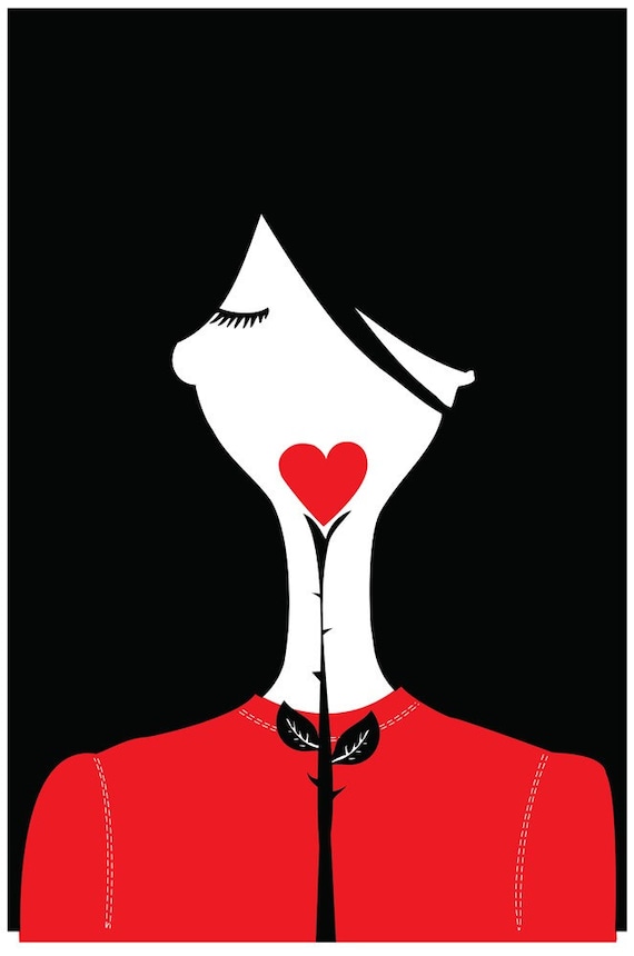
Rose Red, my new 2-color hand pulled silkscreen print.

Rose Red, Dark, sweet, and full of secrets. Rose Red is the 2nd in print in my fairy tale inspired print series, (my now sold out print, The Lady & The Wolf was the first). I’ve been fascinated by, OK possibly addicted to, fairy tales and fables since I was very young. Their allure has yet to lose it’s magic, especially the older versions of fairy tales with darker themes and symbols.

These days, many people know these stories best as tales for children, however many of our most loved fairy tales have much more brutal original tellings than you might imagine something fit for little kids. I read folk & fairy tales obsessively, the darker the roots of the tale, the more I love it. It’s super interesting how the same stories appear in similar versions and places for both children and (especially originally) for adults as well.

Rose Red is my 2-color, all hand silkscreen printed art print using scarlet red and velvety black hand-mixed and non-toxic water based silkscreen inks. And yes! Edition of 200. Size: 16 x22 inches (39.4 cm x 55.9 cm.) Paper: no acid, archival Cougar, White 100lb cover weight. $25

Fresh off my press, hand printed and now available for purchase here at my website and also here in my Etsy shop.

Neato extra! This design is also available as a free iPhone & iPod Touch wallpaper at the super cool Poolga.com right here.

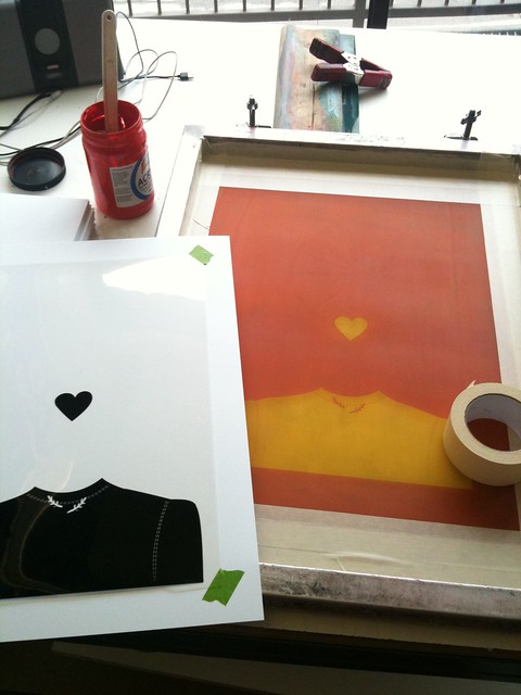
Are you a print nerd too? Check out some process photos from my Flickr account below.


Getting all set up to print Rose Red.


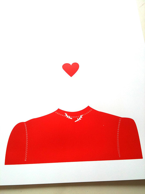
1st color of my hand silkscreen printed art print, Rose Red.


2nd and final color of my silkscreen printed Rose Red art print.


New ‘W is for Whale’ Exclusive Desktop Design at Green Eyed Monster released!

Green Eyed Monster is an awesome little corner of the web and we’re really excited to announce that we’ve teamed up to do an exclusive release of a desktop background design with Ash & Kimmy from this environmentally forward curated shopping & blog site. Their name is less a term of jealousy and far far more a big nod to the environmental and green ideas, products, and philosophies found within the DIY and Handmade movement.

For the month of April, my adaptation of our W is for Whale Alphabet Print design (the original print is here) will be available for free as a download for your desktop all April long. So swim on over, whatcha waitin’ for?

Click the below images or click here to get the April W is for Whale desktop background and enjoy a little undersea funscape for a while and feel free to pass it on.

This is the beginning of a series of digital background pieces that we’re going to be releasing all through 2011 too. Yep! We just want to make our big world a little bit happier. More designs coming soon.

To learn more about Green Eyed Monster, see & shop their products and more, click here.

To see all of our hand silkscreen printed Alphabet Prints for sale, click here.

Huge thanks to Green Eyed Monster for their super sweet profile about us too, you chicas rock!

Click to get my full-sized free desktop design from Green Eyed Monster.

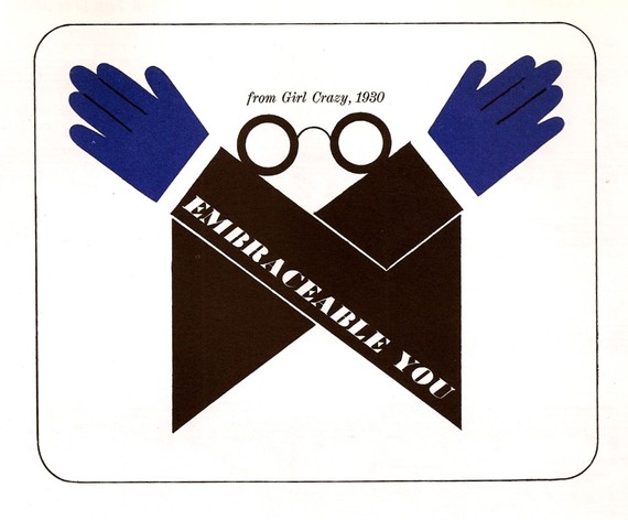
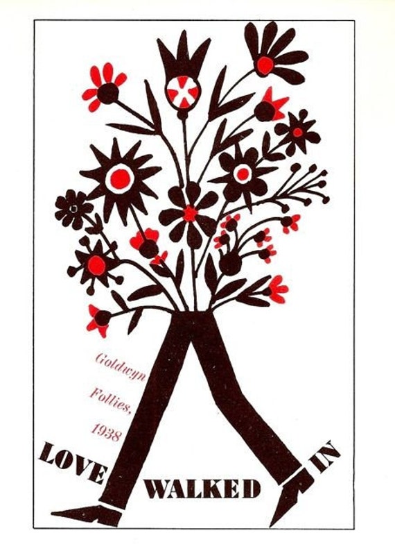
Milton Glaser illustration score; Gershwin Song Book beauties

Milton Glaser illustration in the 1960 Gershwin Song Book

Score! Pun!

I saw a few loose pages in an Etsy shop (called Sensorium, click here for more) of this amazing Gershwin Song Book (which is cool enough) illustrated by the legendary Milton Glaser (which is amazing!) published in 1960 and had to find out more.

I searched out an inexpensive &  complete song book, in beautiful condition at Abe Books and eeeeeeeeeeeee….it’s really lovely. Below are a just few more images from the song book. Yet, there are many more throughout the song book. Yum.

Milton Glaser illustration in the 1960 Gershwin Song Book

Milton Glaser illustration in the 1960 Gershwin Song Book

Milton Glaser illustration in the 1960 Gershwin Song Book

Alabama & Judson College, here I come!

Pittsburgh is awfully cold and grey in the winter, and I’ll tell you, a little Southern hospitality sounds perfect right about now. Lucky me!

I am heading to Judson College in Marion, Alabama for a few days this week for a solo exhibition in the Marian Tucker Acree Gallery, and to work with the Art Dept. students on a silscreen printmaking demonstration. Having never been to Alabama, I’m excited.

The schedule breaks down like this:

  • 2/9/11 (Wednesday) – The exhibition, Strawberryluna! opens Feb. 9 and continues through March 6. The show features a selection of my posters and prints and will be on view at the Marian Tucker Acree Gallery. There will be an artist’s reception on Wednesday, Feb. 9, from 4 – 6 pm in the gallery,
  • 2/10/11 – (Thursday) I will give a brief lecture on my work in Tucker Recital Hall from 11 am until noon on Thursday, Feb. 10.  I will also be making a print with the art department students in Mead Hall on Thursday at 1 pm. Anyone is welcome!

All events are free and open to the public. The works in this exhibition are for sale. For more information about the work, the schedule, or the show, please contact  Dept. Head Jamie Adams at 334.683.5251.

For more information, click the Judson College link here.

For the location & directions to Judson College, click here.

For a Google Maps lnk & directions, click here.

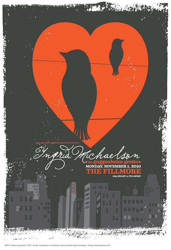
New poster released: Ingrid Michaelson at The Fillmore, San Francisco


Poster for Ingrid Michaelson at The Fillmore in San Francisco, by strawberryluna. (Click for more info or to purchase.)


Hey smartie-sweetie-cuties, what’s up?

Here is a “new” poster release! I say “new” in “quotes” as the show date was from way back in November of 2010 (that’s like a lifetime ago!), but I didn’t receive my copies of the poster until just a few weeks ago, and somehow posting this little baby up slipped from my to-do list. Apologies!

Onward & upward: We were commissioned by the legendary Fillmore in San Francisco to do a special show poster for Ingrid Michaelson’s show there on 11/1/10 with The Guggenheim Grotto. In the classic Fillmore tradition, they print and give 1,000 copies of the posters created for their shows away at the end of the night to the fans as a big thanks. And this is that poster for Ingrid Michaelson’s show.

And it’s now available for purchase from my website here and also from my Etsy shop here.

More about this poster:

The Fillmore hosted the multi-talented musician, signer / songwriter Ingrid Michaelson, and as their tradition, which dates back to the 1960s, they handed out copies of this poster to the audience at the end of the show. We’re so proud to be a part of this incredible legacy and are tickled to do this poster for The Fillmore & Ingrid Michaelson.

This poster is an offset print, not screenprinted, it was printed by The Fillmore for the show. It’s a 3-color, design with an edition of 1,000. Of that 1,000 given to the fans at the show and to the bands’ members. Artists’ Edition of just 75 posters, each one hand signed & numbered by me, strawberryluna. Size: 13w x 19h inches (33 cm x 48.3 cm). Paper: thick and heavy white stock.

This poster was given away at the show in San Francisco and I have just a portion of the run available (less than 70!) for sale here, so they will go quick!

3 New prints released for Poetic. Aesthetic. at The University Of Maryland Art Gallery!

Hello hello. It’s been a few weeks! And we’ve been hard hard at work on a bunch of projects, hence the radio silences, as it were.

One of the new news is our inclusion in the very cool and brilliant gallery show Poetic. AestheticAn Exploration of Creativity in Poetry and Visual Art at The Art Gallery at The University of Maryland, curated by John Shipman. For this show, visual artists were paired up with poets and asked to interpret 3 poems via their visual medium. In our case, we worked with the poems of 2-time Pulitzer Prize nominee Dave Smith to produce 3 limited edition silkscreen prints for the show.

The exhibition opens on Friday January 28, 2011 with an Opening Reception from 5:00 -7:00 pm, and will be on exhibit through March 5, 2011. Works will be available for purchase at the show as well!

Poetic. Aesthetic. explores the relationship between the lyricism of poetry and the aesthetic force of the visual. By probing this relationship, Poetic. Aesthetic. also seeks to foster creative collaboration across artistic disciplines. Working with the University of Maryland Creative Writing faculty, The Art Gallery has partnered Maryland poets with national and international artists to collaborate on visual works for Poetic Aesthetic. Each visual artist will create three new works of art based on, and incorporating, the poems of one poet. Poetic. Aesthetic. exhibits works in various media, including paintings, sculptures, videos, drawings, screen-printed posters, and installations.

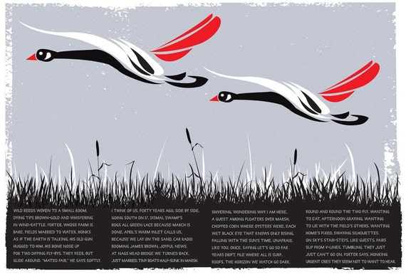
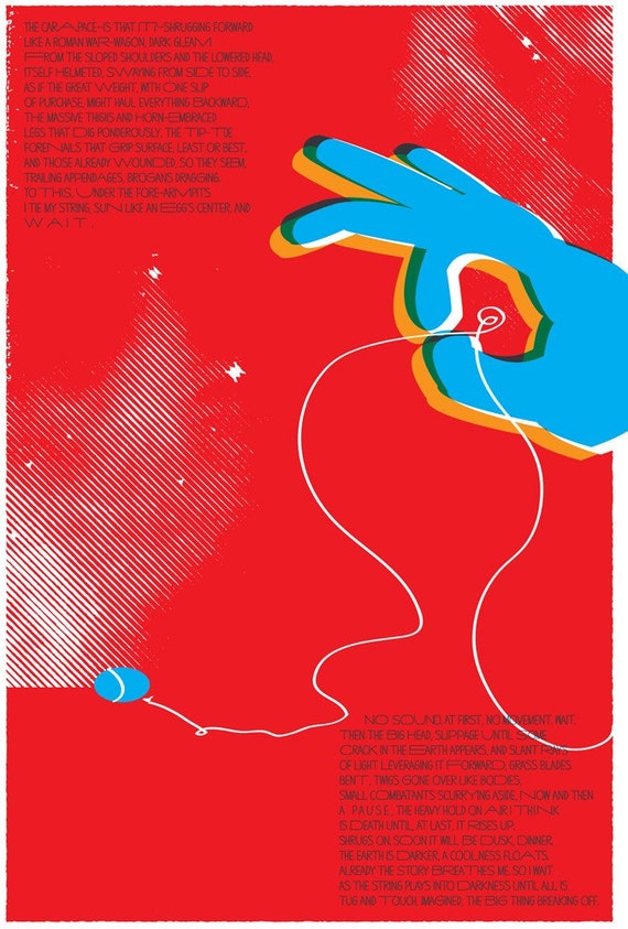
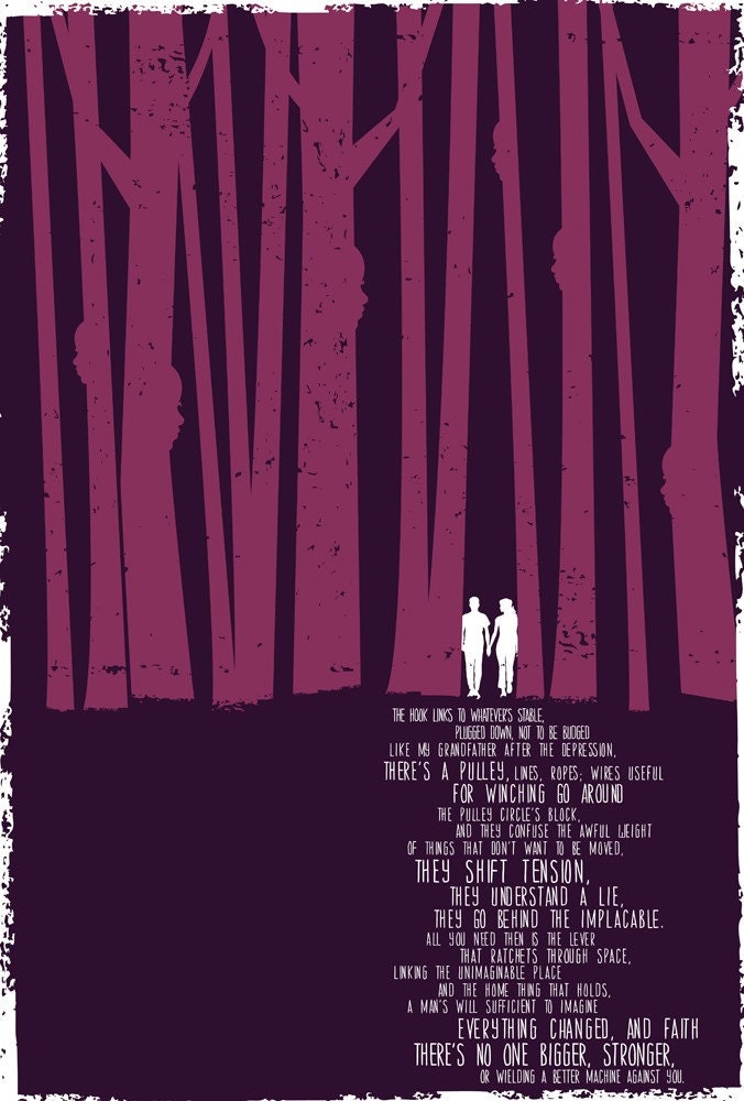
We chose the 3 poems of Dave Smith’s that spoke to us visually the most, and they are as follows: Goose Blind, June Bug and Come-Along:

3-color hand printed silkscreen "Goose Blind", poem by Dave Smith. Click for more info or to purchase.

5-color hand printed silkscreen print "June Bug" (poem by Dave Smith). Click for more info or to purchase.

2-color hand printed silkscreen print "Come-Along" (poem by Dave Smith). Click for more info or to purchase.

Dave Smithis the author of more than a dozen books of poems, including The Wick of Memory: New and Selected Poems, 1970-2007 (Louisiana State University Press, 2000), which was chosen as the Dictionary of Literary Biography’s Book of the Year in Poetry, and Little Boats, Unsalvaged: Poems 1992-2004 (Louisiana State University Press, 2005). He is also a novelist, critic, and editor. He has twice been nominated for the Pulitzer Prize and has won fellowships from the National Endowment for the Arts, the Guggenheim Foundation, and the Rockefeller Foundation. He is the Elliott Coleman Professor of Poetry at Johns Hopkins University, where he is also Department Chair of The Writing Seminars.

The Art Gallery at the University of Maryland presents the exhibition Poetic Aesthetic: An Exploration of Creativity in Poetry and Visual Art. The exhibition opens on Friday January 28, 2011 with an Opening Reception from 5:00 -7:00 pm, and will be on exhibit through March 5, 2011. The multimedia exhibition brings together visual art with contemporary poetry in original, interdisciplinary works. Text from poets Elizabeth Arnold, R. Dwayne Betts, Lucille Clifton, Michael Collier, Jehanne Dubrow, Michael Glaser, Joseph Harrison, Ethan Huang, Linda Pastan, Stanley Plumly, Dave Smith, Saul Sosnowski, Elizabeth Spires, and Joshua Weiner will be featured in works from artists Kris Chau, Audra Buck-Coleman, Bill Dunlap, John Foster, Tim Gough, Dan Grzeca, Hero Design, David Hughes, Mirta Kupferminc, Ruth Lozner, Jefferson Pinder, Strawberryluna, Julianna Swaney, and James Thorpe.

If you are in the College Park / University of Maryland area, please stop by and check out this amazing exhibit, running from  Friday January 28, 2011 with an Opening Reception from 5:00 -7:00 pm, and will be on exhibit through March 5, 2011.

Stunning posters for Aronofsky’s Black Swan

Being a poster artist for me essentially also means being a fan & student of the history and art of posters, no matter what, where, when & for whom. In my case? Also being a bit of a film nut (to put it mildly), means that yeah, I’m really impressed by these absolutely amazing posters designed by London based outfit La Boca for Darren Aronofsky’s new film Black Swan. Which, I can’t wait to finally go see, as it looks incredibly cool & creepy. Holy spooky mirrors.

Add in my undying love for some good old-fashioned propagandist style & design, and poof! The perfect recipe of awesome was born with these masterful pieces. And while the photo-based posters (of which there a many striking and excellent ones too), are also incredible, I’m just floored by this set of graphic & illustrated posters. What a bold set they make and how well they work in tandem as well as on their own. It’s perfection. Hope that you dig them too.

Edit/add: Thanks to our pal Cameron of Two Duck Disco for letting us know that these posters were created by La Boca out of London. Cheers!

New print released: Hello Birds 2011 Calendar!

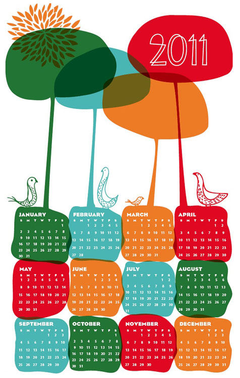
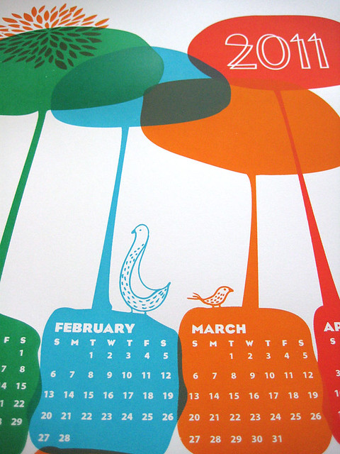
Hand screenprinted, 9 color Hello Birds 2011 Calendar. (Click to purchase or for more info!)


Calendars quite something, right? They help us keep track of time, but they can also help set a mood for the day. Let’s face it, of all of the things that we look at each & every day? A least a few should make you happy just by eyeballing ’em. My 2011 “Hello Birds” Calendar aims to do just that. It’s just a fresh new day with some bird friends, saying “Hello.” Pretty good start already!

Our 2011 “Hello Birds” Calendar comes in 2 versions, the one that you see here on crisp white paper, and next week there will also be a version on a wintery Spearmint to be released on 12/9/10. Your choice!

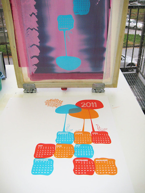
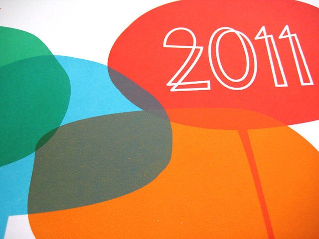
This happy day scene is my 9-color, hand screenprinted silkscreen print, loaded with overprints from my hand mixed poppy red, sun orange, sky cyan and forest green water based screenprinting inks. The extra bit of magic? From 4 colors pulled, I get 9 by layering inks to make new colors. I love screenprinting! All 2011 “Hello Birds” Calendar prints are hand signed. Limited Edition of 75. Size: 12 x 19 inches (39.4 cm x 55.9 cm.) Paper: archival Cougar, White 100lb cover weight. $20

Click here to purchase this new 2011 Hello Birds Calendar from my website and/or for more information, or head on over here to my Etsy shop.

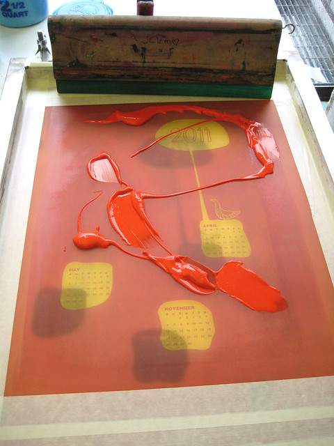
Below are some selects from the silkscreen printmaking process for this calendar too:

Click to see more photos of screenprinting, or for more info.

Click to see more photos of screenprinting in action, or for more info.

Click to see more photos of the screenprinting process in action, or for more info.

Click to see more photos of the screenprinting process, or for more info.


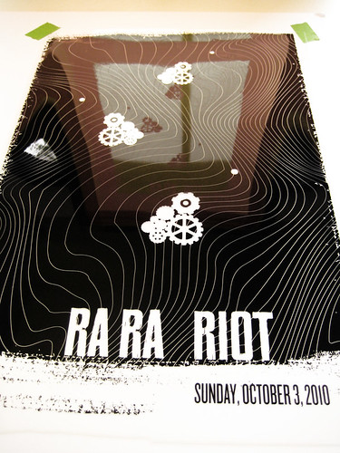
New poster released: Ra Ra Riot w/ Chikita Violenta & We Barbarians

All new 2-color hand screenprinted poster for Ra Ra Riot. (Click to purchase or for more info.)

It’s a year in the making, but I’m so happy things work out the way that that do sometimes. We had originally talked with Ra Ra Riot‘s management over a year ago about working together on a poster, and here were are, October 2010 when it all came together. Huzzah!

The show was amazing, and surprising too. We arrived home from a great weekend in DC for Crafty Bastards just in time for me to edition & sign the posters for Sunday night’s Ra Ra Riot 10/2 show, gulp some homemade soup for dinner and run on down to Diesel for the show. As it turned, out, I was selling my posters behind the merch booth that evening. It was good spot to catch the amazing openers We Barbarians (from California) and Chikita Violenta (hailing from Mexico City), all of whom were super rad as well. Thanks to Rachel, the bands, & everyone at the show for great night 🙂

Info about this new poster release:

Modern & looking back to the past, like thinking about living off of the backs of our ancestors. That’s a bit how Ra Ra Riot‘s awesome sound feels. We love them! And we’re super aced to do this poster for their Pittsburgh, PA show.

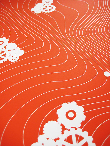
This is my hand screenprinted, limited edition silkscreen poster for Ra Ra Riot, Chikita Violenta & We Barbarians with poppy orange-red and midnight black hand mixed, water-based acrylic silkscreen inks. Edition of 112, signed and numbered (by me, strawberryluna). Size: 16 x22 inches (39.4 cm x 55.9 cm.) Paper: archival Cougar, White 100lb cover weight. $20 This poster is now available for sale at my website HERE or in my Etsy shop here.

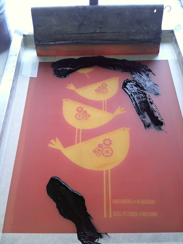
And, in case you are into process photos, here are a few from the printing of this poster over at my Flickr account here.

1st color film, Ra Ra Riot hand silkscreened poster. (Click for more info & photos.)

1st color flood: Ra Ra Riot, hand silkscreen printed poster. Click for more info & photos.)

1st color detail: Ra Ra Riot silkscreened poster. Click for more info & photos.)

2nd color ink on the screen: Ra Ra Riot hand screenprinted poster process. (Click for more info & photos.)

Detail of the birds, gears, and overprinted black ink on my Ra Ra Riot poster. (Click for more info & photos.)