Strawberryluna

Hit Them With The Razzle Dazzle – WWI British Navy Ship Cammo

normal-wilkinson-inventor-of-dazzle-camouflage

The Father of Dazzle Camouflage, Norman Wilkinson

When you are interested in design, technology, perception AND history? (As I am.)  Sometimes a story comes along that feeds all 4 things.

This post, borrowed from Twisted Sifter does just this. And rather than blab on about why this is so damn cool, I’ll just let you check out an abridged version here and hopefully, marvel like we have at this ingeniuous and extremely cool graphic solve to a fatal problem of war.

For the full blog post with many more photographic examples, please visit Twisted Sifter or click on any image.

__________________________________________________________

You are the Fleet Admiral of the Navy in WWI what do you do?

THE SITUATION

You’re the Fleet Admiral of the Navy in World War I. Your ships are being sunk at an alarming rate by the devastatingly effective German U-Boat. The traditional camouflage isn’t working because your environment (sea and sky) changes with the weather. What do you do?

ww-i-dazzle-painting-camouflage

THE INSIGHT

World War I occurred from 1914–1918; back then sinking an enemy battleship was a three-step process:

Step 1: Locate your target’s position and plot its course.
Step 2: Determine the ship’s speed and confirm the direction it is heading
Step 3: Launch torpedo not directly at the ship, but where you think it’s going to be by the time the torpedo reaches the ship.

*Remember this is early 20th century warfare, weapons don’t travel at the speed they do today

So what’s your solution Fleet Admiral?

HIT THEM WITH THE RAZZLE DAZZLE

world-war-1-dazzle-camouflage

Forget about not being seen, that only solves their first problem. Focus on confusing them so they don’t know where you’re going. Then their torpedoes will be shot in vain because they thought you zigged when you really zagged.

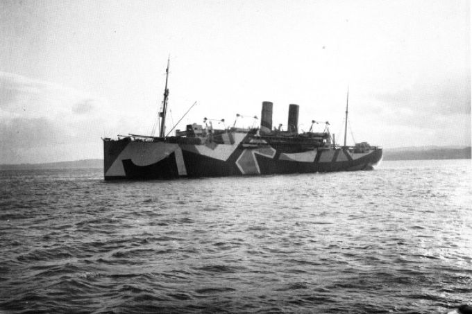
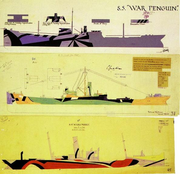
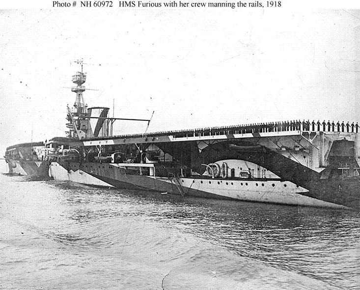
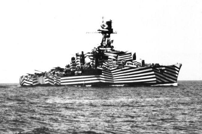
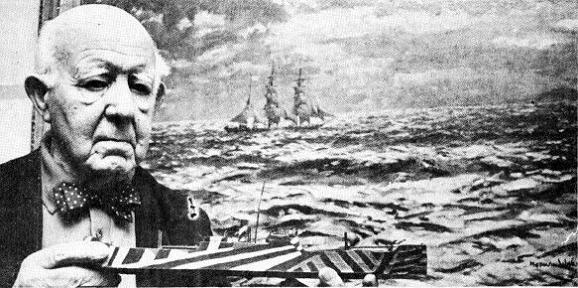
British Artist and naval officer Norman Wilkinson had this very insight and pioneered the Dazzle Camouflage movement (known as Razzle Dazzle in the United States). Norman used bright, loud colours and contrasting diagonal stripes to make it incredibly difficult to gauge a ship’s size and direction.

It was cheap, effective, and widely-adopted during the War. Check out the incredible photographs below.

dazzle-painting-a-boat

*NOTE: Unfortunately the images are in black and white, being from the early 1900s and all, so the loud, bold colours will require a little imagination. Can you picture a fleet of electric yellow, orange and purple ships coming to get ya!
dazzle-camouflage-sketches

razzle-dazzle-paintjob

dazzle-painting-ship

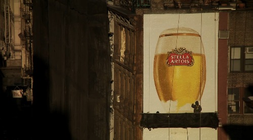
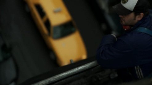
Up There: Hand painted advertisments, alive and beautiful.

This 12+ minute documentary speaks for itself. So, just take a break and watch sign & advertisement painters work the old fashioned way. Total badasses.

Click the above to watch Malcolm Murray’s absolutely cool and beautiful short film Up There and follow the tough & crazy talented painters of  Sky High Murals work on a new, hand painted ad in NYC for Stella Artois. If you have a love for design, all things hand done, the past, present. & future all balled up into one, or frankly, if you have eyeballs, you’ll dig this. Fully.
Click any of the images below to learn more about Up There.

Oscar, The Bionic Cat: We’re big fans.

Oscar, showing off his super new bionic back legs.

Oscar, a handsome English gentleman kitty, lost the lower halves of his back legs in a farm accident in October of 2009. In a ground-breaking feline first in Britain, the two-and-a-half year old cat was perfect candidate for a new surgical procedure that could save his life, bionically.

The BBC produced a short documentary of Oscar’s groundbreaking surgery & recovery, the below is a short snippet:

Taken from The Straits Times: Oscar lost at least one of his nine lives when he was run over by a combine harvester last October – but eight months later he has regained a spring in his step. The prosthetic paws were fitted by neuro-orthopaedic surgeon Noel Fitzpatrick, in a three-hour operation involving grafting the replacement legs onto the stumps of Oscar’s remaining bones.

‘The real revolution with Oscar is because we have put a piece of metal and flange into which skin grows into an extremely tight bone,’ said Dr Fitzpatrick, who carried out the surgery last November.

Oscar, climbing the stairs with his little bionic paws, no problem.

‘Oscar can now run and jump about as cats should do.’ His owner Kate Nolan said: ‘We had to do a lot of soul-searching and our main concern has always been whether this operation would be in Oscar’s best interests and would give him a better quality of life.’

Playing with a toy like nothing happened. Oscar rules.

Dear Oscar, keep a sharp eye on your remaining 8 lives little dude. Rock on.

“Dear Loser: Letter from the Comic to a Young Plagiarist”, an Object Lesson in design-theft caution.

Click to read Sara's amazing letter to a plagiarist!

And then…this happened, beginning a couple of weeks ago. Long store essentially short – a fantastic comedian Sara Benincasa (who is pretty much the coolest person on the planet to me now) contacted me about quite a sticky wicket. And hats off to her not only for her talent, but her quick moves and general coolness under what had to have felt like complete, well…crap.

The chain of events:

1.  Sara Benincasa, an up & coming comedian hired “designer” to make a promo flyer and poster for her one-woman show Agorafabulous. As it turns out, that “design” was (unknowingly to Sara) a ripoff of a poster that I was hired to do for the band Spoon. My poster is the first you see below:

My design done under commission for the band Spoon in 2007.

2. The ripoff poster (mind-blowingly) was nominated for a design award with the ECNY Awards. The ripped off design by a real Wang is below:

My design stolen and re-sold to Sara Benincasa as "original".

3. My design was recognized by a savvy someone who alerted Sara.

4. Sara then emailed me immediately & before I even knew fully what was going on. I was out running errands before the SNOMG 2010 round 2 hit here and started seeing Tweets about me, but not to me, so I was trying to follow the leads when I got her email about the situation. Amazing.

5. Sara had already started taking down all images from her sites ASAP, and also had the design DQ’d from the award competition, and we’ve been talking ever since.

6. We’re definitely going to work together soon on a couple of projects. So, really? It’s all good.

Does the story stop there? It should, but it doesn’t:

7. THEN awesomely (!) a couple of days ago the “designer” (thief) emailed Sara asking why “his design” was no longer in the running for an ECNY award.

8. Oooohhhhhhhhhhh good times. This girl is fierce! Please CLICK HERE or the below giant link to read Sara’s open letter on her blog to The Wang who stole art & tried to profit:


UPDATE 1: Well, as it turns out, the same Wang also tried to initially sell another stolen design, this one from our very good friend and extremely talented Dan Stiles. Unbelievable. Dan’s beautiful Zero 7 poster is first, with The Wang’s ripoff following.

Dan Stiles poster for Zero 7. (Visit http://danstiles.com to see more of Dan's work.)

The Wang's stolen "design". Unbelievable.

UPDATE 2: The theft was finally acknowledged, and the Wang apologized, which is really appreciated. Apology accepted. Please do not steal my work or the work of others again and we’re cool. This goes out there to every designer and artist who needs to hear it.

So you see kids, you WILL get busted for thieving designs. And to boot? Something truly good and just might just happen to those you’ve wronged. Thanks to a Wang, a designer and a fun client have found each other. Sara Benincasa rules the skool.

I love a happy ending.

Light Up Dog Hoodie – DIY adorableness!

Tucker showing off the night lights of his LED-lit Light Up Dog Hoodie. (click for more info!)

Get ready to file this is in the “Super Cool / Super Cute” folder. Our smartie friend Val (and fellow Pittsburgher) who works with and on about a million different  design projects and interactive/digital organizations (PittMFUG and Refresh Pittsburgh and Flashpitt to name a few) is also the power behind the This Is Portable blog. Where, she recently posted a process piece about the awesome LED lit custom doggie jacket that she made for her dog, Tucker. (Yes, the handsome fellow above and below.)

Val’s post was so rad, it was even re-blogged by Make here. Dag!

Tucker's badass hoodie in the light. (click for more info!)

Walking my dogs at night in the city, especially on busy, dark, or hilly streets – and even all 3 as we have commonly here in Pittsburgh – something like this fantastic little safety get-up with good design is just the coolest.

Rather than fudge up the technicals, (I find electricity and its theories to be mysterious, baffling, and a leap of faith), I’m just going to re-post how Val built, sewed and made this bit of awesome. It’s better that way, trust me.

—————————————————————————————————————————————–

“This was a really fun project to work on. Printing, sewing, and soft circuit stuff all rolled into one project! I can’t wait to take Tucker out for a walk wearing it, but right now there is just way too much snow for that to happen.

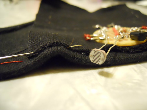
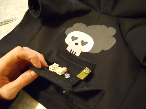
The LEDs on the hoodie’s pocket light up when it’s dark out and fade back when there is more ambient light. Perfect for evening walks in the winter when it gets dark far too early. The photo resister peaking out of the bottom of the pocket senses the amount of light present and the rest of the circuit reacts from there. There’s a lot going on in that little pocket!

A close up of the circuitry work of the Light Up Dog Hoodie. (click for more info!)

Close-up of the circuitry of the Light UP Dog Hoodie. (click for more info!)

If you’re interested in how it was made, I documented my work on this project in a flickr photo set with lots of notes. It’s much easier to describe in photos. The only part I didn’t take photos of was printing the skull and cloud on the fabric. Those were silk screened on the fabric before any of the sewing started.

Originally I had planned to make the hoodie a little more complex and include a lilypad arduino. As it turns out, a hoodie that fits a ten pound terrier is very small. Luckily I was able to convince one of my officemates, Tom, to do a little soldering for me for an alternate plan.

I used coin cell batteries (two 3V batteries) for this project because of their size and the fact that they would be easier to swap out in a small space. I was hoping that this project was still small enough to get away with using coin cells, but well, maybe not. They definitely work, but they die FAST. So, I’ll be buying a batch for cheap on eBay and then looking into lithium polymer batteries for my next project. Lesson learned.”

Open pocket on the Light Up Dog Hoodie. (click for more info!)

—————————————————————————————————————————————-

For more information, or to see what else Val & Jason are up to from time to time, be sure to visit This Is Portable or check out her full Flickr set about the construction of Tucker’s Light Up Dog Hoodie here.

Damn Fine Tea & Damn Fine Design

Series 1 teas in Nepalese, Ceylon & Chinese green styles. (click for more info)

It’s hard to tickle my design and happy feathers more than something like this does. Yummy, carefully crafted teas and super dupes design all smooshed up into one awesome product. Our  design-y peers (nay, HEROES) at Aesthetic Apparatus have teamed up with the folks at Damn Fine Tea to produce a series of limited edition teas, all with an eye as careful on the design as the teas themselves. If you are a design nerd or a tea devotee, or gasp! BOTH well dang, here’s our Nirvana. This is a design dream job.

Series 2 teas in traditional English tea styles. (click for more info or to purchase)

Tea-obsessed Damn Fine Tea offer exceptional teas, sold loose and processed traditionally, rather than industrially with custom blends and styles. All with a keen eye on the quality not only of each tinning, cup and brew, but in the design factor as well. Potentially an endangered cultural species these days. Plus, each style has specific brewing tips tailored for that particular tea for the perfect cup.

We love these tins’ killer flair and style, and of course we do. They are all designed by the powerhouse of fun, rad, and on-point Aesthetic Apparatus out of Minneapolis, MN.

With each series Damn Fine Tea & AA take a fresh approach to the tea’s style and name. This is so apparent with teas such Series 1 and Series 2 pictured above (inspired by British Victorian boxers & the wonders of the Far East) and the below Series 3 & Series 4, respectively inspired by Rock’n’Roll (YES! See? It’s a triple match made in heaven!) and 2010 The Year Of The Tiger.

Series 3 teas in Rock inspired styles. (click for more info or to purchase)

Sometimes tongue-in-cheek comes off poorly, more like tongue-in-cheekiness or it just falls flat. Not so at all with these designs paired so well with these teas. For instance, the Series 2 teas come with limited edition mini-posters, replicating the awesome old boxing posters of yore. A fact that’s coolness is only amplified by the fact that Aesthetic Apparatus are rooted firmly in the rock & gig poster scene as well as the Series 2 mini-poster designs evoke the phenomenal test print style that so many know and love AA for in the first place. It’s like a hall of damn designers, errr, I mean mirrors. With designers in them. Maybe.

Moving on, just peep the below Carävan tea with it’s adorable little blood dripping pentagram, surrounded by a ring of tea like a Dark Wizard waiting for his Master. Hehe.

Series 3 teas come with a freakin’ Tour Patch too. Seriously, if the AA guys weren’t so nice and cool, you want to hate them for being so damn fun.

Hellfire!!!! (click for more info or to purchase)

And finally, the newest addition to the Damn Fine Tea line is the ultra-limited edition tea for Series 4, Yunnan tea, inspired by 2010, the Chinese Year Of The Tiger. Raaarrrrrrrrgh! Amazingly, this tea is limited to just 50 (FIFTY! Come on, that’s crazy!) tins, with designed & hand screenprinted labels by Aesthetic Apparatus. At the time of writing this blog post, only 6 tins remained…duh DUH.

So, these Damn Fine Teas are my current obsessive design and tasty treat geek out. Pass it on if you’re down.

We can’t wait to see what comes next.

Series 4 tea is Yunnan & limited to just 50 tins. (click for more info or to purchase)

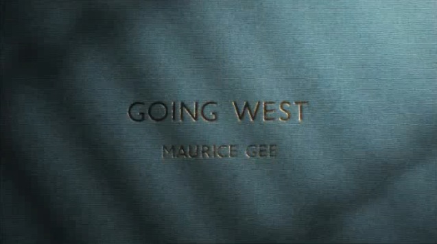
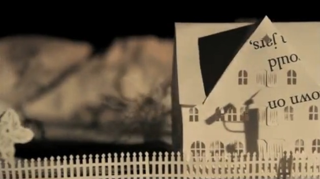
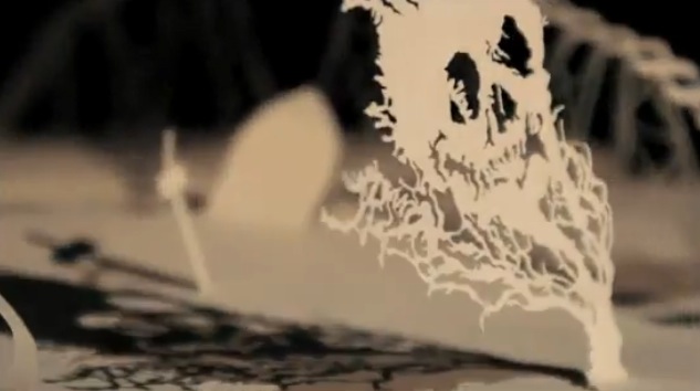
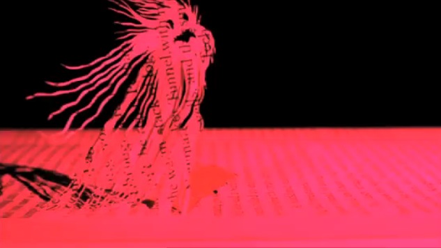
Stunning animation: Maurice Gee’s “Going West”, by Andersen M Studio

(click to watch the animation)

So, here is a really cool animation that I found through my friend Standard Design’s Twitter feed today (Tom Pappalardo) and I’m just unable to stop watching it.

It’s from an outfit called The New Zealand Book Council, a not-for-profit organization that serves to promote more reading, foster a love of  books and promote New Zealand authors. I think it’s just completely riveting, beautiful, eerie, and downright superb.

(click to view the animation)

Paper cutting, stop-motion, and plain old lighting are 10,000x more mysterious and lovely looking than computer-generated work. As a fan of very old Disney (just about only the old stuff) and more so Warner Bros. classic Looney Tunes work, I’ve said it a million times before and I’ll probably be saying it in my grave.

(click to view the animation)

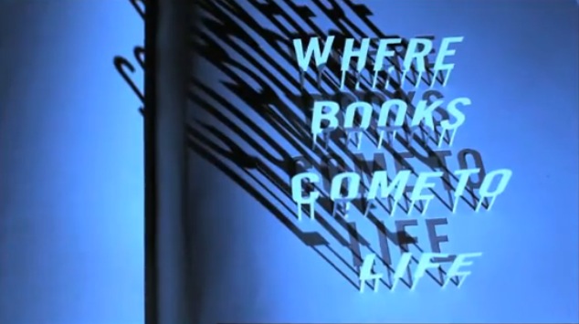
This piece, “Going West” is based on a novel by New Zealand author Maurice Gee. Produced for The New Zealand Book Council by the Andersen M Studio in London (a multi-talented brother & sister duo), the aim is clear as the NZBC’s motto at the end of the animation suggestion, to bring books to life. This piece is a stunner in that attempt.

(click to view the animation)

The NZBC’s mission statement reads: “Bringing books and people together. Like no other human activity reading opens up our imagination. It enables us to understand those around us. It allows us to project the future and reach back into the past. Reading can entertain, challenge and educate. We believe that reading can transform people’s lives.”

Having never heard of Maurice Gee, I can assure all that I will be seeking out his work based purely on the animation done here from his novel “Going West”, so it appears that their aims have worked a bit already. And, I’m now a HUGE fan of the Andersen M Studio, who’s range of work runs from animated pieces (as evidenced here) to commercial photography, music-making, and music packaging to book design. Perhaps I’ve found new heroes.

To learn more about the novel “Going West” click here.

To learn more about Maurice Gee, click here.

To learn more about Andersen M Studio, click here.

To learn more about The New Zealand Book Council & it’s projects, click here.

(click to view the animation)