Strawberryluna

Sweet new Sisters Red news & fun stuff!

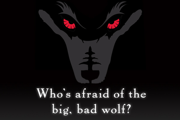
Are you afraid?

We’re not. With the impending release date of the new Jackson Pearce novel Sisters Red creeping slowly closer (the official release date is June 7th, 2010), we’re getting pretty excited around here. The buzz about Pearce’s 2nd Young Adult novel is really good, and moreover, the cover art illustration and jacket design that we did for Jackson Pearce and her publisher Little, Brown & Co. has also been getting attention as well.

That’s just rad. I won’t lie. It’s not just gratifying as a lowly, often practically anonymous book jacket illustrator and designer, (I mean, I know that I look to see who designed covers I like, but really, I know that’s also an art nerd thing too).

Here’s the thing: The main challenge we were given when first approached for this book jacket design by Little, Brown & Co. was to create a cover illustration and design that would fully pull people across a crowded book store just to find out more about Sisters Red, based purely on the cover art. Awesome! That’s the sort of challenge every designer and illustrator wants, and, it’s also the kind of challenge is, well, frankly a heck of a challenge. However, working on this project was not only that, but super fun and one of the most rewarding creative experiences strawberryluna, as a firm, has had to date. It’s not surprising really, as Little Brown, & Co. is also the publisher for the Twilight Series as well, also with a stunningly notable cover art. We’re so thankful and excited about the whole shebang we wanted to share a little more with you.

Coupled with the coolness and a well-written upcoming new book like Sisters Red, you can imagine it’s been a dream project already. And the publication date is just over a month away!

To that end, there’s a bunch of fun goodies over at the Sisters Red website here. Like what? Alright, hold on a sec, I’ll ya. Dang!

There are beautiful Wallpapers for your Mobile Phones (the iPhone sized one is below as an example) and for your Computer Desktops here, all perfectly sized and ready to go for you.

Click to view all Wallpapers, sized & ready to download.

And, there are some neat E-Cards, as shown below. Send them and spook your friends into Believing.

Click to view & send all E-Cards.

Click to view & send all E-Cards.

Also, the lovely Jackson Pearce is not only an author, but a really great video-blogger. She’s always up to new and fun posts at her Live Journal site, and via her YouTube site as well. She posts about what she’s writing, the creative process, and speaks directly with her fans as well as other authors weekly. In a word? She’s rad!

If you are more interested in what Sisters Red is about, (and of course you are), you can click here to read an excerpt and definitely check out this promo video Pearce posted recently about Sisters Red here:

And finally, (wowzers!) a review of Sisters Red’s cover art from Barnes & Noble.com by Melissa-Walker, with Pearce’s perspective as well. We’re just tickled! Click here to read it.

Thanks so much again Jackson & Little, Brown, xo.

New art print release: ‘Let Love Grow’ hand screenprinted, limited edition

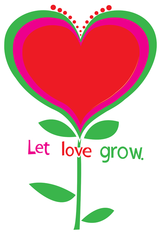
New hand screenprinted, 3-color, limited edition art print: "Let Love Grow", fresh & ready. (click here for more info or to purchase)

Lately, I’ve been really obsessed with 60’s design, but not the psychedelic and (to me) overly wrought side, but more of the very clean and simplistic designs that came out of Madison Avenue in the forms of advertising and brand / logo design and cohesion. There is something so appealing about those directions to me, very pure. This print and design is a part of that interest, as well as a statement on everyday negativity & violence, be they figurative or actual.

Hey negativity! Scram! Just feed, water, and nourish love and it will grow like a flower forever.

This simple scene is my newest art print “Let Love Grow”, bright & ready to help you plant seeds happiness and love all around you. Featuring hand lettered text, it’s a perfect gift of hope and love for your sweetie pie, as a wedding gift, for a young person in your life, or to brighten up your own home.

Love: Let it grow bright and strong.

You, my friend, are looking at my 3-color, all hand screen printed, limited edition art print with fresh spring green, vibrant magenta, and heartbeat red hand mixed and non-toxic water based inks. Edition of 190. Size: 18 x 22 inches (45.7 cm x 55.9 cm.) Paper: acid free & archival Cougar, White 100lb cover weight.

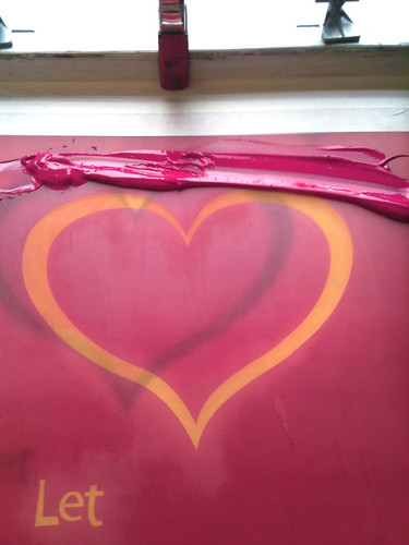
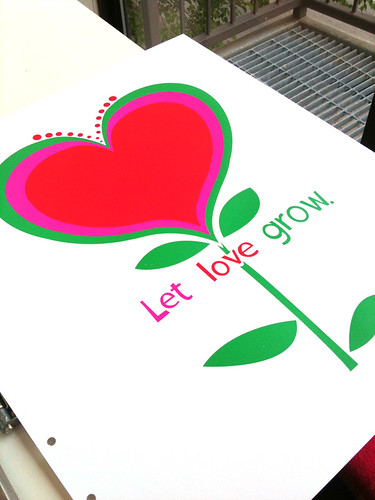
Below are some process photos, now also up on my Flickr account, of this art print, “Let Love Grow” being printed. Got questions? Shoot me an email!

1st color of "Let Love Grow", printed. (click to see more process photos.)

2nd color ink (magenta) in the screen, getting ready to print. (click here to see more process photos.)

About to print the 3rd & final color (green) of a new art print, "Let Love Grow". (click to see more process photos.)

All done! "Let Love Grow", finished printing and fresh for spring. (click to see more printing process photos.)

F*ck Up! A Test Print Exhibit

Just a few of the Test Prints in the exhibit.

FUCK UP :: A Test Print Exhibit

It’s a new gallery show that I’m in! And what a great name. I love it. I have a few Test Prints in this new show, opening on April 2nd, 2010 in Lincoln, NE  at
SCREEN INK  from 7:00pm – 11:00pm. If you have a Facebook account click here for the Event Page & all of the details. And also, for more information check out this article describing the show and the screenprinting process as well as a little info on Test Prints & why so many printers have them.

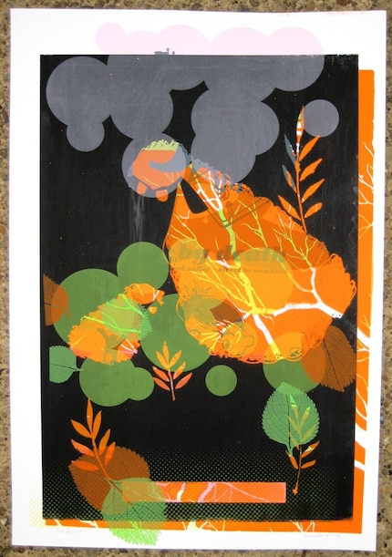
Test prints are by-products of the screen-printing process that contain a multitude of layers of color and shape from numerous different posters, resulting in (occasionally) beautiful, one-of-a-kind monoprints. Because the process is completely spontaneous and unplanned, imperfections and accidents are embraced rather than shunned. FUCK UP is an art show that illuminates this emerging art form with a collection of prints from numerous international artists, both celebrated and up-and-coming. Test prints are an intersection of art and design, individuality and mass production, inspiration and collection, planned and impromptu.

Check out this sneak peek of the promo poster for the FUCK UP show. 11 colors down, 6 more to go!

OPENING: April 2nd, 2010 in Lincoln, NE  at SCREEN INK  from 7:00pm – 11:00pm
Please join us at our First Friday opening reception for booze, classy hors d’oeuvres, shit-talking, and brown-nosing (not necessarily in that order). You’ll meet some of the artists and can badmouth the ones who didn’t show up. DJ set by Darren Keen from The Show Is The Rainbow!! The official after party will be located at the nearby YEE OLDE TAVENRE.

Featured Artists
The Bubble Process (Cleveland, OH and Brooklyn, NY) – http://www.thebubbleprocess.com
Delicious Design League (Chicago, IL) – http://deliciousdesignleague.com/
Doe Eyed (Lincoln, NE) – http://www.doe-eyed.com
Bennett Holzworth (Lincoln, NE) – http://www.bennettholzworth.com
Steady Print Shop Co (Minneapolis, MI) – http://www.steadyprintshop.com
Ron Liberti (Carrboro, NC) – http://www.gigposters.com/designer/18832_Ron_Liberti.html
Micah Max (Omaha, NE) – http://www.micahmax.com
Pat Oakes (Omaha, NE) – http://www.inktankmerch.com
Sidekick Design (Portland, OR) –http://www.gigposters.com/designer/43745_Sidekick_Design.html
The Silent Giants (Detroit, MI) – http://thesilentgiants.com/blog
Dan Stiles (Portland, OR) – http://www.danstiles.com
strawberryluna (Pittsburgh, PA) – http://www.strawberryluna.com
We Buy Your Kids (Sydney, Australia) – http://www.webuyyourkids.com
Workshop (Lincoln, NE) – http://www.workshopworkshop.com
Young Monster (Chattanooga, TN) – http://www.weareyoungmonster.com

One of my Test Prints, available for sale n my Etsy shop. (click for more info or to purchase)

Addendum! Here is a great review of the opening night of the Fuck Up Test Print show complete with an awesome video of the crowd and live test print tshirt printing and of course, tons of rad Test Prints on the walls. The video is HERE!

2 new art prints released: Lovebirds & Going To See My Baby Lavender

New 7-color hand screenprinted art print, "Lovebirds" now available. (click for more info or to purchase!)


Ok! This is a quick post as I really should be packing my clothes for Flatstock & SXSW in Austin TX (see this previous post for more info), so I will keep this one short and sweet.

I jammed out two brand new art prints this past weekend in a marathon printing run. 2 days, 8 screens, 13 colors, 1,000+ pulls, 200+ prints =  2 new prints. BOOM!

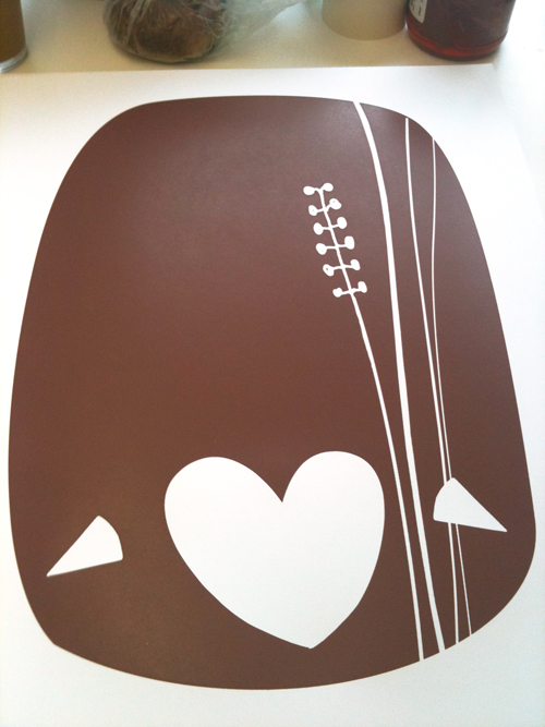
The first print is above, and it’s called “Lovebirds”. When we were working on our poster for St. Vincent, we started playing around with the flower illustration and found that it made very cute little birdies, we added a heart and ta-da! Lovebirds.

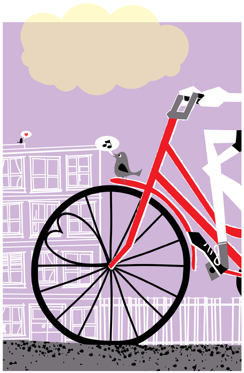
The second new art print is below, and it’s a fresh new colorway of my very popular “Going To See My Baby” print, now in Lavender. I love that lemony cloud action. I have to say as well that it’s kinda funny that both new prints feature hearts and love and romance quite prominently. Spring is here!

New 6-color hand screenprinted art print, "Going To See My Baby Lavender" now available. (click for more info or to purchase!)

It’s been really awesome getting to work out of my new studio space, rockin’ out to music and watching movies too while printing. In fact, I did a little Twitter contest while printing “Lovebirds” and asked if anyone could name the movie that I was watching in the background of a Photoshop mock, and wouldn’t you know it? Someone (@kurometarikku) got it right on the money by identifying “The Great Race” from a terrible screenshot. Amazing! Check out the photo below:

The Great Race in the background. Goofy, yes. But Jack Lemmon never disappoints.

And here are a few process shots of each print, sorry that they are not up on Flickr yet, but they will be next week! Apologies for some of the greyed out light. I do live and work in Pittsburgh, PA afterall. The actual prints are on lovely & crisp white paper 🙂

1st color of my new hand screenprinted art print "Lovebirds". (click for more info or to purchase)

2nd color of my hand screenprinted new art print "Lovebirds". (click for more info or to purchase)

3rd & final color of my new hand screenprinted art print "Lovebirds" drying on the rack. (click for more info or to purchase)

1st, 2nd, & 3rd colors printed of my new colorway "Going To See My Baby Lavender" art print.

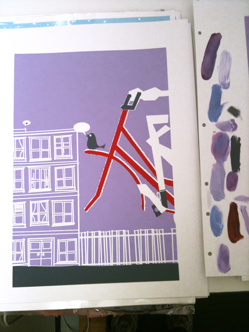
Colors 1,2, and 3 of my hand screenprinted art print, "Going To See My Baby Lavender, with color test smears of inks on the right. (click for more info or to purchase!)

4th color down (black) of my hand screenprinted art print, "Going To See My Baby Lavender". (click for more info or to purchase!)

All done! New hand screenprinted art print, "Going To See My Baby Lavender". (click for more info or to purchase!)

Twin Soul Art Studio & Chris Bryant Guitar School opening!

This is one of those stories about when two souls meet and see their counterparts in one another. It really is.
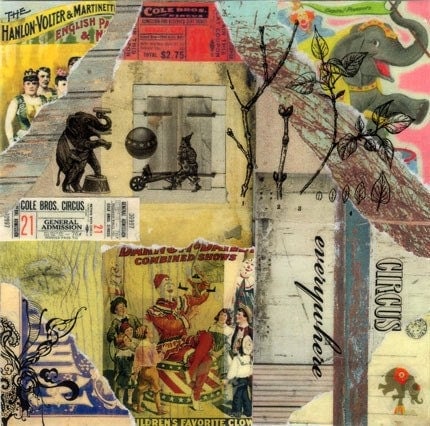
A couple of months ago I was contacted by a lovely woman & fellow artist named Jeanne on Etsy.com (check out her shop Three Paper Pigs here! and her beautiful collage below) who had some questions about a few of my posters.

"Circus Everywhere" by Jeanne of ThreePaperPigs. (Click for more info!)

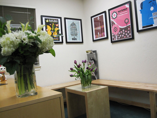
After conversing back and forth, she placed a rather large order (to my amazement and delight) of posters and told me that she and her partner were opening up a brand new art & music space in Los Gatos, CA, in the greater San Francisco Bay area, in the form of a new guitar school and art studio. I was thrilled and honored that these two artists chose a bunch of my work, from all of the talent they saw on Etsy to help decorate their new endeavor.
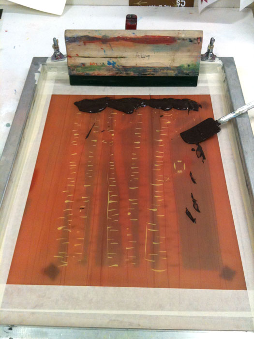
At the time, they were still working furiously to completion, but now, it’s all done, ready, and up and running so I’d like to introduce you all to the Twin Soul Art Studio & Chris Bryant Guitar School.
Twin Soul Art Studio & Chris Bryant Guitar School open & ready for you!

Twin Soul Art Studio & Chris Bryant Guitar School open & ready for you!

Jeanne (an artist and designer) and Chris (a musician, ceramicist and guitar teacher) describe their new venture as a true labor of love here on Three Paper Pigs blog:
Chris and I just had our grand opening last weekend and it was truly a blast. We celebrated the opening of Chris Bryant Guitar School and Twin Soul Art Studio in downtown Los Gatos, CA. We had two weeks to prepare the school and studio before the celebration, so you can imagine how busy we were after Christmas until the day of the event on January 10th. I took care of putting up all the wall decals (Dali Decals on Etsy) and my sister helped me design the Twin Soul Art Studio logo as a main focal point for the back wall. I prepared the appetizers for over 100 people and loved how everything came together. My family was a great support and they flew out from Hawaii just for the event. The weather brought sunshine, lots of traffic, happy hearts and awesome music. Chris put together a five-hour playlist of Indie artists – The Decemberists, Black Moth Super Rainbow, Brett Dennen, Tristan Prettyman, Meiko, Joshua Radin, Belle & Sebastian, Matt Costa, Someone Still Loves You Boris Yeltsin, The Dandy Warhols, We Are Scientists, Bishop Allen, As Tall As Lions and Ben Harper to name a few! And, I was happy to also put up tons of gig posters by the talented and down-to-earth artist Strawberry Luna on Etsy.

Artists an co-creators, Jeanne & Chris.

Yum! And so much natural California light too.

As you can see from their photos for the opening, they’ve created an incredibly positive and warm space to foster creativity on many levels. We here at strawberryluna wish them the best of luck and are so honored to have  such an array of our work gracing the walls of the Twin Souls Art Studio and the Chris Bryant Guitar School.
If you are in the Bay Area in California, please check them out! Get a guitar lesson, or schedule a time for a fantastic hands-on art learning experience. The new Twin Soul Art Studio & Chris Bryant Guitar School is located at:
644 N. Santa Cruz Ave., Suite #9
Los Gatos, CA 95030
40-354-7400

More details for you and websites about this rad couple that you should check out:
Chris Bryant Guitar School – all information about schedules, hours, Chris, the guitar school, directions and more are here.
Three Paper Pigs – Jeane’s line of custom stationary and her super cool collage pieces in mixed media and more.
Three Paper Pigs on Etsy.com – a good selection of Jeanne’s currently available collage pieces are here.
Three Paper Pigs Blog – you know what a blog is! Lots of great stuff to be found there.
Chris Bryant’s pottery can be found here.

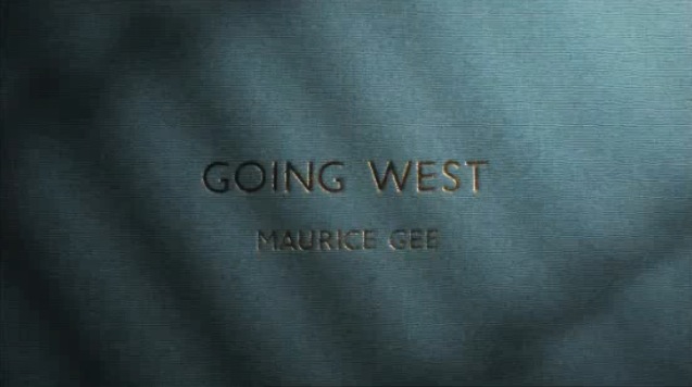
Stunning animation: Maurice Gee’s “Going West”, by Andersen M Studio

(click to watch the animation)

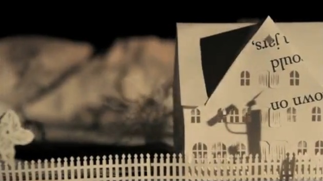
So, here is a really cool animation that I found through my friend Standard Design’s Twitter feed today (Tom Pappalardo) and I’m just unable to stop watching it.

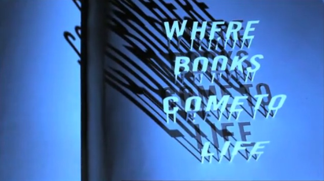
It’s from an outfit called The New Zealand Book Council, a not-for-profit organization that serves to promote more reading, foster a love of  books and promote New Zealand authors. I think it’s just completely riveting, beautiful, eerie, and downright superb.

(click to view the animation)

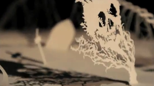
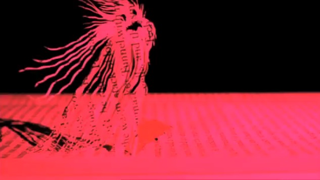
Paper cutting, stop-motion, and plain old lighting are 10,000x more mysterious and lovely looking than computer-generated work. As a fan of very old Disney (just about only the old stuff) and more so Warner Bros. classic Looney Tunes work, I’ve said it a million times before and I’ll probably be saying it in my grave.

(click to view the animation)

This piece, “Going West” is based on a novel by New Zealand author Maurice Gee. Produced for The New Zealand Book Council by the Andersen M Studio in London (a multi-talented brother & sister duo), the aim is clear as the NZBC’s motto at the end of the animation suggestion, to bring books to life. This piece is a stunner in that attempt.

(click to view the animation)

The NZBC’s mission statement reads: “Bringing books and people together. Like no other human activity reading opens up our imagination. It enables us to understand those around us. It allows us to project the future and reach back into the past. Reading can entertain, challenge and educate. We believe that reading can transform people’s lives.”

Having never heard of Maurice Gee, I can assure all that I will be seeking out his work based purely on the animation done here from his novel “Going West”, so it appears that their aims have worked a bit already. And, I’m now a HUGE fan of the Andersen M Studio, who’s range of work runs from animated pieces (as evidenced here) to commercial photography, music-making, and music packaging to book design. Perhaps I’ve found new heroes.

To learn more about the novel “Going West” click here.

To learn more about Maurice Gee, click here.

To learn more about Andersen M Studio, click here.

To learn more about The New Zealand Book Council & it’s projects, click here.

(click to view the animation)

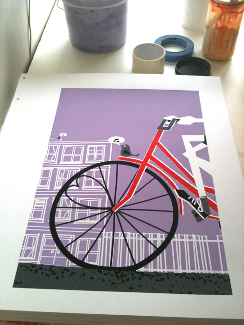
New release: Going To See My Baby Sage art print

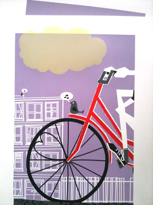
6-color, all hand screenprinted "Going To See My Baby Sage" art print. (Click for more info or to purchase!)

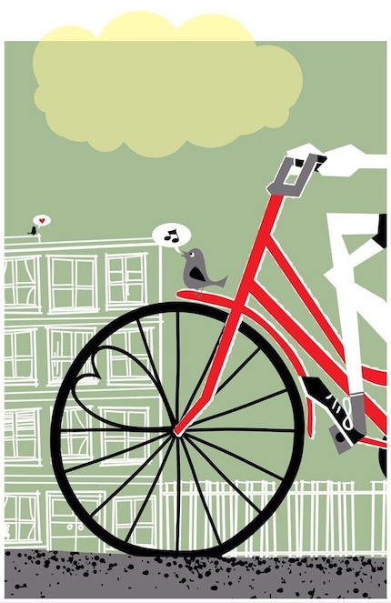
Love love love! Everyone falls in love. You included! And you are looking at my hand screenprinted, limited edition art print “Going To See My Baby Sage”.

This screenprinted happy day is a brand new colorway of a very popular print that I did in 2007, but in a super small edition, now returned in sage green & soft lemon, just for you.

Going To See My Baby Sage is my 6-color, all hand screen printed art print with holiday green sage, bright bike red, dark grey, black and soft transparent lemon hand mixed and non-toxic water based inks. And yes! The lemon cloud breaks the margin/border just like a good cloud should, and is partially transparent over the white margin. Tweet! Edition of 95. Size: 16 x22 inches (39.4 cm x 55.9 cm.) Paper: acid free & archival Cougar, White 100lb cover weight.

Click here for more information or to purchase from my website, or visit my Etsy shop or even check out my 1000 Markets shop.

New print released: Winter 2009

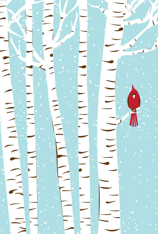
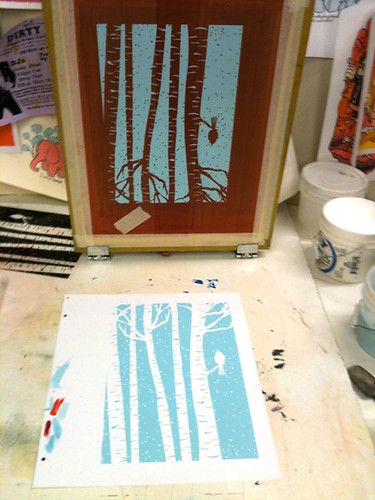
Hand screenprinted, 3-color art print 'Winter 2009', part of my seasons series and available now. Click for more info!

Yay for cold weather, hot cocoas, snow and bar branches! Yes, that’s right, I mean it. I am a true Northerner because I love Winter. And my newest print is a love letter to an under-rated season.

I just love that absolute quietness that falls with snow in a forest. We have Cardinals here in the winter, and their brilliant red always darts out from the winter pattern of color behind them like a signal, reinforcing the magic of a winter’s day.

Hey hey! So you looking at my Winter 2009 art print, a part of my new Seasons series. This is the fifth print in series of seasonal, limited edition prints that I’ll be releasing. Ready? Here’s the mind-blowing part = there will be 4 per year.

Winter 2009 is my 3-color, all hand screenprinted art print with icy blue, bark brown and scarlet red hand mixed and non-toxic water based inks. Edition of 119. Size: 16 x22 inches (39.4 cm x 55.9 cm.) Paper: acid free & archival Cougar, White 100lb cover weight.

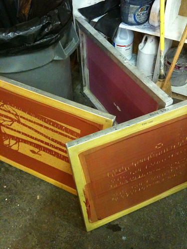
As always, here are a few photos of the print in progress, and you can see more at my Flickr page here too.

3rd & final color ink, ready to go!

Happy Halloween!

Run!

Yay! It’s Halloween, my fav-o-rite! From current celebrations to Halloween’s incredibly rich pagan history across many cultures and groups of people and religions, the close of summer and the end of the harvest is an incredibly powerful and interesting time. Be a dork like me and learn more here: Halloween Wikipedia entry.

Here are a few vintage Halloween postcards that I’ve found around the web and really love. I’m just fascinated by how many postcards used to be produced to commemorate nearly every day. And as always with vintage postcards, the emotional and stylistic gamut they run is so interesting.

We’ve got your spooky (above) and your portraiture (below)

It's like a family photo.

A little classic witchery, complete with some amazing characters in the cauldron’s smoke.

Witch & kitty & friends.

A touch of what the…???

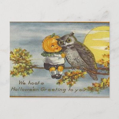
The traditional Pumpkinhead & Owl BFFship.

The traditional Pumpkinhead Baby & Owl BFFship.


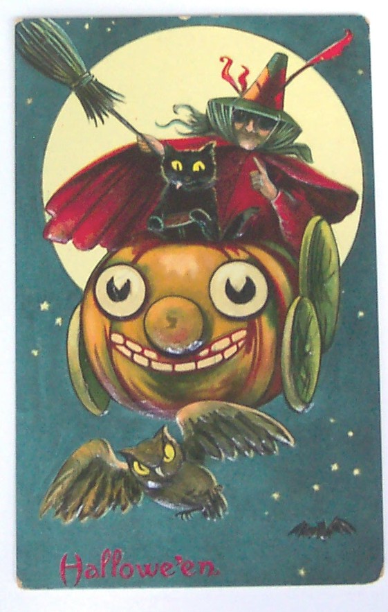
Rad pumpkin cart!

Sage advice from the Greeks to us.

A little Victoriana is always found in postcard art:

Vintage Sexy Witch, omg!

Some things never change.

The Man In The Moon likes what he sees.

And this gem that has a lot more in common with Halloween’s ancient thematic roots of the harvest and fear of winter than most of things we see now:

Scary!

So, enjoy!

Happy Halloween scary blast from the past. Poor Pluto!

New art print released: Fall 2009, in 2 colorways!

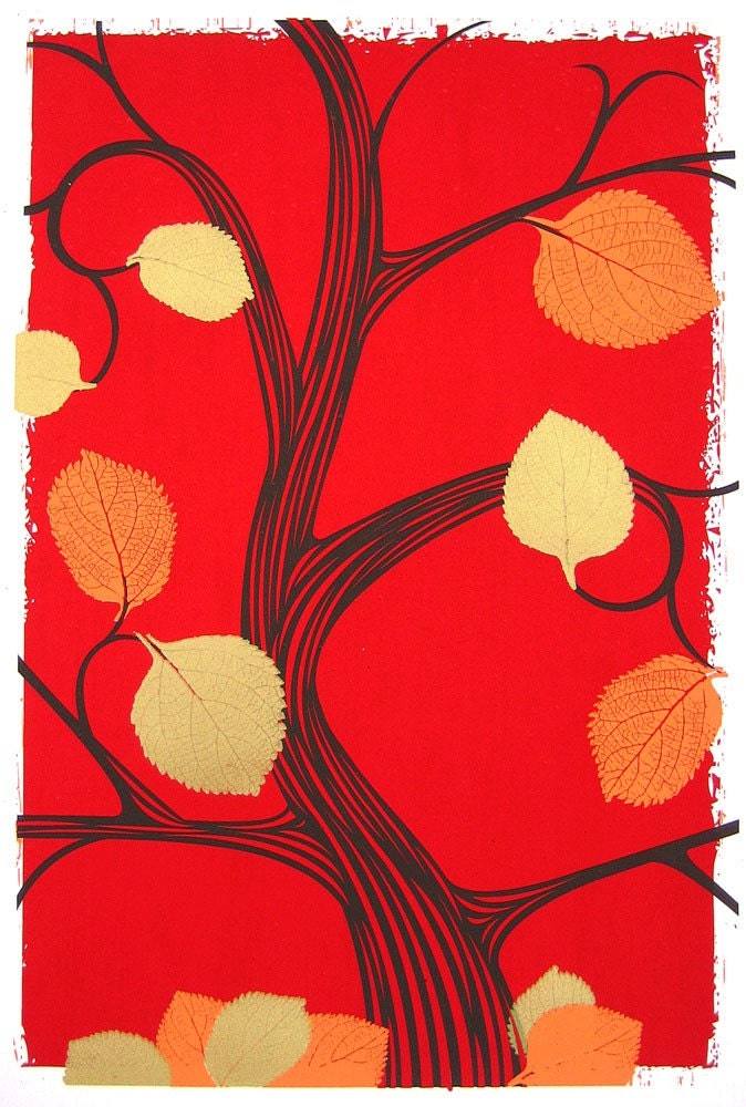
Hand screenprinted, 4-color love letter to fall. Clock for more details or to purchase.

Hand screenprinted, 4-color love letter to fall. Click for more details or to purchase.

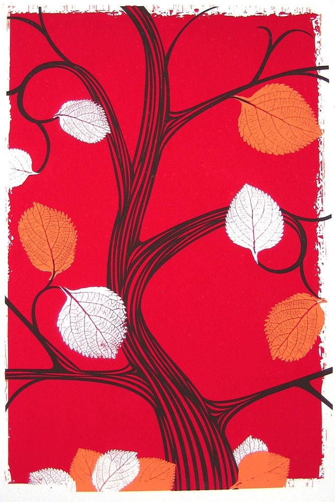
Fall & Autumn, my favorite 2 seasons. So, I’m not at all surprised that while in the process of hand printing this art print, I decided to do two colorways of the same print. This is the fourth print in series of seasonal, limited edition prints that I’ve been doing all year. That’s right, they fit the number of seasons, crazy right?!

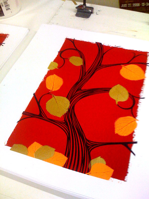
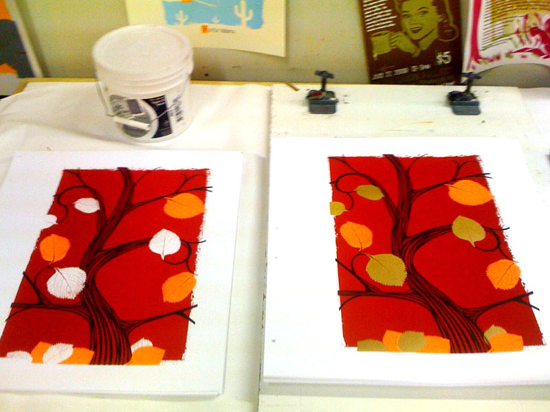
Anyhoo, here you see both colorways, the above as planned 4-color design with metallic gold leaves, (edition of 75) and the below with frosty, nay, ghostly white negative space leaves. A harbinger of things to come (a smaller edition of just 25). The leaf shapes are from leaves that I gathered on a dog walk and scanned in at home a couple of years ago. I love their shape and definition.

Click either image for more details or to purchase, cause those clicks will take you right to my website.

Hand screenprinted, 3-color love letter to fall. Click for more details or to purchase.

Hand screenprinted, 3-color love letter to fall. Click for more details or to purchase.

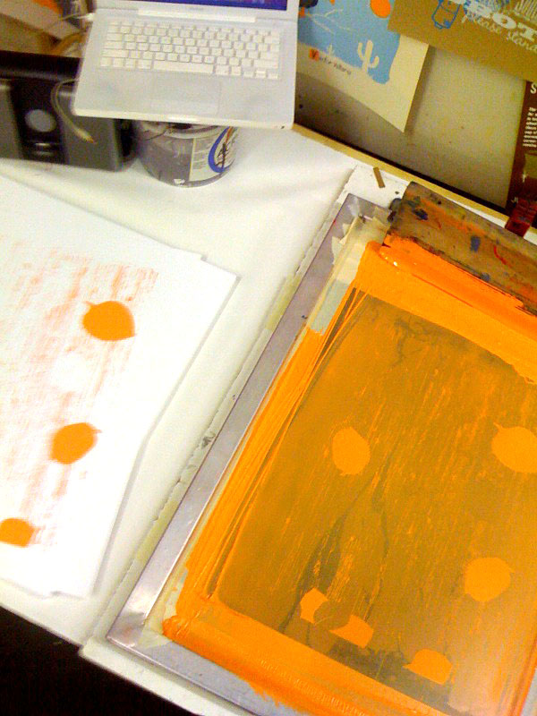
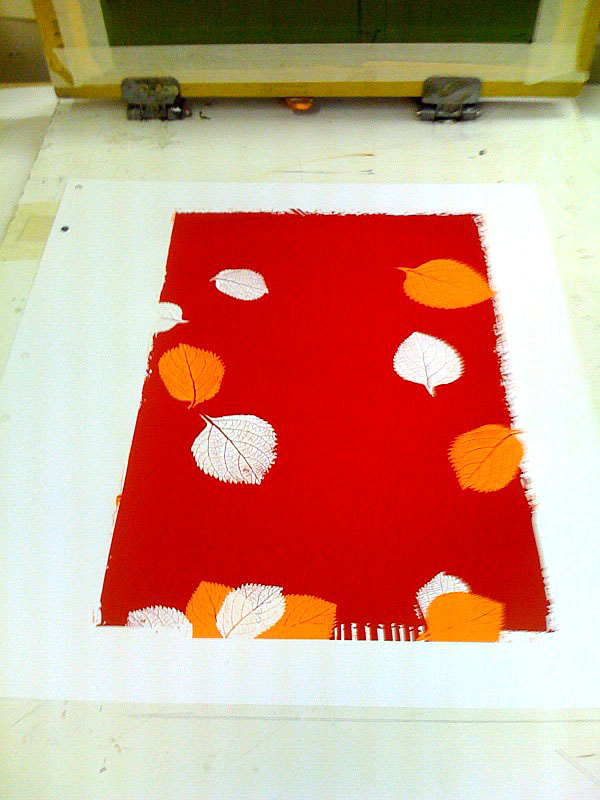
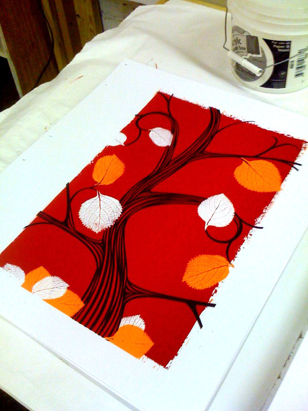
And, here are a few cruddy phone-photographs of the print in progress while on press:

First color, orange, being printed.

First color, orange, being printed.

2 colors completed, things are shaping up!

2 colors completed, things are shaping up!

3rd color, the brown of the tree. This is where I started thinking about splitting the edition in two.

3rd color, the brown of the tree. This is where I started thinking about splitting the edition in two.

The final 4-color print, on press and all done.

The final 4-color print, on press and all done.

Side by sidesies.

Side by sidesies.

New poster released: The Decemberists

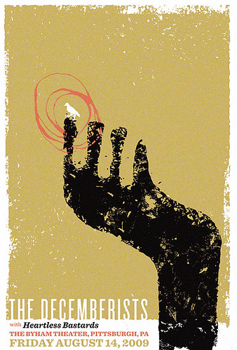
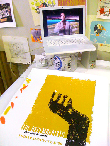
Hand screenprinted 3-color poster for The Decemberists show on 8/14/09 at The Byham Theater in Pittsburgh, PA

Hand screenprinted 3-color poster for The Decemberists show on 8/14/09 at The Byham Theater in Pittsburgh, PA

No surprise, I love, love The Decemberists, they work the lovely and dark into a thing of beauty and complexity so well, so deftly. We’re really pleased and excited to be working with them once again for this poster.

This poster is my all hand screenprinted ode to The Decemberists “The Rake Song”. It’s a 3-color print with bright & shiny metallic gold, midnight black and rusty pink inks. Edition of just 110. Size: 16w x 22h inches. Paper: acid-free & archival Cougar 100 lb White, cover weight. Available on my website here.

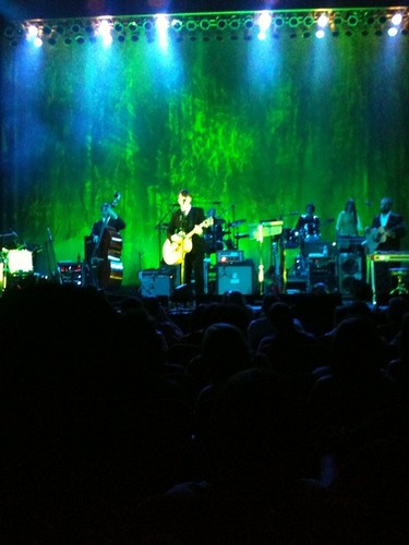
Their show in Pittsburgh last night was fantastic, exceeding even the rumors we’d heard and expectations set up from tales of previous nights’ shows on tour. Playing “The Hazards of Love” from start to brutal finish, kicking much ass with a killer rendition of Heart’s “Crazy”, and giving a magical reenactment of “The Battle Of Fort Pitt” by The Decemberists Family Players, we were spellbound. And now I’m even further in love. Thank you for the magic. And thanks again for signing a copy of your poster for us too!

The Decemberists take the stage at The Byham Theater

The Decemberists take the stage at The Byham Theater.

For more progress photographs of this poster being printed, check out more photos on my Flickr page here.

Finished poster & Carl Sagain. Yep.

Finished poster & Carl Sagan. Yep.

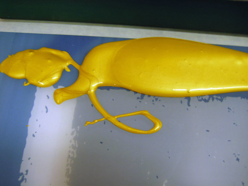
Gold ink, ready to go.

Gold ink, ready to go.

Vintage postcard art & design; Part 1: Dogs

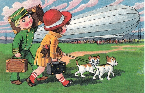
The trip of a lifetime! (Pre-Hidenberg, assumably.)

The trip of a lifetime! (Pre-Hidenberg, assumably.)

Postcards used to be far far more popular than they are today. Possibly as a pre-television, pre-Internet way of communicating, and possibly due to their fairly cheaply reproduced but lovely art and extremely variable style, they once enjoyed a big place in popular culture, not just of vacation destinations but of everyday life. Because of that large volume of postcards produced in the late 19th and well into the 20th centuries, both photographic and purely illustrated, there are many amazing sub-genres, several of which have become highly sought for collectors. I’ve decided to start another irregular series of posts, featuring the art and design of postcards. Today’s post? Dogs, dude.

Dogs are obviously well loved pets and companions, perhaps because of that long history they also have a place symbolically with humans as well. I was surprised to find that despite being Man’s Best Friend, many of the images I came across were actually of women and little girls with dogs.

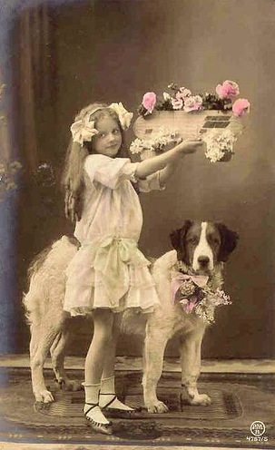
A flower dog and a flower girl.

A flower dog and a flower girl.

Summer reading.

Summer reading.

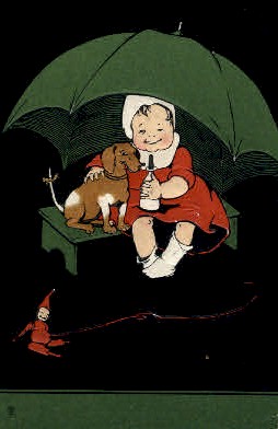
There are also many many images in which children and dogs seem to be equals, as below where a young girl shields her dog from rain while they sit on the same bench:

Finding shelter together.

Finding shelter together.

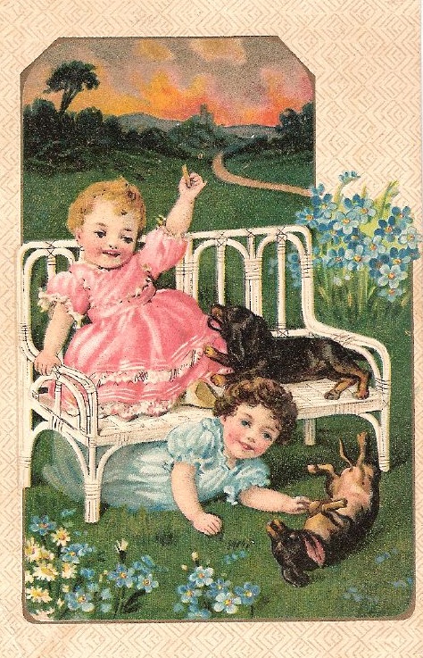
And this one, where one child is rollicking on the ground at dog-level, and the other pup is up on the bench, elevated with her friend:

All friends here.

All friends here.

Whoah.

Whoah.

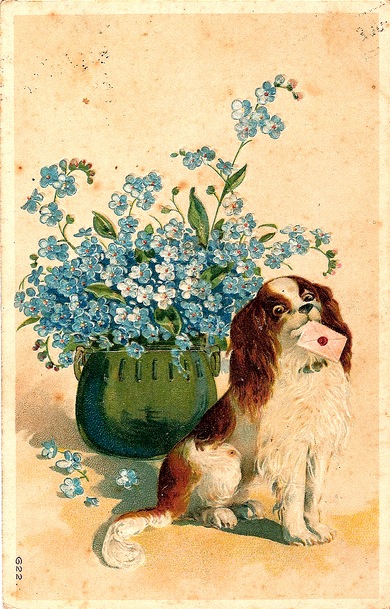
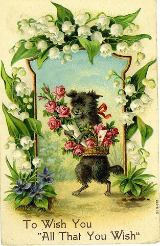
Being a symbol of fidelity, I love the many subtle variations on a warm greeting and love letters that I found as well. Many featuring the blue flower Forget-Me-Not as an added layer of meaning:

Cute, but psycho.

Cute, but psycho.

How sweet.

How sweet.

There are many postcards which simply show off a specific breed’s characteristics, either in a straightforward way or more comically:

A noble Irish Setter in the field.

A noble Irish Setter in the field.

Poor little Dauchshund, he's only the way we made him.

Poor little Dauchshund, he's only the way we made him.

Washing Day, Scottie style.

Washing Day, hard-working Scottie style.

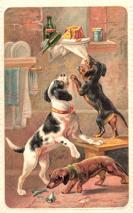
I expected to find postcards of dogs getting into all sorts of troubles, probably fed by the iconic Coppertone ad illustration, like the below little scamps:

Sneaky Petes.

Sneaky Petes.

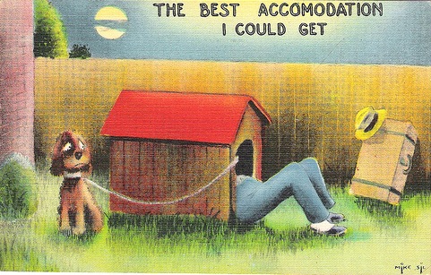
And of course, I knew there would be some great and symbolic postcards of doghouses, to convey being in trouble, often with one’s spouse:

Sleep tight.

Sleep tight.

However, a surprising find was a plethora of postcards featuring dogs working in some traditional and other very surprising situations. We’re all familiar with the idea of Arctic travel and mobility using dog sled teams:

Mush!

Mush!

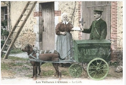
But mostly likely, if like me, you are also not familiar with the use of smaller dogs teams to haul milk carts, which was quite common in the 19th and early 20th century:

Pups taking a break.

Pups taking a break.

A French milk dog cart.

A French milk dog cart.

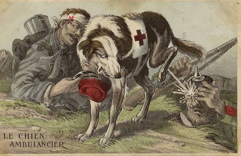
But perhaps the most intense or emotional are the postcards featuring dogs and men in times of war. Of course the arguments can be made that animals shouldn’t be conscripted to serve in the wars of mankind. It seems absurd. And unfair. Perhaps that is why seeing images of dogs, such faithful and willing friends, in these scenes (both photographic and illustrative) is especially bittersweet.

dog-med-war3

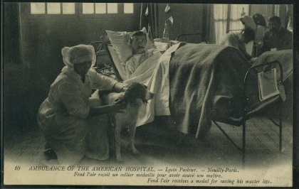
A dog who saved this soldier's life and received a medal.

Rover, hatin' on the Enemy.

Rover, hatin' on the Enemy.

A German Shepard medic.

And finally, but never ever least, there is this stunner:

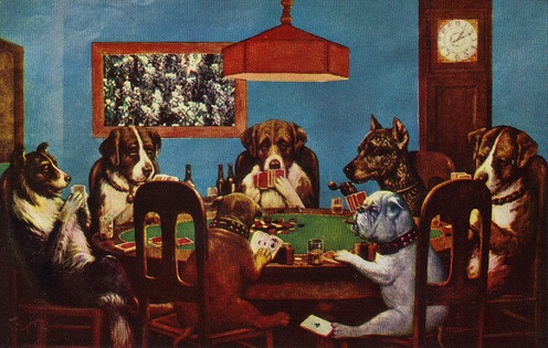
Look! The bulldog is cheating!

Look! The bulldog is cheating!

“Naïve: Modernism and Folklore in Contemporary Graphic Design”, aka I can’t believe I’m in this book (!)

This year is rich with books celebrating and exploring current graphic design, screenprinting and the vibrant hands-on design processes. The newest book that I’m beyond in love with is Naive:  Modernism and Folklore in Contemporary Graphic Design. And I am thrilled and honored to have a selection of my posters in this book with an amazing collection of ridiculously talented artists from around the globe.

Published by the German art & design publishing & curration house Gestalten, they describe this beautiful book best:

“Naïve documents the extraordinary renaissance of Classic Modernism, from the 1940s to 1960s, in contemporary graphic design. This compilation introduces a new wave of young designers who are rediscovering the stylistic elements reminiscent of classic graphic design such as silkscreen printing, classical typography, hand lettering, woodcutting and folk art and integrating them into their work. Inspired by 20th Century American legends such as Saul Bass, Charley Harper and Alexander Girard, the burgeoning designers and their work showcased this in this book are inspiring, ranging from illustrations, poster art, editorials, book covers and record sleeves to stationary and textiles.”

Naïve is a seriously stunning book filled with jaw-dropping illustration and design work at every turn of the page. No foolin’. Naïve is available at Gestalten’s website, or Amazon, and book sellers near you.

Renegade Craft Fair in Brooklyn, this weekend!

So go darn it!! RCF is in McCarren Park (but not in the pool this year) in lovely Brooklyn, NY.

Sadly, I won’t be attending or vending this year 🙁 due to other travel plans in June. And I’m so bummed because this year’s Renegade Craft Fair is the biggest and best looking offering of amazing handmade crafts, art to date. The offering of incredible work from the DIY and Handmade culture is just fantastic, and the Renegade Craft Fairs are the premiere shows loaded with international talent.

Seriously. I feel like a ghost and watching all of my crafty, arty friends are hanging out together. BooooOOOOoooo :rattleschanins:

So, since I can’t go, you go for me! Say hello to my friends below and spread the word. See you next year Brooklyn!

Some of my favorite artists and crafters whom you should check out & totally say HI! to for me:

Berkely Illustration – amazing animal and other illustrations.

Bossa Nova Baby – super fun hand screenprinted skirts, sewn embellishment and retro-cool accessories. (And one of the funniest people I know.)

Giant Dwarf – beautiful embellishments for your head, hair and heart.

Hero Design Studio – these guys are my stone cold BFFs. Amazing every which way, including loose.

Isle of Printing – quite possibly the best that there is out there. Ever.

Mat Daly – amazing printmaker and poster artist

Mogo – modern goods from scratch, and two of the coolest chicks ever.

Nina Dinoff – fantastic fresh modern jewelry

Orangyporangy – maker of the cutest skirts EVER.

Ragtrader Vintage – retro-awesome jewelry, and a Pittsburgher! This is her 2nd show ever, so be NICE damnit. 🙂

Seattle Show Posters – great prints and posters

Seibei – super fun shirts and a hoot of fella.

Tugboat – Huzzaah! Another fantastic Pittsburgh printshop. We’re loaded with ’em.

Twigs & Heather – incredible solid silver cast natural work. Unreal.

We Are Campfire – great dudes who make great threads.

The Who, What, Wheres:

This year’s event is taking place June 6 + 7 from 11am – 7pm, at McCarren Park. The full Artist list is up, so check it out and get a sneak peak at who will be there!

New art print released: Coffee, Thee & Me

Do you love coffee?

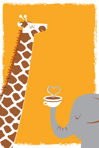
new 3-color, hand screenprinted art print, "Coffee, Thee, & Me"

New hand screenprinted, 3-color art print "Coffee, Thee, & Me"

Do  you love things that good, sweet, fair and even? What about best friends and love? You better! Otherwise where’s the fun in life?

This is my all hand screenprinted art print done for a traveling print show and Fair Trade coffee benefit organized by Mugshots Coffeehouse* in Philadelphia. These bestest buddies are my all hand screen printed art print with sun-orange, warm red-brown and elephant grey, hand mixed and non-toxic water based inks. Hi friend! Edition of 80. Size: 16 x20 inches (40.6 cm x 50.8 cm.) Paper: acid free & archival Cougar, White 100lb cover weight.

Freshly printed and available on my website here.

_________________________________________________________________________

Beans & Screens, screenprinted art print Coffee Show 2009 Important Details:

*Mugshots Coffehouse in Philadelphia is a part of the Independents Coffee Cooperative, both working collectively to raise $16,000 for the Peruvian farmers who grow the coffee sold as their house coffee (Independents Peruvian Select). The farmers are undertaking an ambitious project to build a solar powered drying facility (to dry the beans after they are harvested). This will allow for the farmers to improve both the quality and quantity of the coffee they grow, by protecting it from the frequent rains in the region. 100% of the profits made through the show at Mugshots will go to Cooperativa San Fernando, a farmer-owned organic coffee cooperative located high in the Andes Mountains near Cusco, Peru.

Beans & Screens traveling show dates in Philadelphia, PA:

Opening June 26th 2009 – Green Line on Locust – Green Line Cafe

August 2 2009 – Kaffa Crossing – Home Page

October 4 2009 – Metropolitan – Metropolitan Bakery : The Art of Old World Baking

November 1 2009 – Mugshots Coffeehouse, Manayunk – Mugshots CoffeeHouse & Caf :: Homepage

December 6 2009 – High Point Café @ the Allens Lane Train Station – High Point Cafe

Januray 31 2010 – InFusion Coffee & Tea – InFusion Coffee & Tea

February 7 2010 – Mugshots Coffeehouse, Fairmount – Mugshots CoffeeHouse & Caf :: Homepage

All 25+ artists’ prints will available through Mugshots online when the show opens at: the Mugshots Coffeehouse  website here.