
Happy Thanksgiving!
Did I post this same completely perfect and lovely Charles Schulz cel illustration last year for Thanksgiving? Yes. Suck it up, because it’s the best.
Wishing you all a Happy Thanksgiving in all of it’s meanings for you.
Happy Thanksgiving!
Did I post this same completely perfect and lovely Charles Schulz cel illustration last year for Thanksgiving? Yes. Suck it up, because it’s the best.
Wishing you all a Happy Thanksgiving in all of it’s meanings for you.

So, here is a cool thing that you might not know about. It’s called Rock For Kids, headquartered in Chicago, IL. They are a really wonderful organization that I work with by donating posters throughout the year, and they in turn have the bands sign them and put them up for fund-raising auctions to help fund their incredible year-round musical education programming. A little more about them from their website:
Rock For Kids is a non-profit organization that provides support, hope, inspiration and assistance to underserved children and teens. Realizing that music can be a positive motivator in a young person’s life, Rock For Kids provides free year-round music education for children in need. Rock For Kids positively impacts and celebrates young lives by offering access to safe and constructive learning experiences through which children may challenge themselves, build self-esteem and explore their own creative potential. Rock For Kids provides programs that cause children to feel encouraged, supported and valued. We believe that all children should have access to music education and be given the chance to explore their own creative potential in a safe environment. We feel no child’s future should be compromised academically, socially or emotionally simply because of economic disparity. Rock For Kids believes it is critical that all children experience kindness, security, compassion, personal success and individual creativity, as the smallest of these may inspire the course of a life.
OK! Hey now! So, Rock For Kids is having their 21st Annual Rock’n’Roll Auction on 12/4/09 in Chicago, IL at 7pm (VIP reception at 6pm) and there are tons of great items up for auction.
“Oh really, like what?” you may ask. Well, for starters this lovely signed-by-the-band copy, totally sold out copy of my 3rd Spoon poster is up for auction at the Rock For Kids website to help raise funds for their awesome work.
If you are interested, please bid! If you know someone who is a fan and would dig this, please pass it on. Help kids and save music too.


Design For Obama book, edited by Spike Lee & Aaron Perry-Zucker w/ an essay by Steven Heller. Click to purchase or for more information.
Hey! Remember the 2008 Presidential Election? The intensity, the rabble-rousing, the way that people were so directly affected to work for their chosen candidates? Well, color me included in that wave. Twice, if you will.
A poster that I designed and printed (my Vote! poster, below, or page 64 in your books!) to help get the word out about Barack Obama in the fall of 2008 was included in a fantastic new book called Design For Obama, published this November by the swell Taschen Books, edited & curated by Spike Lee & Aaron Perry-Zucker with an essay by design steward, Steven Heller.

2-color hand screenprinted poster, Vote! Click for more information or to purchase.
The book is culled from a collection of posters from around the world that were submitted to and featured on the Design For Obama website before the election of the United States 44th President. Designers interested in the election and wanting to express their take on the entire Obama campaign’s story sent in an amazing series of work. When I became aware of the site, I sent in my own poster, which had already been printed, and in turn I was blown away by the work of hundreds of others who had also been feeling similarly. But don’t take my word for it, here are some of the editors words about their book:
Design/ers for Obama was created when Design Observer essentially asked the question, “how can graphic designers best support Barack Obama?” Our answer ended up extending the question to cover visual communicators at all levels. In addition to supporting Obama for America we jumped at the opportunity to bring the spirit of grassroots style organizing and collaboration to poster design which, to us, meant not only forming communal bonds but sharing the fruits of our efforts equally and in such a way that anyone can enjoy and benefit from (because most of us do not own our own printing presses).
Design for Obama was created by Aaron Perry-Zucker, a senior studying graphic design at the Rhode Island School of Design, and was built by Adam Meyer, a senior studying industrial design at said school. This website was inspired and is supported by Design Observer.
Design for Obama book key info for you:
If you are at all interested in design, art, the intersection of politics, propaganda and the previous, well…I don’t know what you are waiting for, this book is rad. I’m sure that it would make a great gift for the design and political wonks in your life too. Thanks very much to Spike Lee, Aaron Perry-Zucker & Steven Heller for including my poster in your kickass book. Cheers!

Run!
Yay! It’s Halloween, my fav-o-rite! From current celebrations to Halloween’s incredibly rich pagan history across many cultures and groups of people and religions, the close of summer and the end of the harvest is an incredibly powerful and interesting time. Be a dork like me and learn more here: Halloween Wikipedia entry.
Here are a few vintage Halloween postcards that I’ve found around the web and really love. I’m just fascinated by how many postcards used to be produced to commemorate nearly every day. And as always with vintage postcards, the emotional and stylistic gamut they run is so interesting.
We’ve got your spooky (above) and your portraiture (below)

It's like a family photo.
A little classic witchery, complete with some amazing characters in the cauldron’s smoke.

Witch & kitty & friends.
A touch of what the…???

The traditional Pumpkinhead Baby & Owl BFFship.

Rad pumpkin cart!
Sage advice from the Greeks to us.

A little Victoriana is always found in postcard art:


Vintage Sexy Witch, omg!

Some things never change.

And this gem that has a lot more in common with Halloween’s ancient thematic roots of the harvest and fear of winter than most of things we see now:

Scary!
So, enjoy!
Happy Halloween scary blast from the past. Poor Pluto!

My ARC jacket design for Jackson Pearce's awesome new book "Sisters Red"
Well, OK, this post was a LONG time coming. I’ve been working on a bunch of really fun designs since the summer and haven’t posted many of them here on my blog. In part because for a few, like this one that I am SUPER excited about, I had to wait until everything was final and a full on GO.
And here we go! I got the chance and had the supreme pleasure of working with Little, Brown, & Co. on the book jacket design for Jackson Pearce, and really lovely and talented writer, on her newest book Sisters Red, which will be published to the public in June 2010. Jackson Pearce describes the plot best, so I won’t bother to butcher it for you:
Scarlett March lives to hunt the Fenris– the werewolves that took her eye when she was defending her sister Rosie from a brutal attack. Armed with a razor-sharp hatchet and blood-red cloak, Scarlett is an expert at luring and slaying the wolves. She’s determined to protect other young girls from a grisly death, and her raging heart will not rest until every single wolf is dead.
Rosie March once felt her bond with her sister was unbreakable. Owing Scarlett her life, Rosie hunts fiercely alongside her. Now Rosie dreams of a life beyond the wolves and finds herself drawn to Silas, a young woodsman who is deadly with an ax– but loving him means betraying her sister and has the potential to destroy all they’ve worked for.
A little publishing world insider information: What you see above is the final design for the ARC Cover, aka the Advanced Reading Copy, this is a near-final copy of a book that is sent out for reviews, but that may still have final revisions before the actual publication date. ARC covers are typically not the complete or final design, though sometimes they are very close. (As we think in this case…don’t you?)
Naturally having read a manuscript copy of Jackson’s book Sisters Red I can tell you that it’s super awesome and that you should certainly find a copy next year when it’s out (I’ll post a reminder, don’t worry) because it’s quite good. But, in the meantime Jackson is hosting a giveaway of a few of her personal copies of her ARCs on her website here with a super fun video of “Things You Can’t Have” (including her adorable puppy and some of my prints eeeee!) and then happily “Things You CAN Have” too, so check it out.
The main problem that this designed needed to solve was to be eye-catching and to be something that would attract you from across a room, say at a bookstore. Fun challenge for sure. So, I hope that you like it.
Double thanks to Tracy & Little, Brown & Co. and Jackson!
Book publishers, see anything you like 🙂 Feel free to contact us for book jacket design, we love doing them!

Since we lost our best guy Jettson in early September it’s been a too quiet household here. We definitely started looking for a new 4-pawed friend about 2 weeks ago. Amazingly, we found this little bag of donuts at a fabulous local shelter called Animal Friends here in Pittsburgh, PA and took her home this past Saturday. Meet Sprite! / Squee(gee) / Tank. 2 year-old Boston Terrier-Jack Russell mix. Fully housebroken and 125% sweetpea snuggler.
Here is a video of the spazz out all dogs do in the meet’n’greet room the night that we first met her. She was so sweet and funny with bat ears for days (click this link!)
We walked her around outside the shelter to get her some fresh air. I’m pretty sure Sprite! just thought we were random volunteers taking her for a walk. But then, when she hopped in the car, she busted out this huge smile:

And then fell asleep in my lap while Craig drove us all home:

Sprite! (yes, the ! is a part of her name’s spelling) is settling in well. She has since defeated The Candy Corn:

And moved onto The Carrot:

Thanks for reading and meeting Sprite!
Please always consider adopting a new pet rather than buying one. Many cats, dogs, bunnies, and other pets from pet stores DO NOT come from reputable breeders. Please don’t support irresponsible breeding and abuse of animals. And now more than ever, there are literally millions of fantastic, ready-to-go-home-with-you pets in shelters all over the country. Breed specific rescue groups are also a fantastic way to find a new best friend too.
For more information and resources nationally and in your area, check out these links below:
The American Human Association (US)
The Humane Society (US)
And as one of pets’ best friends in the US ever, Bob Barker, always closed The Price Is Right with these important words: “Please always spay & neuter your pets.”
Let’s get this truth out of the way first: I love Jason Lytle. Unabashedly and completely. What’s not to adore? His songwriting is orignal and fantastic, he’s a funny assed dude, and a sweetpea. He is just super dupes.
We got to see Jason Lytle play a live set as the opening act for Neko Case while touring in support of his first and incredibly good solo record (Yours Truly, The Commuter) this summer at possibly the weirdest venue that Pittsburgh has yet managed to pull out of thin air: a swampy downslope on the Monongahela River next to a water slide park. It was a warm and muggy night full of folding chairs, teenaged ushers with no real idea where one’s seat were, and the slow roll of Jason Lytle‘s music weaving magic. I can’t say it was ideal, but it was perfect, if you get me. Thanks for being so nice too after the show sir, I love my poster and doodley postcards.
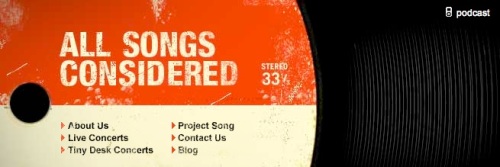
With all of the work and travel that I’ve done in September this year, I’m a little behind on some things, and this NPR’s excellent All Songs Considered recorded show of Mr. Lytle’s at The Bowery Ballroom in NYC this past July, but posted by All Songs Considered on 7/11/09 is one of them. Just listen and fall in love.
You can listen and stream or download his set here or click on the photo below.

Jason Lytle, live in concert at The Bowery Ballroom in NYC on 7/11/09. (Photo courtesy of All Songs Considered.)

Oooooohhhh..
How cool is this? 500 beautifully colored pencils look absolutely lovely all together. Presented by the folks at Social Designer as a set and a subscription, this is one of those _______-of-the-month-club deals that I actually think is really rad. Obviously, I am a fan of color, the more the better usually, so these collections and rad little display vignettes just charm the hell out me.

Watch it polar bear!
25 pencils per month for 2o months gets you quite literally all the colors of the rainbow. Or, as Social Designer puts it: “500 Colored Pencils: the only set in the world that matches the span and wonder of human creativity.” At $33 a month, it’s like a sweet 70’s car payment.

I'm into it, all nice and flat on the wall.
PS – All of these photos are examples of the ways that you can store and / or display the wonderland of color that is this 500 Colored Pencil collection, all available at Social Designer as well as a few other neato ideas, beyond the trusty and iconic old coffee can.

Hold 'em tight...
Though I use mostly plain old graphite pencils or scratchy old ink pens to sketch, this collection is tempting, I just love the idea of a fresh set of color like a bouquet (sans mort et bees) arriving to brighten up every month for almost 2 years. And yes, I am a design nerd.
Click on any of the images for more information or this link to visit Social Designer.

Color & light.

Just wanted to give a bustass shout out to everyone in Chicago who came out and made this year’s Chicago Renegade Craft Fair so fun and so amazing. It’s always so great doing a busy show and getting to meet so many awesome people. I was a little overwhelmed with the idea of working this 2-day, outdoor festival solo, but man oh man, things could not have gone more smoothly. Perfect weather, lovely neighbors, and awesome shoppers. The crowd was really big, and everyone was super friendly and nice. What else could a craft show boother ask for?

I got a quick chance to step out into the crowds on Saturday & take this one. Busy all of the time!

A typical view of the weekend from booth #135, strawberrylunaville.
A special thanks to Sue Daly & everyone else of Renegade for all of your hard work, I can’t imagine the monumental kitten herding feat it must be to bring this fair to order. You guys did a phenomenal job! And a double extra special thanks to my homies in Pittsburghtown, the little area of Renegade where fellow Pittsburgh Craft Collective crafters Rag Trader, garbella and Cosy Knits and myself were. Thanks for looking out for me, and most huge thanks to Rag Trader Beth & her brother Joel, I could not have done it without you cats.
This trip was super special as it was the 2nd part of a 2 week show tour that I did with friends and fellow print and poster artists Hero Design & Delicious Design League too. Thanks for your hospitality Delicious! We love hanging around Chicago, as the photos while working and playing below can attest to. And there are more boring photos on my Flickr page here!

Lamps by neighbors Bright Lights Little City made from vintage ribbon. Click for more info!
And below, some photos from our day off in Chicago on Monday. It’s always so nice when we can build in a little time to walk around and do quintessential things in other cities.

A bag by Pink Corporation that I wish I'd bought. Can't find it anywhere online now, Darn!

Heading into Wrigley Field, go Cubs!

The awesomely pretty field before the game got started. PS-those are bleachers on the buildings across the street...yowza!

Instant Cubs fan. The whole field smells like popcorn, cotton candy happiness.

Wizard Car!!!! Found in Sandusky County, Ohio on the way home, with Mark Hero feelin' the magic.

The Pains Of Being Pure At Heart & Bishop Allen posters, hangin in Sarah & Hilary's awesome pad
And here comes the case for “maximalist” living. What’s that? Why, the very opposite of minimalist, silly.
This study of maximalism comes from the fantastic design & lifestyle blog Apartment Therapy, when two roomates from Pawtucket, Rhode Island opened their home to Apartment Therapy. How could they refuse? Their home is absolutely beautiful, cool, chic, warm and anything but the austere minimalist vibe that’s been overwhelming in vogue for quite some time.

I just want to sit here all day.
What I love best about their style, is that they use and clearly love the mid-century look and design, but refuse to let the more recent empty aesthetic run roughshod over their personal tastes and attractions.
For the full tour of Srah & Hilary’s place, click here. Thanks so much for showing off some of my work in your super bitchin’ pad too ladies!

Such a fun and organized space!

Huzzaah! It’s show time! Flatstock 22 Poster Exhibition, an on-going gig and rock poster exhibition that travels throughout the year is on again. This time it’s Flatstock 22, in Seattle WA during the Bumbershoot Music Festival. This is possibly my favorite Flatstock and we are so looking forward to traveling once again to the lovely city of Seattle. With over 75 international and currently working poster artists selling and displaying our work, Flatstock 22 Poster Exhibition is bound to be an explosion of awesome for your eyes, and even a treat for your home and office decor. Most posters and prints were printed by hand, and all will be available for purchase. Come and meet the artists and talk about the poster game, there is a story behind every single print.
When & Where!
Flatstock 22 Poster Exhibition will be inside the the Bumbershoot Music Festival at the very cool Seattle Center, a 74 acre park built for The World’s Fair in 1962. Flatstock hosts over 75 poster artists and we will all be found in the The Fisher Pavillion right next to the Fisher Green Stage. You will need an entrance ticket to Bumbershoot to see Flatstock, though there is no additional cost for entrance to Flatstock. For more info, check out the Bumbershoot Music Festival and Flatstock websites.
Dates: September 5th, 6th & 7th 2009.
Hours: 11am – 8pm, all 3 days.
Below is a small map of the Seattle Center park complex, with a larger & legible version available on my Flickr page here.

Click for a larger map!
And here is a list of attendees at this year’s Bumbershoot Flatstock:
Amy Jo, Artillery, Trevor Basset, The Bird Machine, Inc., Boss Construction, Broken Press, Mike Budai, The Bungaloo!, Burlesque of North America, Casey Burns, Crash Design, Frida Clements, DKNG, David V D’Andrea, Nat Damm, Daniel Danger, Delicious Design League, Design Medicine, Diesel Fuel Prints, Doublenaut, NateDuval.com, F2design, Furturtle Show Prints, Gigart, GigPosters.com, Guyburwell, Justin Hampton, Hero Design Studio, Insurgentsarts.com, Jambone Creative, Kollective Fusion, Mig Kokinda, Largemammal, Landland, LeDouxville, Lil Tuffy, Mad Pakyderms, Mexican Chocolate Design, The New Year, Patent Pending Industries, Mark Pedini, Penhead, Popfuel, Powerslide Design Co., Will Ruocco, Sandusky Bay Poster Works, Seattle Show Posters, Todd Slater, The Small Stakes, Jon Smith, Squeegeeville, Standard Deluxe, Inc., Dan Stiles, strawberryluna, Diana Sudyka, Kevin Tong, Two Rabbits Illustration, Vahalla, Voodoo Catbox, Clint Wilson

Click on it! Go to Gigposters.com today!
Gigposters.com is just about the best website one the entire internets. I know, I’ve looked at almost every site out there. (No, really…) Not only is Gigposters.com my home away from home, the reason that I do what I do for a living as a rock poster artist, it’s also the most comprehensive and amazing resource for art, design, bands, artists, wise-acres, designers, and people who just love lively conversation and dig art. Straight up.
And, Gigposters.com needs your help. Desperately. With over 107,000 thousand posters currently (and literally growing every day) for over 98,000 bands this incredible website takes a good amount of time and maintenance to keep running smoothly. And that means money honey. So, this is my personal drive for support and plea for anyone who is already familiar with this kickass site, or to anyone who is perhaps just becoming aware of it now, and sees how rad it it from this link to Gigposters.com here.
If you love posters, screenprinting, design, kittens, bacon, cheese, intelligent wit, music, bands, and love and/or are a currently working designer, artist, or illustrator, this site is for you. Help support one of the most innovative and cool websites that gave every single working poster artist today a chance to grow and shine. We could never have done it without Gigposters.com.
Ways to help include becoming a Premium Member (with rad benefits), buying the new and fantastic Gigposters Book Vol. 1 (complete with exclusive prints by the wonderful Jay Ryan), buying merch or making a donation, no matter how small.
Look! I made it easy for you! ![]()

This might be the coolest book ever.

Jay Ryan exclusive Gig Posters Book print 1

Jay Ryan exclusive Gig Posters Book print 2

Jay Ryan exclusive Gig Posters Book print 3
And tons of other really cool and fun stuff, like colorings book with illustrations by over 40 underground artists, (Vol. 2 pictured below) 3 delicious volumes of playing cards with a different gig poster designer doing art for each card (also pictured below), a pin up calendar (hubba hubba!), t-shirts, hats, hoodies, mouse pads and more.

Gigposters.com Coloring book Vol. 2 (Vol. 1 is also still available.)

Gigposters.com exclusive Card Deck # 3, uncut sheet art.
And so much more. Please visit Gigposters.com today and check out the super cool Merch section, and consider making a donation to this amazing, excellent and vibrant website that supports SO much of the art and design you love. Feel free to pass this information along or post to your own blog. Every bit helps!
![]()

Au Revoir Simone play live at Seattle's KEXP (photo by Dan Shultz)
As a bit of an NPR junkie, you might be able to imagine that the musical offshoot, NPR Music’s All Song Considered is an even bigger addiction for me. If you are not familiar with it, come on, climb out from underneath that rock friend.
As a designer, I’m always interested in how things are put together, and more specifically as a rock poster designer, well, of course I listen to what is likely an ungodly amount of music, all day, and sometimes all night long. So the gigantic culling breadth of All Song Considered and it’s amazing way of finding and showcasing music, bands and process makes it just about one of my favorite stops to park on the web.
A recent addition to All Song’s Considered’s list of Studio Sessions site is this live show by the Brooklyn-based band Au Revoir Simone at the KEXP studios in Seattle, WA. Being fans of both the incredible work of KEXP and Au Revoir Simone for quite some time now, it was one of those “Awww yay!” moments when I came across it.
More photos from Au Revoir Simone‘s live session at KEXP are here on KEXP’s Flickr page.
Hope that you dig it too!


Halloo! Thank you so much Chicago! We had a blast both coming and going this year at Flatstock Poster Show and Pitchfork Music Festival last weekend. We loved getting to hang out with our poster friends from all over the country (and even Canada, yes way.) But even more, it’s so fun and awesome when we get to talk to folks who love design and posters and printmaking like we do.
So, thanks so much everyone, hope to see you next year!
Here are a few silly photos of this year’s adventures in poster carny-ing. This was one good road trip full of delicious old fashioned road side stops, fireworks, laughs, overpriced bloody marys and too many anchovies. All in all, great times. Feel free to check out more photos at Flickr too.

Root beer pit stop with Hero Design on the way to Chicago at Simonton Lake Drive In, in IN. In in in! (Photo courtesy of Hero Design.)

Talking with folks and working the booth.

Flatstock 21 at Pitchfork Music Fest 2009 by night. (Photo courtesy of Doublenaut.)

Dan Grzeca & the fruitiest poster fan ever.
If you see this guy while driving the Interstate…hit the gas. I mean it.

Chuckie, gettin' his eat on. (Photo courtesy of Hero Design.)

The trip of a lifetime! (Pre-Hidenberg, assumably.)
Postcards used to be far far more popular than they are today. Possibly as a pre-television, pre-Internet way of communicating, and possibly due to their fairly cheaply reproduced but lovely art and extremely variable style, they once enjoyed a big place in popular culture, not just of vacation destinations but of everyday life. Because of that large volume of postcards produced in the late 19th and well into the 20th centuries, both photographic and purely illustrated, there are many amazing sub-genres, several of which have become highly sought for collectors. I’ve decided to start another irregular series of posts, featuring the art and design of postcards. Today’s post? Dogs, dude.
Dogs are obviously well loved pets and companions, perhaps because of that long history they also have a place symbolically with humans as well. I was surprised to find that despite being Man’s Best Friend, many of the images I came across were actually of women and little girls with dogs.

A flower dog and a flower girl.

Summer reading.
There are also many many images in which children and dogs seem to be equals, as below where a young girl shields her dog from rain while they sit on the same bench:

Finding shelter together.
And this one, where one child is rollicking on the ground at dog-level, and the other pup is up on the bench, elevated with her friend:

All friends here.

Whoah.
Being a symbol of fidelity, I love the many subtle variations on a warm greeting and love letters that I found as well. Many featuring the blue flower Forget-Me-Not as an added layer of meaning:

Cute, but psycho.

How sweet.
There are many postcards which simply show off a specific breed’s characteristics, either in a straightforward way or more comically:

A noble Irish Setter in the field.

Poor little Dauchshund, he's only the way we made him.

Washing Day, hard-working Scottie style.
I expected to find postcards of dogs getting into all sorts of troubles, probably fed by the iconic Coppertone ad illustration, like the below little scamps:

Sneaky Petes.
And of course, I knew there would be some great and symbolic postcards of doghouses, to convey being in trouble, often with one’s spouse:

Sleep tight.
However, a surprising find was a plethora of postcards featuring dogs working in some traditional and other very surprising situations. We’re all familiar with the idea of Arctic travel and mobility using dog sled teams:

Mush!
But mostly likely, if like me, you are also not familiar with the use of smaller dogs teams to haul milk carts, which was quite common in the 19th and early 20th century:

Pups taking a break.

A French milk dog cart.
But perhaps the most intense or emotional are the postcards featuring dogs and men in times of war. Of course the arguments can be made that animals shouldn’t be conscripted to serve in the wars of mankind. It seems absurd. And unfair. Perhaps that is why seeing images of dogs, such faithful and willing friends, in these scenes (both photographic and illustrative) is especially bittersweet.

A dog who saved this soldier's life and received a medal.

Rover, hatin' on the Enemy.

And finally, but never ever least, there is this stunner:

Look! The bulldog is cheating!
