Strawberryluna

Rock Show: iPad app for Rock Posters

Rock Show, view and buy posters from your iPad. (Click for more info or to download Rock Show from the iTunes store for FREE!)

Dangit! I’ve been meaning to post about this for a little bit now.

Right before SXSW & Flatstock in Austin, TX this year, I was approached by a software development team from Neutrinos in Portland, OR. They were getting ready to release a pretty cool (and FREE!) new app for the (then) upcoming iPad called Rock Show. The new app Rock Show was being debuted at the Interactive portion of SXSW, just a few days before the Music segment of this huge Festival begins.

Examples of posters on Rock Show to view & purchase. (Click for more info or to download Rock Show from the iTunes store for FREE!)

After talking with Rob from Neutrinos, we signed on as one of the first wave of artists submitting posters to be shown and sold via the Rock Show app for the iPad. It seemed like a big step, but we could tell that the team behind Rock Show was committed to making a great app for music, poster and art fans that would also support rock posters artists like us, and help gain more exposure for the artists involved and the resurgence of rock posters in general.

So what is Rock Show? They describe it best:

“Exclusive to the iPad, Rock Show is an awesome way to view, share and purchase concert posters. Rock Show is the best way to view, share, and buy concert posters. All the posters featured in Rock Show are available for sale directly through the iPad. Posters are often signed, numbered, and shipped by the original poster artist. All of the concert posters in Rock Show are available for purchase securely from the app.

Hold your iPad however you want to get the best view of high resolution, full screen artwork. Learn more about a band using the app’s quick Wikipedia link.

I naturally got on board being A) A rock poster artist B) An Apple and Mac person and C) Wildly excited about the iPad and the new horizons it’s opening and D) Impressed with Neutrinos approach for Rock Show. I’m proud to say that we were among the very first poster artists to sign on and start working with Rock Show and uploading posters.

Currently, we here at strawberryluna have about 15 titles listed under ‘strawberryluna’ in the Rock Show app, and there are tons more poster artists partnering with Rock Show and adding their work up for viewing and purchase as well. It’s definitely worth checking out.

Using your iPad, you can search Rock Show posters by poster artist and also by band names, as seen below:

Rock Show is an amazing way to explore the variety of art and design in the current rock poster movement with the large and frankly beautiful resolution and clarity of the iPad screen, as well as being a great new way to connect artists and fans, be they musicians or artists, or best, all of the above.

There are complete descriptions for each poster, such as the band name, date & location of the show, the medium of the poster, and more. Rock Show‘s payment gateway is secure, so it’s a seamless process, with posters shipping directly to the customer from the artists’ themselves, often within a day or so of order receipt.

It’s pretty sweet! We’re having fun with it, and if you own an iPad or know someone who does, check out the FREE app Rock Show and have some pretty fun too.

Rock Show is always looking for new poster artists and designers too. If you are interested, drop them a line here.

The Sketchbook Project 2011, open call to artists.

click for more information

It’s like a concert tour but with sketchbooks.

We’re not even halfway through 2010, but you might want to start thinking about 2011 a bit. At least, if you are interested in participating in The Sketchbook Project, 2011.

Organized by Art House Co-op, a group that seeks to create large art projects that tie hundreds to thousands of artists together, the newest incarnation of their Sketchbook Project for 2011 is possibly the most ambitious attempt yet. Unlike other sketchbook sharing and interactive projects, this one gives each artist their own book to work with, rather than depending on artists to share and ship books amoung themselves.

Which, honestly? Is probably a good thing. Each person is responsible for their own destiny and whatnot. It’s pretty sensible.

Sketchbooks ready to be displayed and read. (click for more information.)

However, it’s also super cool, because additionally, by having one identically sized Moleskine sketchbook for each individual artist or studio participating, The Sketchbook Project 2011 will do the following amazing stuff:

1. Tour the country to at least 6 particpating galleries across the US as a sort of . Currently set are:

Brooklyn, NY Austin, TX San Francisco, CA Portland, MEAtlanta, GA Chicago, IL

2. Each returned Sketchbook will be assigned a unique bar code which will enable the curators and artists alike to:

  • See where each book is along the touring show.
  • See how many times it was viewed as artists will be able to receive viewing notifications each time their Sketchbook is viewed and checked out via the Library Card system.
  • Allow the book to be catalogued and become a part of the permanent collection of the Brooklyn Art Library system.

3. Digitize the Sketchbooks for artists who wish to participate in that additional aspect of the Sketchbook Project (for an additional small $20 fee) so that their Sketchbook is available for viewing online as well after the Tour ends.

Sketchbook browsers at The Brooklyn Art Library. (click for more information.)

Rather than a random hodgepodge of sketchbooks filled with unrelated material, The Sketchbook Project 2011 has outlined 31 themes for participants to choose from, to align the material inside to whatever degree the artists’ see fit. Themes like “Sleepless”, “This will be fun I swear”, “I’m sorry I forgot you”, “This is not a sketchbook” and “A record year for rainfall” are among the open and/or suggestive themes.

Participation is open for those interested at a starting cost of $25, which covers your individual Sketchbook (with optional cover colors), shipping to the artists, individual bar code, and (hopefully) first choice on a theme, as they are expected to fill up quickly. For an additional fee, artists can opt for the digitizing of their Sketchbooks for online use (covered above), and/or have an 11×17 poster made as well.

Completed Sketchbooks being scanned before lending. (click for more information.)

Interested in learning more or becoming a participating artist in The Sketchbook Project 2011? (I did! Can’t wait for my Sketchbook to arrive.)

If you haven’t clicked any of the above images or previous links, click here forThe Sketchbook Project 2011. Silly goose.

2010 Sketchbook Project books arriving in the mail to Art House. (click for more information.)

Sweet new Sisters Red news & fun stuff!

Are you afraid?

We’re not. With the impending release date of the new Jackson Pearce novel Sisters Red creeping slowly closer (the official release date is June 7th, 2010), we’re getting pretty excited around here. The buzz about Pearce’s 2nd Young Adult novel is really good, and moreover, the cover art illustration and jacket design that we did for Jackson Pearce and her publisher Little, Brown & Co. has also been getting attention as well.

That’s just rad. I won’t lie. It’s not just gratifying as a lowly, often practically anonymous book jacket illustrator and designer, (I mean, I know that I look to see who designed covers I like, but really, I know that’s also an art nerd thing too).

Here’s the thing: The main challenge we were given when first approached for this book jacket design by Little, Brown & Co. was to create a cover illustration and design that would fully pull people across a crowded book store just to find out more about Sisters Red, based purely on the cover art. Awesome! That’s the sort of challenge every designer and illustrator wants, and, it’s also the kind of challenge is, well, frankly a heck of a challenge. However, working on this project was not only that, but super fun and one of the most rewarding creative experiences strawberryluna, as a firm, has had to date. It’s not surprising really, as Little Brown, & Co. is also the publisher for the Twilight Series as well, also with a stunningly notable cover art. We’re so thankful and excited about the whole shebang we wanted to share a little more with you.

Coupled with the coolness and a well-written upcoming new book like Sisters Red, you can imagine it’s been a dream project already. And the publication date is just over a month away!

To that end, there’s a bunch of fun goodies over at the Sisters Red website here. Like what? Alright, hold on a sec, I’ll ya. Dang!
There are beautiful Wallpapers for your Mobile Phones (the iPhone sized one is below as an example) and for your Computer Desktops here, all perfectly sized and ready to go for you.

Click to view all Wallpapers, sized & ready to download.

And, there are some neat E-Cards, as shown below. Send them and spook your friends into Believing.

Click to view & send all E-Cards.

Click to view & send all E-Cards.

Also, the lovely Jackson Pearce is not only an author, but a really great video-blogger. She’s always up to new and fun posts at her Live Journal site, and via her YouTube site as well. She posts about what she’s writing, the creative process, and speaks directly with her fans as well as other authors weekly. In a word? She’s rad!

If you are more interested in what Sisters Red is about, (and of course you are), you can click here to read an excerpt and definitely check out this promo video Pearce posted recently about Sisters Red here:

And finally, (wowzers!) a review of Sisters Red’s cover art from Barnes & Noble.com by Melissa-Walker, with Pearce’s perspective as well. We’re just tickled! Click here to read it.

Thanks so much again Jackson & Little, Brown, xo.

Etsy’s new Treasury East rocks!

Click to see this Treasury.

Hey, are you like me and you love the Treasuries at Etsy.com, but are frustrated with the stampede of trying to snag one? Be frustrated no more. Etsy has launched a new Treasury system that they are now Beta-testing, called Treasury East.

Gotta say, it ROCKS.

What’s a Treasury? Great question. In Etsy’s own words: “The Treasury is an ever-changing, member-curated shopping gallery of handpicked items.” So, it’s sort of like a favorites list, or a collection put together by users based on themes, colors, craft type, a play on words, whatever the Treasury curator wishes. They’re often very lively and a great way to find new things and previously undiscovered shops on Etsy. And, there is always one treasury featured on the front page of Etsy, showing just a peek of the many hundreds of thousands

However, the last time that I tried to make a Treasury was probably in 2006, it was just too bothersome and hard to be at the very right place at the very right time with all of my selected ducks in a row. So, I didn’t even try for the past 4 years.

The way that the current / soon to be old Treasury system worked, there was a finite number of Treasuries and once one expired it was chaos with hundreds to thousands of Etsy users trying to get that next open spot at any given time.

Now, with Treasury East in Beta-testing, it’s wide open, and pretty awesome. So rad in fact, that I spent my Tuesday morning over coffee and making my very first Treasury featuring some of my favorite screenprinters, called “Inky Fingers: Screenprinted and Silk Screened Beauties” <— Click there to see ’em all.

There are some new features, such as no longer being Flash-based (hey! I can see Treasuries on my iPhone now, thanks),  and best (!) lists in Treasury East are not limited to a finite number nor do they currently have expiration dates. This means that anyone, at any time can curate and create a Treasury. Hooraay!

So go play with a Treasury East jimmy-jawn today. For all of the new features, rules, and most importantly, add your own suggestions & experiences, read over this thread on Etsy all about the new Treasury East. And, to find out if your shop is currently featured in a Treasury East list, check out this nifty tool from Craftopolis that will show you, Etsy East Hunt. (Note, you will need to have an active Google Analyitcs account linked to your Etsy shop to pull the info. Currently there isn’t a tool to see if your shop is featured on Treasury East yet via Etsy itself.)

Have you played around with making a new Treasury using Treasury East yet? I’d love to read any comments and see what other Etsy users think too.

To see my Treasury of Inky Fingers: Screenprinted Beauties, click either HERE or any of the images above. And don’t forget to comment on Treasuries that you like 🙂

———————————————————————————————————————————————————————————————

Shops & prints featured above in my “Inky Fingers: Screenprinted and Silk Screened Beauties” Treasury:

1. beethings – limited edition screenprint: “frog dog hog log bog”

2. standard – limited edition screenprint: “Hello Darkness, My Old Friend”

3. strawberryluna – limited edition screenprint “Let Love Grow”

4. Little Friends Of Printmaking – limited edition screenprint: “I Am Number One”

5. girlscantell – industrial felt, set of four coasters: “turntable diagram”

6. youngmonster – screenprinted gig poster:  “Why?”

7. Miss Amy Jo – screenprinted art print: “Kitty Cat”

8. Who Made Who TOOTH – screenprinted art print: “New Wave To The Grave”

9. DWITT – limited edition screenprint: “Magic”

10. Jetsah – limitee edition screenprint: “Arrival”

11. Hero Design Studio – limited edition screenprint: “I Heart My Bike”

12. Anne Benjamin Mok Duk – limited edition screenprint: “Bird In Hand”

13. cricket press – limited edition screenprint set: “Scorcher and Stingray Bike Set”

14. doctor pizzoli – limited edition screenprint: “Awooooga Elephant”

15. darling clementine – screenprinted canvas bag: “Monsieur Cabaret”

16. Jen Skelley – limited edition screenprint: “Beemazed”

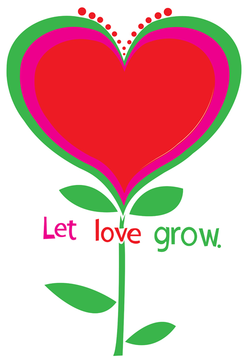
New art print release: ‘Let Love Grow’ hand screenprinted, limited edition

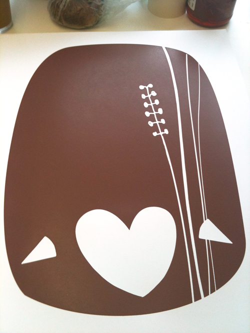
New hand screenprinted, 3-color, limited edition art print: "Let Love Grow", fresh & ready. (click here for more info or to purchase)

Lately, I’ve been really obsessed with 60’s design, but not the psychedelic and (to me) overly wrought side, but more of the very clean and simplistic designs that came out of Madison Avenue in the forms of advertising and brand / logo design and cohesion. There is something so appealing about those directions to me, very pure. This print and design is a part of that interest, as well as a statement on everyday negativity & violence, be they figurative or actual.

Hey negativity! Scram! Just feed, water, and nourish love and it will grow like a flower forever.

This simple scene is my newest art print “Let Love Grow”, bright & ready to help you plant seeds happiness and love all around you. Featuring hand lettered text, it’s a perfect gift of hope and love for your sweetie pie, as a wedding gift, for a young person in your life, or to brighten up your own home.

Love: Let it grow bright and strong.

You, my friend, are looking at my 3-color, all hand screen printed, limited edition art print with fresh spring green, vibrant magenta, and heartbeat red hand mixed and non-toxic water based inks. Edition of 190. Size: 18 x 22 inches (45.7 cm x 55.9 cm.) Paper: acid free & archival Cougar, White 100lb cover weight.

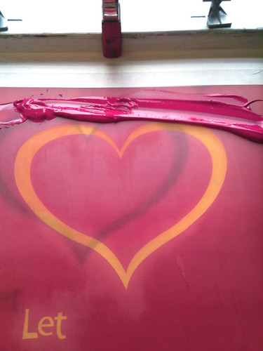
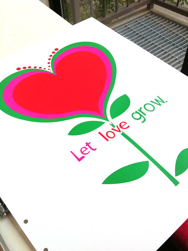
Below are some process photos, now also up on my Flickr account, of this art print, “Let Love Grow” being printed. Got questions? Shoot me an email!

1st color of "Let Love Grow", printed. (click to see more process photos.)

2nd color ink (magenta) in the screen, getting ready to print. (click here to see more process photos.)

About to print the 3rd & final color (green) of a new art print, "Let Love Grow". (click to see more process photos.)

All done! "Let Love Grow", finished printing and fresh for spring. (click to see more printing process photos.)

LCD Soundsystem “This Is Happening” preview….is awesome

Click here to to listen to the new "This Is Happening" LCD Soundsystem record preview

I didn’t think that I could love LCD Soundsytem more, and yet it turns out that I can.

And I do.

Simple little post here. Basically, this new record sounds great. James Murphy & co are back, and awesomer than even before. Best, to pre-empt illegal downloads, there is a heft preview of the new record, “This Is Happening” on their site here. Click! Listen! Fall deeper in love.

Early favorite tracks here are Dance Yrself Clean, Pow Pow (! so good!), and of course, Drunk Girls. 😉

If you love it too, buy this jam when it comes out and support your favorite artists so they can keep making awesome.

moe. Snoe.down ice sculpture, based on our poster!


Awesome ice sculpture by Ben Rand at Moe.'s Snoe.down 2010, with our poster characters.

So how often does this happen? You design a poster for a band, illustrate characters from animals, and then BOOM! Those characters & your typography come to life in the form of an awesome ice sculpture?

Not too often. But it’s cool as hell, (pardon the pun if you must.)

The above photo was sent to me from the band Moe.’s label, it’s from their Snoe.down Festival, for which we did the official Festival poster (as below). A friend of the band named Ben Rand  is a nationally recognized ice sculpture artist and he did this interactive &  amazing rendering of our poster’s animals and even the typography that we did, with little holes to poke your head into so you could become either the Moose or the Polar Bear character right from  from our poster. Whoa! ::mindblown::

We love it!

So much so that we’re running a little contest, yep. That’s right.

If you went to the 2010 Snoe.down and have a photograph of this ice sculpture with people in it’s super faceholes, send us a copy of your photo and we’ll add it here, and add your name to the Grand Prize drawing and then choose a winner at random and send you a special winner gift of a free Snoe.down poster + super secret & special prizes! Enter in one of two ways:

1. Email us  your photo at strawberryluna { a t } strawberryluna dot com OK OK.

2. Drop a link to your photo in the comments section.

Contest Runs until April 30th, at midnight EST. Good luck!

Our screenprinted Snoe.down 2010 poster (click for more info or to purchase)

Our Iron & Wine poster in Ready Made, home decor by Bee Things.

Some of the gorgeous walls chez Bee Things, including my Iron & Wine poster from 2005.

While spring cleaning away this past Saturday, I’d left a small pile of fun mail as yet un-opened and un-perused. So, when I took a little sit-down break and read a tweet from my friend Beth from Hero Design that she saw our Iron & Wine poster (sold out, sorry!) in a spread the new April/May issue of Ready Made magazine, I kinda freaked out. Funny enough, my own issue had just arrived the day before but I hadn’t had a chance to open it and read it yet.

So, of course I tore in immediately 🙂

The feature is on the absolutely amazing and beautiful home of Texas design and screenprinting, husband & wife duo studio, Bee Things, (Jeff Barfoot & Shay Ometz) whose work I have admired from afar for a while now. So, seeing their superbly decorated home, so fantastically well curated and without being fussy or overly intentionally showy (you know what I mean!) featured prominently in a 10 page spread was a complete inspiration and a big blushing moment. I think it’s fantstic how you can see their love of printmaking in all forms by the incredible collection of prints that they have hanging everywhere in their home.

A room full of awesome. The Been Things livingroom and book collection.

Bee Things run a screenprinting studio from their home, from design to printmaking, which we of course relate to and love. And the sunlight that they get in their East Dallas space is completely lovely. They also did a great little tutorial on the screenprinting process for Ready Made that you can see in the April/May issue, and it’s also available online here as well at ReadyMade.com. I love the quote from Note the great IKEA flat file ALEX (the while drawer file in the lower left), a screenprinter’s pal. We have one too in our office! It’s a great way to store films, paper, and ink jet printer inks, among other tools of the trade. Good show Bee Things 😉

Bee Things studio.

We’re just beyond flattered and tickled to the gills to have a design & screenprinting couple, like us, like our work enough to hang it in their home and among their other quite formidable print treasures. And, just so you can see more awesome, this is the entire last page of the feature on Bee Things adorable home below.

Full page scan view.

F*ck Up! A Test Print Exhibit

Just a few of the Test Prints in the exhibit.

FUCK UP :: A Test Print Exhibit

It’s a new gallery show that I’m in! And what a great name. I love it. I have a few Test Prints in this new show, opening on April 2nd, 2010 in Lincoln, NE  at
SCREEN INK  from 7:00pm – 11:00pm. If you have a Facebook account click here for the Event Page & all of the details. And also, for more information check out this article describing the show and the screenprinting process as well as a little info on Test Prints & why so many printers have them.

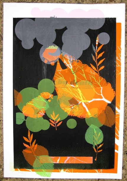
Test prints are by-products of the screen-printing process that contain a multitude of layers of color and shape from numerous different posters, resulting in (occasionally) beautiful, one-of-a-kind monoprints. Because the process is completely spontaneous and unplanned, imperfections and accidents are embraced rather than shunned. FUCK UP is an art show that illuminates this emerging art form with a collection of prints from numerous international artists, both celebrated and up-and-coming. Test prints are an intersection of art and design, individuality and mass production, inspiration and collection, planned and impromptu.

Check out this sneak peek of the promo poster for the FUCK UP show. 11 colors down, 6 more to go!

OPENING: April 2nd, 2010 in Lincoln, NE  at SCREEN INK  from 7:00pm – 11:00pm
Please join us at our First Friday opening reception for booze, classy hors d’oeuvres, shit-talking, and brown-nosing (not necessarily in that order). You’ll meet some of the artists and can badmouth the ones who didn’t show up. DJ set by Darren Keen from The Show Is The Rainbow!! The official after party will be located at the nearby YEE OLDE TAVENRE.

Featured Artists
The Bubble Process (Cleveland, OH and Brooklyn, NY) – http://www.thebubbleprocess.com
Delicious Design League (Chicago, IL) – http://deliciousdesignleague.com/
Doe Eyed (Lincoln, NE) – http://www.doe-eyed.com
Bennett Holzworth (Lincoln, NE) – http://www.bennettholzworth.com
Steady Print Shop Co (Minneapolis, MI) – http://www.steadyprintshop.com
Ron Liberti (Carrboro, NC) – http://www.gigposters.com/designer/18832_Ron_Liberti.html
Micah Max (Omaha, NE) – http://www.micahmax.com
Pat Oakes (Omaha, NE) – http://www.inktankmerch.com
Sidekick Design (Portland, OR) –http://www.gigposters.com/designer/43745_Sidekick_Design.html
The Silent Giants (Detroit, MI) – http://thesilentgiants.com/blog
Dan Stiles (Portland, OR) – http://www.danstiles.com
strawberryluna (Pittsburgh, PA) – http://www.strawberryluna.com
We Buy Your Kids (Sydney, Australia) – http://www.webuyyourkids.com
Workshop (Lincoln, NE) – http://www.workshopworkshop.com
Young Monster (Chattanooga, TN) – http://www.weareyoungmonster.com

One of my Test Prints, available for sale n my Etsy shop. (click for more info or to purchase)

Addendum! Here is a great review of the opening night of the Fuck Up Test Print show complete with an awesome video of the crowd and live test print tshirt printing and of course, tons of rad Test Prints on the walls. The video is HERE!

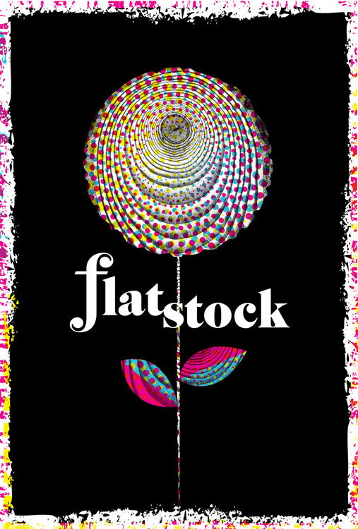
“Rock Paper Show: Flatstock Vol. 1”, new poster book feature!

Click for more info or to pre-order "Rock Paper Show, Flatstock Volume One"

Holy smokes, we’re super stoked on this. At SXSW & Flatstock Poster Show in Austin, TX just over a week ago, a brand new and bitchin’ book made it’s debut: Rock Paper Show: Flatstock Volume One. Published by Soundscreen Design, this book on the rock contemporary rock poster scene has more specific bent & focuses on the Flatstock shows and posters artists’ Flatstock posters, which are created specifically for these poster events.

Rock Paper Show is something of a visual history of the first 20 Flatstock festivals, (there have been 24 as the time of this writing, with 4 per year currently in Austin, TX, Chicago, IL, Seattle, WA and Hamburg, Germany) featuring interviews and essays by artists, collectors and bands, and a compilation of the posters created for the first 20 Flatstock poster shows. What is a Flatstock? Good question! The Flatstock Poster Show series is an ongoing series of exhibitions featuring the work of many of the most popular concert poster artists working today presented by the American Poster Institute (API). Flatstock shows provide the general public with an ongoing & unique series of opportunities to see fine poster art in person and to meet the artists who’ve created it — they provide the API with a way to present the poster artists collectively while showcasing the breadth of individual styles they represent.

Included in Rock Paper Show are our Flatstock 9, Flatstock 12, & Flatstock 14 posters (as seen below)

3 of my hand screenprinted Flatstock posters featured in "Rock Paper Show"

In addition to the standard edition of Rock Paper Show, the limited, Deluxe Edition (produced & limited to just 500 sets) comes enclosed in a collector’s case in which you will find a hand-screened, letterpressed, or stenciled 11″x17″ set of 20 artist prints made especially for Rock Paper Show. The prints feature the original posters commissioned for the book contained within a custom portfolio folder. We’re incredibly honored that we’re among the artists asked to do one of these 20 posters, which are also featured as the chapter headers for each of the 20 chapters of  Rock Paper Show. Here is a look at our poster below I will have a very limited number of these screenprinted posters for sale on my website later this spring.

Flatstock poster for the book about the first 20 Flatstocks, "Rock Paper Show".

Since its inception in 2002, Flatstock has evolved into the definitive showcase of the most talented poster artists working today. Rock Paper Show: Flatstock Volume One is an editorial and visual history of the first 20 Flatstocks, with contributions from the artists and studios that regularly attend the events and the bands who are often the subjects of the posters, as well as critics and collectors involved in this community. Rock Paper Show collects for the first time the original posters created for each Flatstock by the attending studios. Veteran poster-makers take the reader on behind-the-scenes looks at the studios, the artists, the regional scenes, and the personalities of this vibrant and varied community.

Curated by Geoff Peveto (president, American Poster Institute). Designed by Rumors (Brooklyn, NY). For a full list of editorial contributors and Studio Index, please click here.

Over 60 editorial contributors, including: Aesthetic Apparatus, Craig Finn (the Hold Steady), John Foster (author, Masters of Poster Design), Clay Hayes (gigposters.com), Jeff Kleinsmith (Patent Pending), Jay Ryan (the Bird Machine), and Paula Scher (Pentagram). Standard Edition – 312 pages. 566 color images. Hardcover.

You can pre-order either (or both) editions of Rock Paper Show today by clicking on this link! Orders will ship in early May.

Get a sneak peek at Rock Paper Show: Flatstock Volume One in the photo below where Soundscreen debuted at Flatstock 24 at SXSW Music Festival, or by clicking here. It’s a beauty.

Soundscreen's booth at Flatstock 24 (Austin, TX SXSW) debuting "Rock Paper Show" as well as the 20 original & exclusive limited edition posters produced just for the book. (Hey look! My poster is on the lower right!)

New poster released: Moe. Snoe.down 2010

My new screenprinted poster for Moe.'s Snoe.down 2010, 4-colors (click for more info or to buy)

This is our newest poster release all new and ready to go home with you:

It’s the good time winter fun fest of  Moe. and their huge Snoe.down Festival jam. We’re super excited to be working with Moe. When they contacted us, the mission was to mix things up from their previous posters and produce something fun, child-like and fresh. So, we Let loose & had a snowy good time with it for them. Wheee!
Snoe.down is the all-ages annual winter music festival hosted by moe. and not only features multiple sets by Moe., but in 2010 also playing are funk/soul group Sharon Jones and the Dap-Kings, jam-grass favorites Railroad Earth, Assembly of Dust, and Hot Day at the Zoo, southern rockers the Bridge, up-and-coming jam-rockers the McLovins, and the Heavy Pets plus Leroy Justice, Lynch, and Moon Alice.

This is my 4-color, hand screenprinted poster with snowy light blue, warm orange and black hand-mixed, non-toxic water based acrylic inks. Super secret magic: transparent baby blue & orange inks = light brown, magical overprints. (Overprints are when semi-transparent layers of ink combine and overlap to make another color.) I will have a very limited number of this poster for sale, as most of the edition was sold by the band during the Snoe.down festival. Size: 18w x 24h inches. Edition of 675. Paper: acid-free & archival Cougar 100 lb White, cover weight. $25

I design and hand screenprint all of my posters and prints. Let me know if you have any questions! Unless otherwise requested, all orders are shipped within 5 business days, though usually much sooner. I like stupid little toys, hopefully you do too because there will be one or two in your tube.

My new Moe. Snoe.down Festival poster is now available for purchase, click this link for my website or on the image above.

Paper Cuts, The Art & Science of Rock Posters show

Paper Cuts gallery show at Athenaeum (including my Dashboard Confessional poster, lower right side.)

I’m proud to be a part of a new poster  show called Paper Cuts: The Art and Science of Rock Posters that features Washington, DC area artists and venues posters. Paper Cuts will run from March 24 through April 25 at the Athenaeum in Old Town, Alexandria. Featuring a wide range of styles from a number of contemporary artists, the collection reflects the breadth and vitality of the DC Metropolitan area music scene.

My Dashboard Confessional poster (below) is among the posters featured in this DC-area posters art show.

My Dashboard Confessional poster, screenprinted, 4-colors, is in the Paper Cuts show. (clock for more info or to purchase)

To provide context to the art of these music posters, Paper Cuts will explore the science of the works by exhibiting artifacts from the process, including original drawings, sketches, studies, and printmaking ephemera. Additionally, the opening will feature live printmaking with Kristina Bilonick, where visitors can try their own hand at screenprinting!

Paper Cuts is organized by designer and printmaker Anthony Dihle, who also organized last year’s poster show Paper Jam at Civilian Art Projects, which surveyed the work of two dozen East Coast based poster artists.

Paper Cuts will feature the work of 16 poster artists including Hero Design Studio, Jay Ryan, John Foster, Marc Harkness, Zach Bryan, strawberryluna (that’s me!), Anthony Dihle, Todd Slater, Marq Spusta, Hatch Show Print, Dan Grzeca, Guy Burwell, Chris Cernoch, John Whitlock, Adam Saul, and Criminal Design

Show details:

Exhibition Dates: March 25–April 25, 2010.
Opening Reception: Sunday, March 28, 4–6 pm
Location: Athenaeum, 201 Prince Street, Alexandria, Va 22314

Hours: Regular gallery viewing hours are Thursdays, Fridays, and Sundays from 12–4 pm and on  Saturdays from 1–4 pm.

If you are in the DC / Alexandria, VA area do check out the show!

2 new art prints released: Lovebirds & Going To See My Baby Lavender

New 7-color hand screenprinted art print, "Lovebirds" now available. (click for more info or to purchase!)


Ok! This is a quick post as I really should be packing my clothes for Flatstock & SXSW in Austin TX (see this previous post for more info), so I will keep this one short and sweet.

I jammed out two brand new art prints this past weekend in a marathon printing run. 2 days, 8 screens, 13 colors, 1,000+ pulls, 200+ prints =  2 new prints. BOOM!

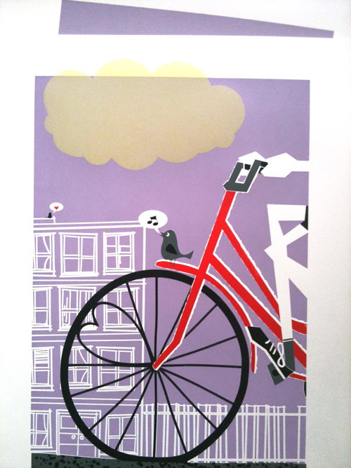
The first print is above, and it’s called “Lovebirds”. When we were working on our poster for St. Vincent, we started playing around with the flower illustration and found that it made very cute little birdies, we added a heart and ta-da! Lovebirds.

The second new art print is below, and it’s a fresh new colorway of my very popular “Going To See My Baby” print, now in Lavender. I love that lemony cloud action. I have to say as well that it’s kinda funny that both new prints feature hearts and love and romance quite prominently. Spring is here!

New 6-color hand screenprinted art print, "Going To See My Baby Lavender" now available. (click for more info or to purchase!)

It’s been really awesome getting to work out of my new studio space, rockin’ out to music and watching movies too while printing. In fact, I did a little Twitter contest while printing “Lovebirds” and asked if anyone could name the movie that I was watching in the background of a Photoshop mock, and wouldn’t you know it? Someone (@kurometarikku) got it right on the money by identifying “The Great Race” from a terrible screenshot. Amazing! Check out the photo below:

The Great Race in the background. Goofy, yes. But Jack Lemmon never disappoints.

And here are a few process shots of each print, sorry that they are not up on Flickr yet, but they will be next week! Apologies for some of the greyed out light. I do live and work in Pittsburgh, PA afterall. The actual prints are on lovely & crisp white paper 🙂

1st color of my new hand screenprinted art print "Lovebirds". (click for more info or to purchase)

2nd color of my hand screenprinted new art print "Lovebirds". (click for more info or to purchase)

3rd & final color of my new hand screenprinted art print "Lovebirds" drying on the rack. (click for more info or to purchase)

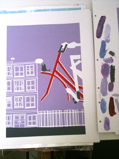
1st, 2nd, & 3rd colors printed of my new colorway "Going To See My Baby Lavender" art print.

Colors 1,2, and 3 of my hand screenprinted art print, "Going To See My Baby Lavender, with color test smears of inks on the right. (click for more info or to purchase!)

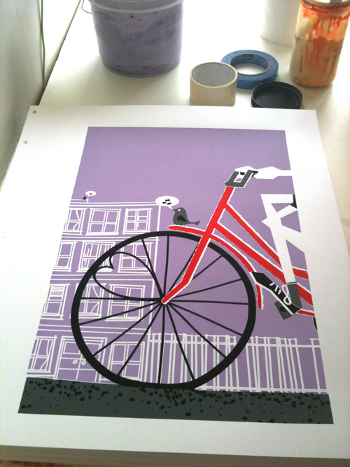
4th color down (black) of my hand screenprinted art print, "Going To See My Baby Lavender". (click for more info or to purchase!)

All done! New hand screenprinted art print, "Going To See My Baby Lavender". (click for more info or to purchase!)

Flatstock & SXSW: Here we come Austin, TX!

The strawberryluna booth at SXSW Flatstock '09, so come see us this year too. (click for more info)

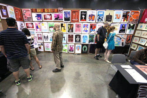
It’s really Spring! And for us that means the first Flatstock of the year, in Austin, TX during the HUGE music festival SXSW. We’ll be working part of the time and having a blast the other. Come on and see us and close to 100 (that’s right) poster artists from all over the world, showing our work and talking shop with music industry folks, poster art fans and the wide open general public.

We will be debuting new posters and new art prints as well as bringing a slew of Test Prints too, so it’s going to be rad.  Come say hi!

Co-presented by the American Poster Institute (API) and SXSW, Flatstock 24 will display the works of more than 100 artists from across North America and the globe. Posters representing decades of styles, colors and techniques will be on display and for sale as well as additional merchandise. Show up early and be ready to be overwhelmed with amazing posters. (You might want to bring some dough since you won’t want to leave empty handed!) The exhibition is free and open to the public. Check out this year’s exhibiting artists.

Big ol' fisheye view of a Flatstock in Austin, TX, photo Jen Soto. (click for more info)

The best concert posters have always captured both the essence of the music they promoted and the spirit of the time in which they were produced. Flatstock provides an ongoing series of opportunities to see fine poster art in person and to meet the artists who created it.

Making SXSW a true music collector’s paradise, don’t forget to set time aside for the Austin Record Convention in the same exhibit hall and the Texas Guitar Show in the adjacent hall.

The legendary Smokey Robinson will visit Flatstock 24 on Thursday afternoon following his keynote address to sell his limited edition prints designed by Shepard Fairey. Swing by to get your one-of-a-kind poster signed by both Smokey and Shepard.

Screenprinted art print of the legendary Smokey Robinson by Shepard Fairey.

The Important Details!

Schedule & Hours:

  • Thursday. 3/18  HOURS from 1:00pm – 6:00pm (includes Smokey Robinson & Shepard Fairey appearances.)
  • Friday. 3/19 and Saturday. 3/20 HOURS: from 10:00am – 6:00pm

Location:
Austin Convention Center Level 1, Exhibit Hall 1, on the Ground Floor.

About the API: The American Poster Institute is a nonprofit corporation dedicated to serving the poster artist community and promoting the art form. The Flatstock shows provide the American Poster Institute with a way to present poster artists collectively while showcasing the breadth of styles they represent.

About SXSW: The first South by Southwest Music Conference and Festival (SXSW) was held in 1987 in Austin, Texas. Despite the fact that Austin was not a Top 20 major market at the time, the background and character of the city made it a perfect location for the conference. SXSW’s original goal was to create an event that would act as a tool for creative people and the companies they work with to develop their careers, to bring together people from a wide area to meet and share ideas. That continues to be the goal today whether it is music, film or the internet. And Austin continues to be the perfect location.

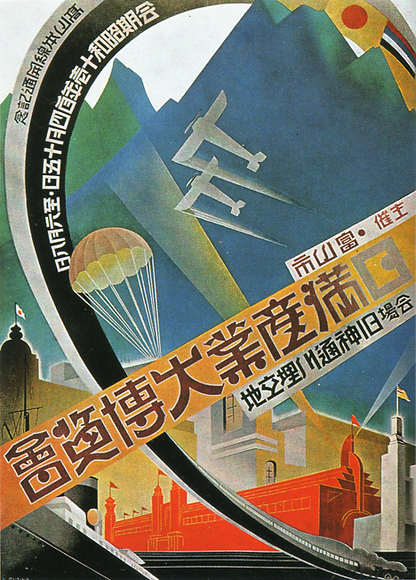
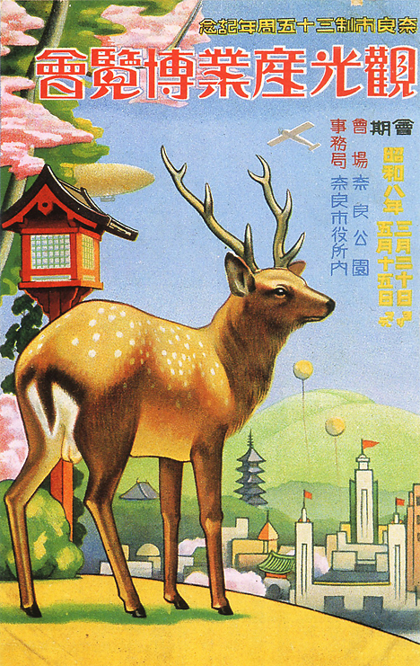
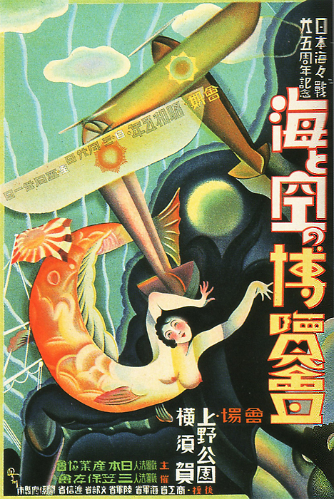
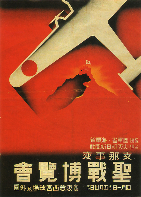
Vintage Japanese Industrial Expo posters


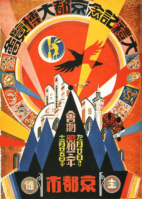
Grand Exposition in Commemoration of the Imperial Coronation – Kyoto, 1928 (click to see more posters & for more information.)

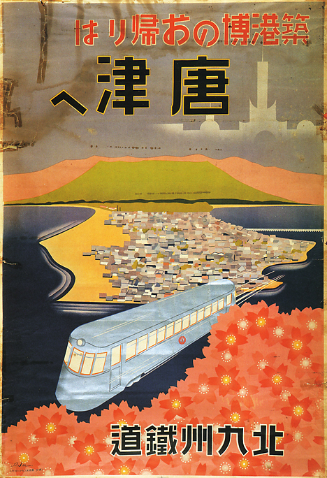
One of my favorite thing about the interwebs is stumbling onto incredible things that I would otherwise never see. Recently I came across the Pink Tentacle’s fantastically beautiful blog post featuring Vintage Japanese posters produced for several different industrial expositions throughout the late 1930’s and into the early 1940’s.

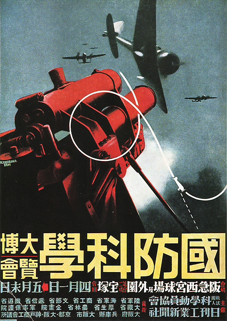
I can’t gush adequately or explain my fascination with propaganda in general, let alone describe the thrill of looking at poster art such as these pieces. They are just stunning. I really love the ways that the themes and imagery run from incredibly dark, heavy serious (much like the word “industry” can conjure such connotations as well) such as the two examples below:

National Defense Science Exposition – Hyogo, 1941 (click to see more posters & for more information.)

The above being especially chilling given that the imagery evokes Japanese-American connection to each other and WWII via Pearl Harbor both in theme and the year of the Japanese National Defense Science  Exposition, 1941.

Japan-Manchuria Industrial Exhibition – Toyama, 1936 (click to see more posters & for more information.)

Or, a much ligher aspect of “industry” can be called forth, as in the Tourism Industry Expo poster seen here, where even a Buck might be enticed into playing tourist:

Tourism Industry Exhibition – Nara, 1933 (click to see more posters & for more information.)

And here is an interesting combination of both heavy, militaristic and mythologically represented industries in the form of a Sea & Air Expo:

Sea and Air Exhibition – Tokyo, 1930 (click to see more posters & for more information.)

Beyond the heavily represented military-based industries & expositions, of which there seem to have been numberous. Check out the poster  for an exhibition for the Second Sino-Japanese War below, which weirdly had only begun the year previous to this Expo’s poster and continued on for another 7 years:

Second Sino-Japanese War Exhibition – Osaka, 1938 (click to see more posters & for more information.)

There were also some really lovely commemorative exposition posters produced for potentially simpler and more peaceful (t0 a degree) endeavors like the new (at that time) Hakata port construction, an international gateway port for centuries in Japan:

Exposition Commemorating the Construction of Hakata Port – Fukuoka, 1936 (click to see more posters & for more information.)

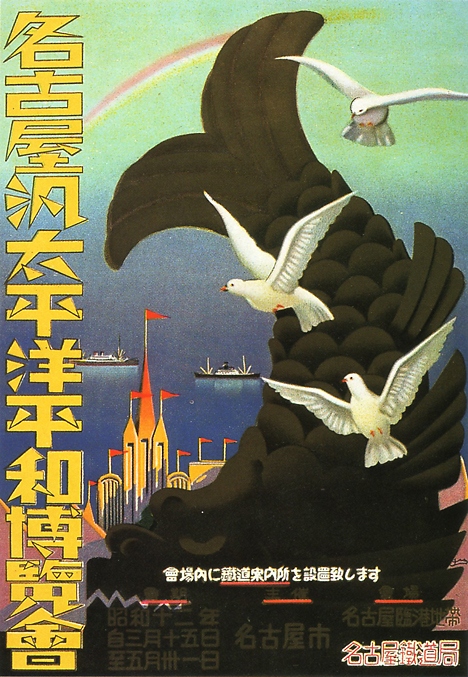
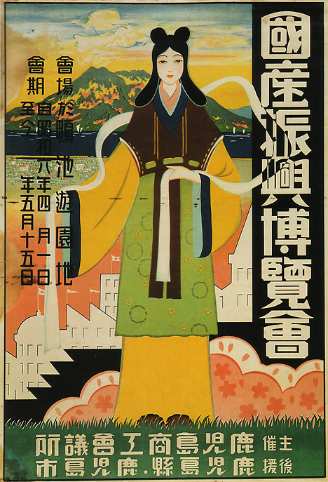
And then finally, there are some posters whose lettering just really catches my eye. No, I read no Japanese and don’t know a thing of Kanji. Even so, I find the idea of reading letters a pretty amazing feat as they rarely formed the same way twice when rendered by hand or in different fonts and lettering style. When you stop & think about it, it’s practically a miracle that humans read really. Case in point, the lettering examples below are so stylized and almost wrought with objects and illustration or have parts of the illustration itself crossing into the formation of the letterforms, that even I can see how non-traditionally styled they are:

Nagoya Pan-Pacific Peace Exposition – Nagoya, 1937 (click to see more posters & for more information.)

The National Products Progress Exhibition – Kagoshima, 1931 (click to see more posters & for more information.)

Above all else, I am in love with the colors, opacity & transparencies and relationships of shapes in all of these posters. They are just phenomenal. Thanks to Pink Tentacle for posting so many and feeding my eyes. To see more posters, visit the always interesting Pink Tentacle blog here or click on any of the images above. And as always, feel free to comment!