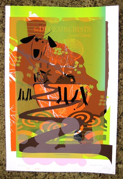
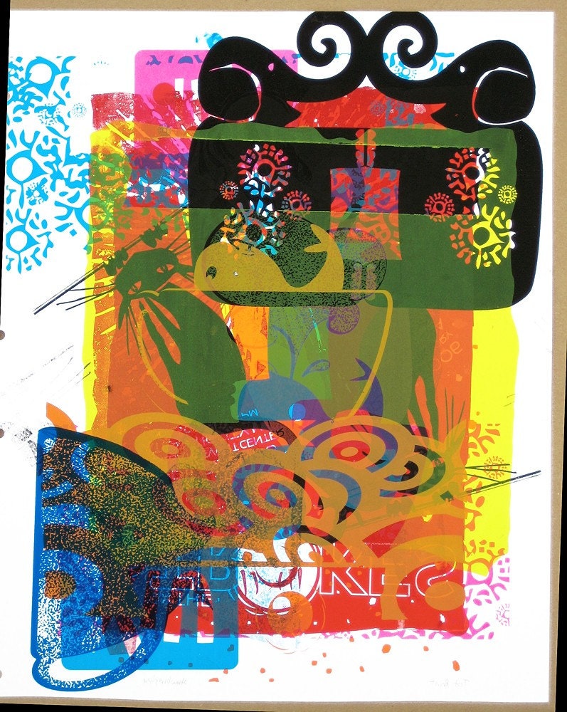
Strawberryluna

2 new rock poster releases! St. Vincent & The Wreckids


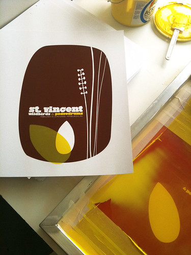
My 6 color, hand screenprinted poster for St. Vincent's show wi/ Wildbirds & Peacedrums in Pittsburgh on 2/21/10. (Click to purchase or for more info,)

After taking the month of January off from printing to work on some big design projects, as well as recover and regroup from a fantastically hectic summer + fall + winter 2009 work schedule, we were finally able to really focus on getting my new studio up and running for real. Craig found the space in July ’09 and I signed the lease starting in September. It was love at first sight for sure. A blog post covering the set up and construction of my new solo studio (nicknamed Friendship Studio) is definitely due. And now that it’s been one week since completing my first prints and posters there from start to finish? I’m feeling really great about all of the crazy and hard work that we did. But, more on that soon.

For now, I’m really stoked to post these new releases, as they are the first posters out of my Friendship Studio!

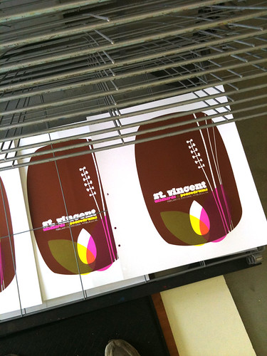
First up is actually the 2nd poster printed at my new space : that being my poster (pictured above) for St. Vincent. I’m really proud to be a part of the tour series organized for this tour, with the super cool (& Swedish!) Wildbirds & Peacedrums. The show was…amazing. Definitely try to catch St. Vincent on tour at some point this year. The above is my 6-color all hand pulled screenprinted poster with bark brown, clear yellow & magenta hand-mixed, non-toxic water based acrylic inks. Super secret magic: Three inks & 3 screens were used to make a total of 6 colors utilizing lots of overprints. (Overprints are when semi-transparent layers of ink combine and overlap to make another color.) I will have a very limited number of this poster for sale, as most of the edition was sold by the band on the night of the show & on tour. Size: 16w x 22h inches. Edition of 125. Paper: acid-free & archival Cougar 100 lb White, cover weight. Click here for more information on my website or to purchase.

And next up is actually the FIRST poster that I printed in my new studio. Is it backwards posting this first poster one second? Yes. But cousin, that’s how I roll.

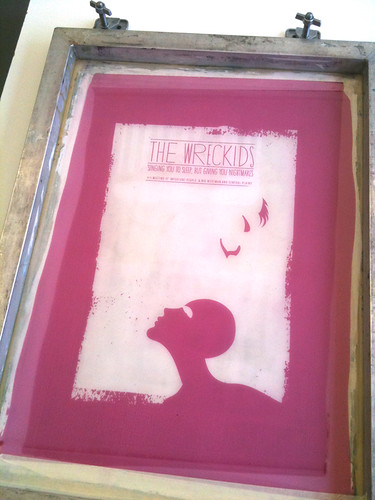
My 2 color, hand screenprinted poster for The Wreckids CD release show in Pittsburgh on 2/19/10. (Click for more info!)

This poster is special all over. It’s for our dear friends The Wreckids CD release party in Pittsburgh, and you need to know a few things. 1. They are the coolest. 2. They’re awesome. 3. This poster is ONLY and EXCLUSIVELY available through the band. Yep, that’s right. So if you like it? Please help support them and purchase a poster from The Wreckids directly via their Myspace page HERE.

The Wreckids are some sweetie pies in disguise. This poster is for their CD release party for the record “Singing You To Sleep But Giving You Nightmares”, and doesn’t that just about folktale style say it all? The above is my 2-color all hand pulled screenprinted poster with blood red and midnight black hand-mixed, non-toxic water based acrylic inks. Size: 16w x 22h inches. Edition of 25. Paper: acid-free & archival Cougar 100 lb White, cover weight.

And, I finally got to take some more screenprinting process shots, only these offer some sneak peaks into my new print digs. Holy moly! Natural light! Click HERE or on the images below for more information about my hand screenprinting process & to see more photos at my Flickr page.

St. Vincent poster process photos:
2nd color printed of my St. Vincent poster. (Click for more information & photographs.)

My completed hand screenprinted St. Vincent poster, drying on the rack. (Click for more information & photographs.)
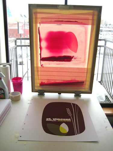
St. Vincent poster process, 3rd color flooded in the screen backlit screen. (Click for more information & photographs.)

The Wreckids poster process photos:

The Wreckids CD release poster 1st color screen. (Click for more information & photographs.)

The Wreckids CD release poster, racked & done SON! (Click for more information & photographs.)

My above St. Vincent poster is now available in my webstore here.

Have questions about these posters or screenprinting? Ask away! It might take me awhile, but I always write back.
ModCloth’s Blog did a lil feature on me = the poster artist is ::blushing::

My poster for The Dandy Warhols in ModCloth's feature on Gig Posters. (Click to read the piece.)

One of my favorite online clothing and accessories stops (I seriously look over there weekly) is ModCloth. They’re awesome, and they really capture the mix of vintage and modern style that I adore with their selections.

ModCloth also run a blog, and to  my utter flattered and shyly amazed delight, their Lifestyle writer Natalie B. wrote a piece about Gig Posters and featured my work. (!) It’s always so cool as a printmaker and designer to hear about what I and others in our little field think about our work, both in a personal way and just generally. Especially since while many of us posters artists know each other, we tend to be far flung and each working in our own microcosmic corners of the scene.

Anyway, thanks so much Natalie & ModCloth! Below is the article, and you can also click the links in this post (like right HERE) or the image above to read the comments posted on the ModCloth blog post about my Dandy Warhols poster (available by clicking HERE) and other poster artists. Or, be awesome and post some of your own comments about poster art & artists here on my blog too. Don’t be shy 😉

Have you ever seen a flier for your fave indie act and thought, “That is too awesome to throw away”? Then you’re already familiar with the artistic allure of gig posters!

The 60’s spawned some of the first fantastic fliers, but today there are a plethora of places that you can suss out posters of beloved bands, from A Tribe Called Quest to Rachael Yamagata, as well as superior sites which feature vast collections, such as GigPosters.com, and individual artists’ sites, like Todd Slater’s. You could even ask around your city to find local haute handbill-creating talent, such as my favorite Pittsburgh poster gal — StrawberryLuna!

One thing’s for sure — if you’re a lover of music and appreciator of art, you will be captivated by gig posters. Do you have a favorite gig poster artist or fantastic flier that you’d like to share? Tell us about it!

“Dear Loser: Letter from the Comic to a Young Plagiarist”, an Object Lesson in design-theft caution.

Click to read Sara's amazing letter to a plagiarist!

And then…this happened, beginning a couple of weeks ago. Long store essentially short – a fantastic comedian Sara Benincasa (who is pretty much the coolest person on the planet to me now) contacted me about quite a sticky wicket. And hats off to her not only for her talent, but her quick moves and general coolness under what had to have felt like complete, well…crap.

The chain of events:

1.  Sara Benincasa, an up & coming comedian hired “designer” to make a promo flyer and poster for her one-woman show Agorafabulous. As it turns out, that “design” was (unknowingly to Sara) a ripoff of a poster that I was hired to do for the band Spoon. My poster is the first you see below:

My design done under commission for the band Spoon in 2007.

2. The ripoff poster (mind-blowingly) was nominated for a design award with the ECNY Awards. The ripped off design by a real Wang is below:

My design stolen and re-sold to Sara Benincasa as "original".

3. My design was recognized by a savvy someone who alerted Sara.

4. Sara then emailed me immediately & before I even knew fully what was going on. I was out running errands before the SNOMG 2010 round 2 hit here and started seeing Tweets about me, but not to me, so I was trying to follow the leads when I got her email about the situation. Amazing.

5. Sara had already started taking down all images from her sites ASAP, and also had the design DQ’d from the award competition, and we’ve been talking ever since.

6. We’re definitely going to work together soon on a couple of projects. So, really? It’s all good.

Does the story stop there? It should, but it doesn’t:

7. THEN awesomely (!) a couple of days ago the “designer” (thief) emailed Sara asking why “his design” was no longer in the running for an ECNY award.

8. Oooohhhhhhhhhhh good times. This girl is fierce! Please CLICK HERE or the below giant link to read Sara’s open letter on her blog to The Wang who stole art & tried to profit:


UPDATE 1: Well, as it turns out, the same Wang also tried to initially sell another stolen design, this one from our very good friend and extremely talented Dan Stiles. Unbelievable. Dan’s beautiful Zero 7 poster is first, with The Wang’s ripoff following.

Dan Stiles poster for Zero 7. (Visit http://danstiles.com to see more of Dan's work.)

The Wang's stolen "design". Unbelievable.

UPDATE 2: The theft was finally acknowledged, and the Wang apologized, which is really appreciated. Apology accepted. Please do not steal my work or the work of others again and we’re cool. This goes out there to every designer and artist who needs to hear it.

So you see kids, you WILL get busted for thieving designs. And to boot? Something truly good and just might just happen to those you’ve wronged. Thanks to a Wang, a designer and a fun client have found each other. Sara Benincasa rules the skool.

I love a happy ending.

La Muette, a time capsule of French advertising posters

Old advertisements revealed at La Muette. (Photo: Paul Shamble. Click for more info or to read the article 'History dans le Métro'.)

Thanks to a friend who alerted me to this link posted on the AIGA site, (thanks Dave C!) I have a cool little moment in design to share here.

Like all cities, civilization and history continually build on top of itself. One really lovely case in point is the renovations as we would say in English, also known as décarrossage in French, to denote the deconstruction of a previous style or building, of parts of La Muette Metro station in Paris, where for a short time in 2009, demolished walls revealed layers upon layers of old posters and advertisements.

Lovely decay of several posters revealed at La Muette Metro station. (Photo: Paul Shamble. Click for more info or to read the article 'History dans le Métro'.)

It seems that simply pasting up new posters was so the norm when something new came along, that this system even went so far as to work for the construction of the typical Parisian white-arched tile and rather than bother to remove these posters, they were simply walled over.

Happily!

These posters and ads, long since forgotten probably just a few short years, if not months, after being enclosed behind sparkling white tile walls in the 1950’s & 60’s, were a surprise to a new generation of contractors and architects (under the direction and employ of the RATP’, Paris’ transportation organization) apparently when the tiled walls were broken down and these gems from the past were revealed. At times, the layers of posters were incredibly thick, as you can see below.

Dense with poster and board and posters. (Photo: Paul Shamble. Click for more info or to read the article 'History dans le Métro'.)

The article, History dans le Métro’, written by Gene Tempest, a doctoral history student currently studying in Paris can be read in it’s entirety here. It’s a very cool read with neat clues about the ages of many of the posters based on cultural changes, such as the one-time use and eventual discarding of Parisian phone numbers having a place name prefix, a bit like old-fashioned American ones. While ours were more created out of neat sounding memes (PENNSYLVANIA 6500!), the Parisian name-number combinations were geographically linked to the subscriber’s location.

Plus, the article mentions Haussmann’s impact & influence on Paris, a force which can never be overstated nor over-discussed in any of its positive or negative aspects. These photos are really beautiful, and as a designer and history geek…it’s pretty dang neat to see two loves linked together in Paris, even if it was fleeting.

A torn ad for a modern design school sat hiding behind seats for decades. (Photo: Paul Shamble. Click for more info or to read the article 'History dans le Métro'.)

Light Up Dog Hoodie – DIY adorableness!

Tucker showing off the night lights of his LED-lit Light Up Dog Hoodie. (click for more info!)

Get ready to file this is in the “Super Cool / Super Cute” folder. Our smartie friend Val (and fellow Pittsburgher) who works with and on about a million different  design projects and interactive/digital organizations (PittMFUG and Refresh Pittsburgh and Flashpitt to name a few) is also the power behind the This Is Portable blog. Where, she recently posted a process piece about the awesome LED lit custom doggie jacket that she made for her dog, Tucker. (Yes, the handsome fellow above and below.)

Val’s post was so rad, it was even re-blogged by Make here. Dag!

Tucker's badass hoodie in the light. (click for more info!)

Walking my dogs at night in the city, especially on busy, dark, or hilly streets – and even all 3 as we have commonly here in Pittsburgh – something like this fantastic little safety get-up with good design is just the coolest.

Rather than fudge up the technicals, (I find electricity and its theories to be mysterious, baffling, and a leap of faith), I’m just going to re-post how Val built, sewed and made this bit of awesome. It’s better that way, trust me.

—————————————————————————————————————————————–

“This was a really fun project to work on. Printing, sewing, and soft circuit stuff all rolled into one project! I can’t wait to take Tucker out for a walk wearing it, but right now there is just way too much snow for that to happen.

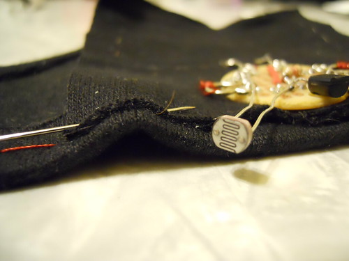
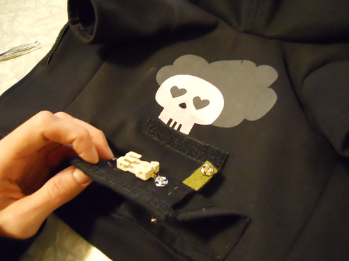
The LEDs on the hoodie’s pocket light up when it’s dark out and fade back when there is more ambient light. Perfect for evening walks in the winter when it gets dark far too early. The photo resister peaking out of the bottom of the pocket senses the amount of light present and the rest of the circuit reacts from there. There’s a lot going on in that little pocket!

A close up of the circuitry work of the Light Up Dog Hoodie. (click for more info!)

Close-up of the circuitry of the Light UP Dog Hoodie. (click for more info!)

If you’re interested in how it was made, I documented my work on this project in a flickr photo set with lots of notes. It’s much easier to describe in photos. The only part I didn’t take photos of was printing the skull and cloud on the fabric. Those were silk screened on the fabric before any of the sewing started.

Originally I had planned to make the hoodie a little more complex and include a lilypad arduino. As it turns out, a hoodie that fits a ten pound terrier is very small. Luckily I was able to convince one of my officemates, Tom, to do a little soldering for me for an alternate plan.

I used coin cell batteries (two 3V batteries) for this project because of their size and the fact that they would be easier to swap out in a small space. I was hoping that this project was still small enough to get away with using coin cells, but well, maybe not. They definitely work, but they die FAST. So, I’ll be buying a batch for cheap on eBay and then looking into lithium polymer batteries for my next project. Lesson learned.”

Open pocket on the Light Up Dog Hoodie. (click for more info!)

—————————————————————————————————————————————-

For more information, or to see what else Val & Jason are up to from time to time, be sure to visit This Is Portable or check out her full Flickr set about the construction of Tucker’s Light Up Dog Hoodie here.

Fresh Batch of 8 new Test Prints up in my Etsy shop!


Test Print 23, freshly up & available in my Etsy shop (click for info or to purchase).

Sha-bam! I’ve finally prepared a new batch of Test Prints for web sales. I love love making test prints, and the ever-rotating stack that I am working on & taking to shows is proof positive. Is it bad that I don’t often get a chance to put them up on the web for sale? I don’t know. It’s true that I usually only have them available for sale AT shows and in person. But, every now and then I like to add some of my favorites to my Etsy shop and the Gigposters.com classifieds for sale.

And hey, being snowed in under about 3 feet of snow this week made cataloging and preparing photos (taken well before the snows, as my driveway backdrop can attest) and descriptions a real possibility. So, I present, 3 of the 8 new Test Prints up, available, and ready for new homes, just like puppies.

Test Print 27, ready to go to a new home (click for more info or to purchase).

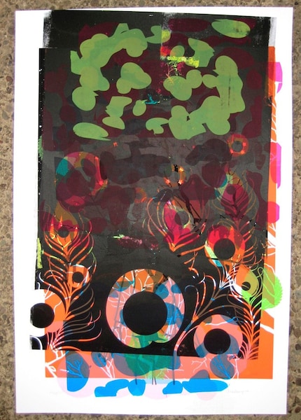
What are Test Prints? Good question Grasshopper. Test Prints, also known as Make-Ready, or Monoprints, are made from various layers of different prints from different print runs, sometimes as a way to check colors or help re-wet and open a clogged screen, or maybe to just goof around with alternate colorways, seeing how they look together, or to test transparency (especially useful if you print with transparency bases a lot like I do). Test Prints are spontaneously created and basically, magical. Hence once a test print is sold, that’s it, gone baby. They are fully one-of-a-kind prints. I always keep a few with me in the studio while printing and every now and then one looks suddenly nice & done.

Test Print 28, an oldie but a goodie (click for more info or to purchase)

So, these prints and 7 others are now available for purchase from my Etsy shop here. If you don’t have an Etsy account it’s free to sign up for one (and easy!) or if you don’t want to set one up, they will also be available for a limited time (about 30 days from today) in the Gigposters.com classifieds here. And, of course you can always contact me if you simply wish to purchase any of the Test Prints currently available online (all viewable in my Etsy shop without signing in or up) if you wish too, just email me at strawberryluna [ a t ] straberryluna dot com.

Damn Fine Tea & Damn Fine Design

Series 1 teas in Nepalese, Ceylon & Chinese green styles. (click for more info)

It’s hard to tickle my design and happy feathers more than something like this does. Yummy, carefully crafted teas and super dupes design all smooshed up into one awesome product. Our  design-y peers (nay, HEROES) at Aesthetic Apparatus have teamed up with the folks at Damn Fine Tea to produce a series of limited edition teas, all with an eye as careful on the design as the teas themselves. If you are a design nerd or a tea devotee, or gasp! BOTH well dang, here’s our Nirvana. This is a design dream job.

Series 2 teas in traditional English tea styles. (click for more info or to purchase)

Tea-obsessed Damn Fine Tea offer exceptional teas, sold loose and processed traditionally, rather than industrially with custom blends and styles. All with a keen eye on the quality not only of each tinning, cup and brew, but in the design factor as well. Potentially an endangered cultural species these days. Plus, each style has specific brewing tips tailored for that particular tea for the perfect cup.

We love these tins’ killer flair and style, and of course we do. They are all designed by the powerhouse of fun, rad, and on-point Aesthetic Apparatus out of Minneapolis, MN.

With each series Damn Fine Tea & AA take a fresh approach to the tea’s style and name. This is so apparent with teas such Series 1 and Series 2 pictured above (inspired by British Victorian boxers & the wonders of the Far East) and the below Series 3 & Series 4, respectively inspired by Rock’n’Roll (YES! See? It’s a triple match made in heaven!) and 2010 The Year Of The Tiger.

Series 3 teas in Rock inspired styles. (click for more info or to purchase)

Sometimes tongue-in-cheek comes off poorly, more like tongue-in-cheekiness or it just falls flat. Not so at all with these designs paired so well with these teas. For instance, the Series 2 teas come with limited edition mini-posters, replicating the awesome old boxing posters of yore. A fact that’s coolness is only amplified by the fact that Aesthetic Apparatus are rooted firmly in the rock & gig poster scene as well as the Series 2 mini-poster designs evoke the phenomenal test print style that so many know and love AA for in the first place. It’s like a hall of damn designers, errr, I mean mirrors. With designers in them. Maybe.

Moving on, just peep the below Carävan tea with it’s adorable little blood dripping pentagram, surrounded by a ring of tea like a Dark Wizard waiting for his Master. Hehe.

Series 3 teas come with a freakin’ Tour Patch too. Seriously, if the AA guys weren’t so nice and cool, you want to hate them for being so damn fun.

Hellfire!!!! (click for more info or to purchase)

And finally, the newest addition to the Damn Fine Tea line is the ultra-limited edition tea for Series 4, Yunnan tea, inspired by 2010, the Chinese Year Of The Tiger. Raaarrrrrrrrgh! Amazingly, this tea is limited to just 50 (FIFTY! Come on, that’s crazy!) tins, with designed & hand screenprinted labels by Aesthetic Apparatus. At the time of writing this blog post, only 6 tins remained…duh DUH.

So, these Damn Fine Teas are my current obsessive design and tasty treat geek out. Pass it on if you’re down.

We can’t wait to see what comes next.

Series 4 tea is Yunnan & limited to just 50 tins. (click for more info or to purchase)

CANCELED – I Made It! Mine Market this Saturday @ The Union Project

Click for more info!

*  CANCELED  *

Due to the humongous snow storm that hit Pittsburgh 🙁

Awww, just in time for Valentine’s Day sweeties!

The I Made It! Market team has pulled together a great bunch of Pittsburgh artists and crafters for their first show of 2010. This Saturday (only!) check out the I Made It! Mine DIY crafts fair at the historic and always cool Union Project in the Highland Park neighborhood of Pittsburgh.

50 local area artists and crafters will be on hand selling their kickass handmade items and work and hanging out so that they can talk with shoppers and Pittsburghers alike about their process, craft and work. There is a huge local community of crafters in Pittsburgh, many of whom are a part of the fantastic Pittsburgh Craft Collective and this is a great chance to get to see their handiwork up close and personal.

So come check it out! For fun previews of who and what will be there, look over here at I Made It! Market’s Blog for artist spotlights.

The details:

What: I Made It! Mine Craft Fair

When: This Saturday (only!) February 6th, 2010 from 12-5pm

Where: The Union Project, 801 N. Negley Avenue (visit The Union Project website for more info here)

Why: On account of handmade being awesome!